Wisconsin Farm Technology Days
Logo Redesign & Brand Development
Background
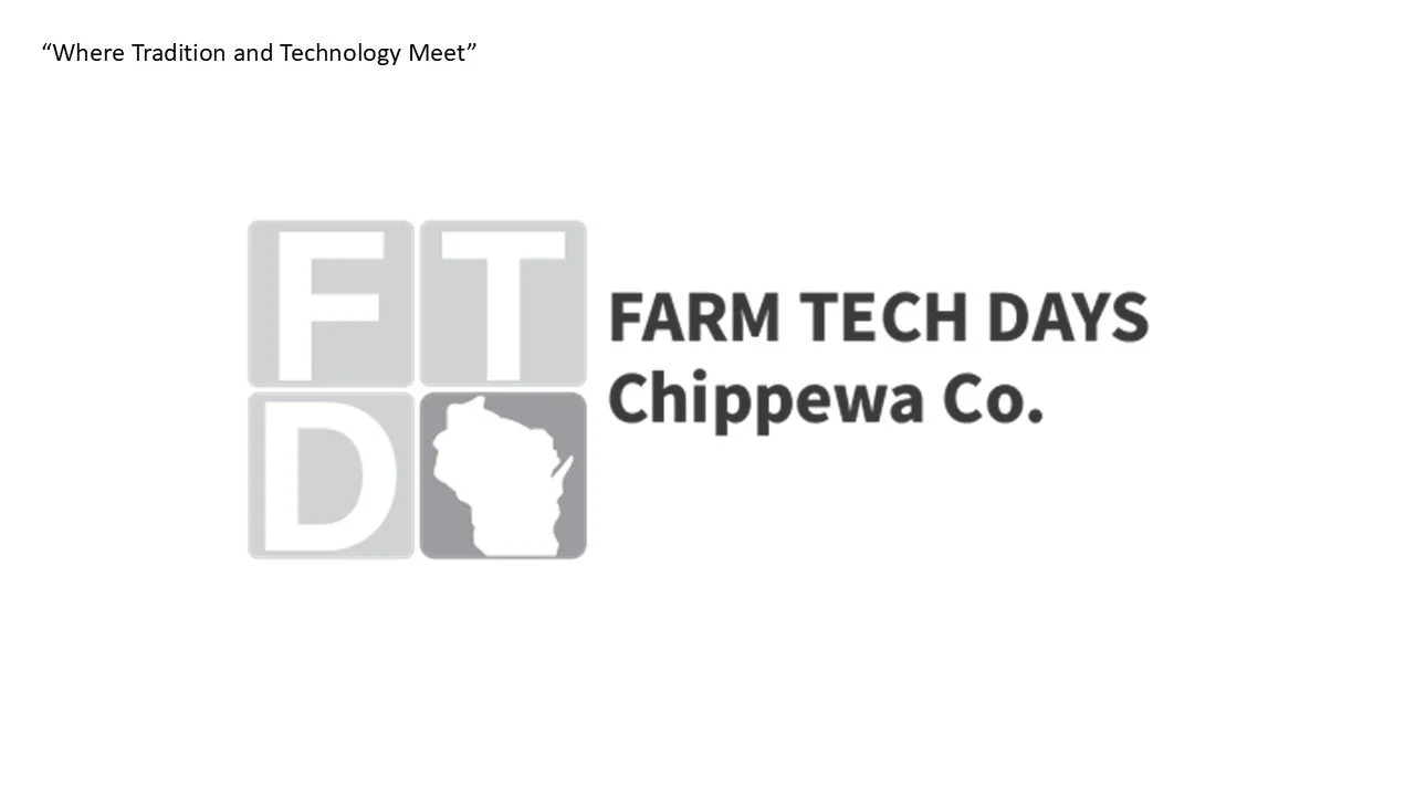
Wisconsin Farm Technology Days (WFTD) is Wisconsin’s largest agricultural show, showcasing innovations in farming and technology. For this project, I created a brand identity system that highlights WFTD’s mix of tradition and innovation. My goal was to design cohesive visuals that could be used across digital and print platforms while keeping the brand authentic, modern, and community-focused.
Challenges
One of the main challenges I faced was not having prior knowledge of farming or agricultural technology, which made it difficult at first to understand the industry’s needs and audience. I also found it challenging to work with a real world company for the first time, learning how to balance professional communication, feedback, and design expectations throughout the process.
Tools
Adobe Illustrator and Photoshop
Role
Graphic Designer
What I Accomplished
To overcome these challenges, I focused on research and communication. I spent time learning about agricultural events, visual trends in farming technology, and WFTD’s mission to better understand the audience. Working directly with a real company taught me how to adapt my design process to client needs, accept feedback, and create visuals that connect with both the brand and its community. This experience helped me grow as a designer and strengthened my confidence in real-world collaboration.
Goal
Create a smooth gift card flow that lets people customize their message in many ways
01 Research & Define
Client interview, creative brief, business proposal, and client presentation
In the first phase of my project, I began by conducting a client interview/brief to learn about WFTD’s goals, audience, and values. I asked questions about what the brand represents, how it connects with local communities, and what makes it unique compared to similar events. Through this research, I discovered that the brand’s identity is built around honoring Wisconsin’s farming heritage, embracing new technology, and bringing people together through community and education.
Client Interview Findings:
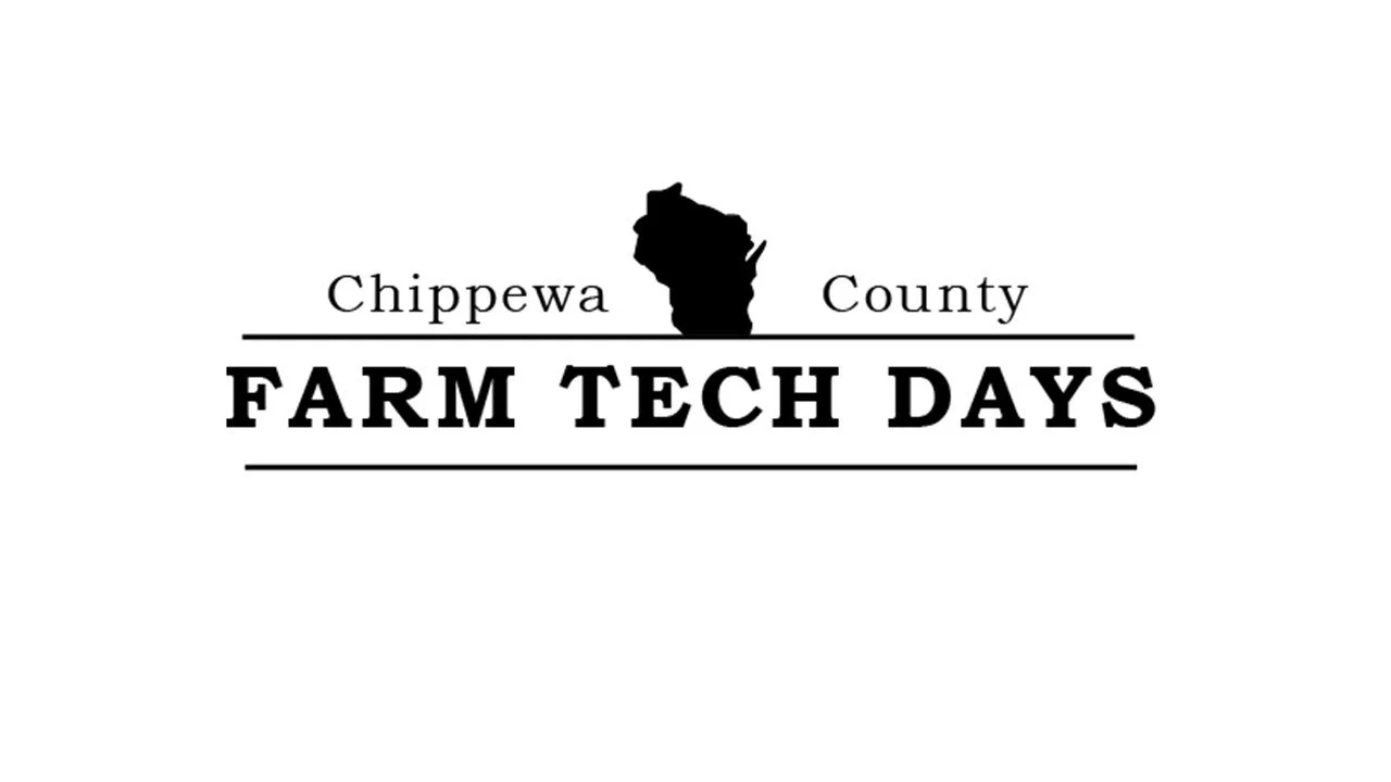
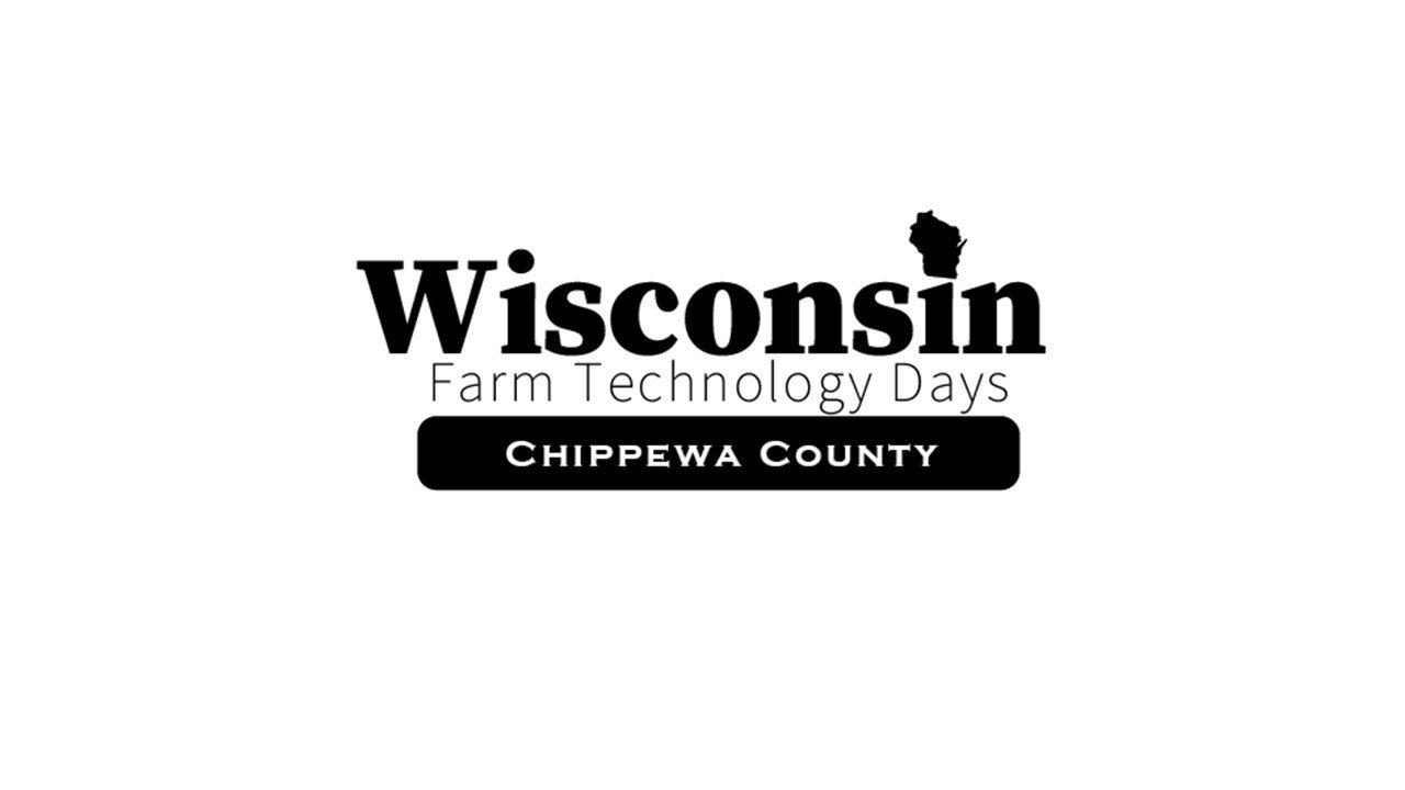
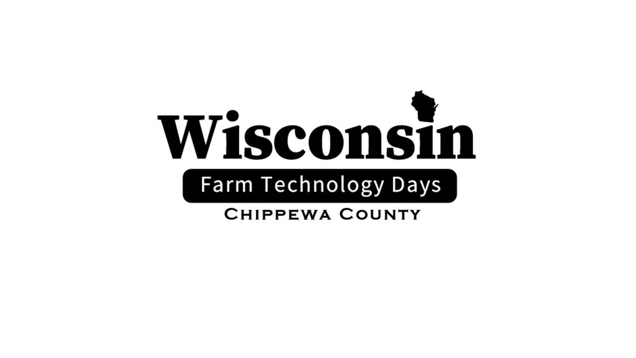
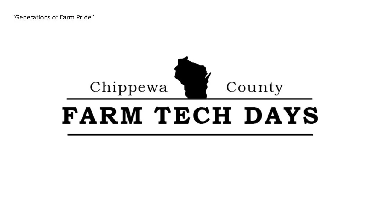
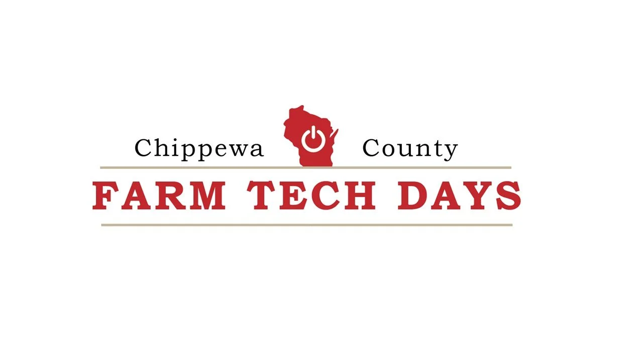
From the client interview, I learned that Wisconsin Farm Technology Days wanted to rebrand after 16 years to create a flexible logo system that could be customized for each year and location of the event. Their goal is to make farming look cool while honoring its traditions and helping farmers embrace new technology. The brand values heritage, innovation, and community growth, aiming to attract both farmers and families. They love the state shape and red color in their logo but want to move away from using “WI” in the name. The brand’s story, starting in 1952, reflects a spirit of exploration and pride in Wisconsin’s farming culture. Overall, the message they want their brand to convey is simple “Agriculture is cool.”
Client Presentation #1:
After completing the client interview, I created a presentation that demonstrated my understanding of the Wisconsin Farm Technology Days brand and its goals. The presentation outlined the organization’s vision of “out with the old and in with the new”, focusing on making the brand feel modern, exciting, and adaptable.
I highlighted the client’s goal of having a flexible logo system that could fit every event location while maintaining a consistent identity. I also suggested simplifying the name, for example, shortening it to FTD or using Tech Days, which they were open to. I analyzed competitors in Wisconsin and their logos that achieved a balance between heritage and innovation, serving as inspiration for the redesign.
This process taught me how to:
Conduct interviews to gather meaningful design insights.
Analyze key findings to identify design opportunities.
Create and present a design rationale that clearly communicates the brand’s direction.
Practice real-world client communication and presentation skills.
02 Design Exploration
Design Exploration & Presentation #2
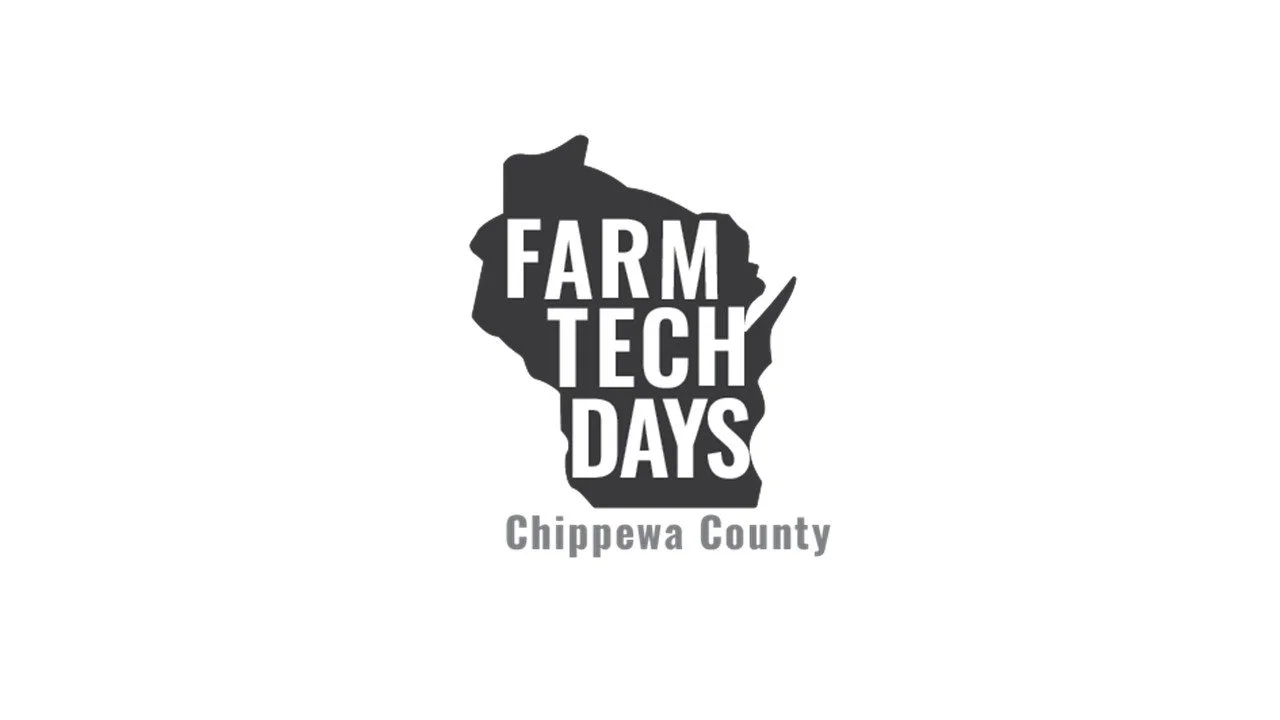
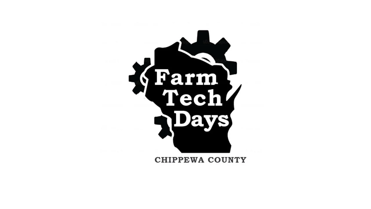
In this phase, I created fifty black-and-white logo concepts in Adobe Illustrator, exploring different visual directions based on the client interview and research findings. From these, I selected ten designs that best represented Wisconsin Farm Technology Days’ goals, making farming feel exciting and modern while keeping the brand adaptable for each new event location. I presented these concepts to the client, explaining how each design aligned with their vision and gathered feedback for refinement.
Through this process, I learned how to translate client insights into design solutions, present my ideas professionally, and adapt based on real feedback. It strengthened my understanding of how to connect creative design choices with a client’s goals in a real-world setting.


Color Development & Presentation #3
During my second presentation, my client selected three of their favorite logos. I refined my black-and-white logo concepts and began exploring color. My goal was to make the designs feel more energetic, memorable, and aligned with Wisconsin Farm Technology Days’ vision of celebrating farming in a modern way.
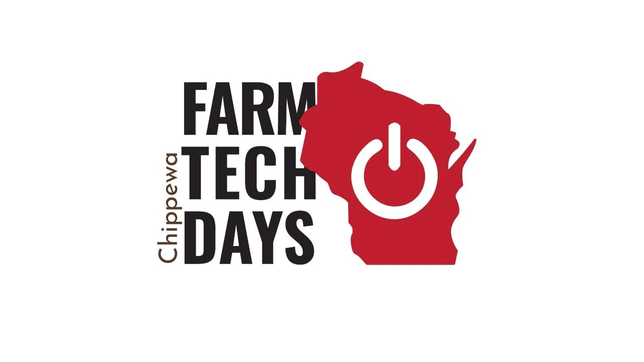
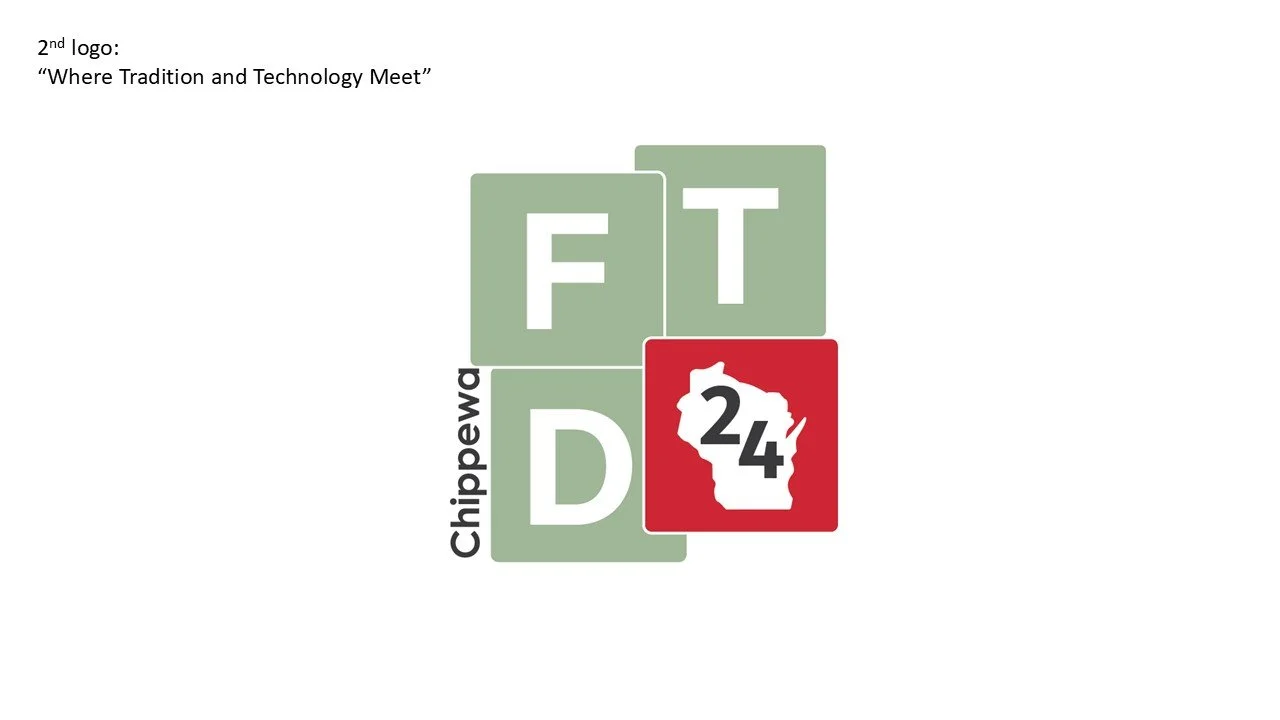
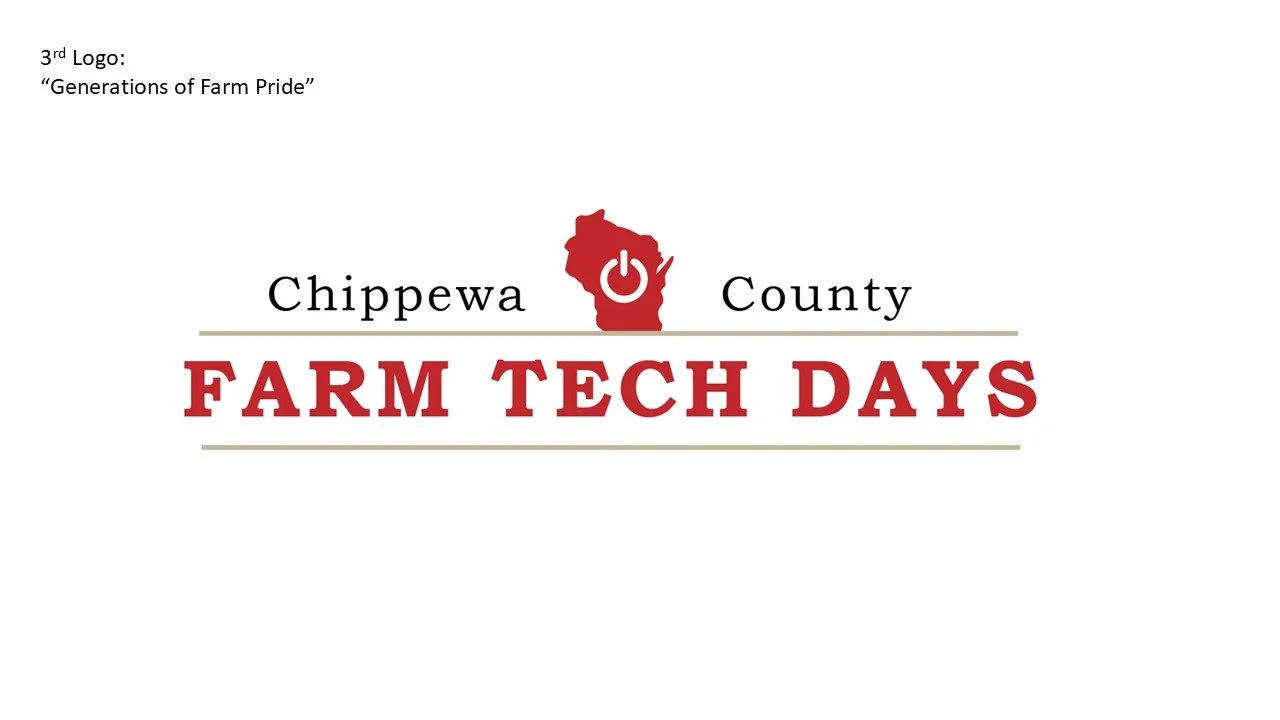
Design 1: Featured a bold red and green color palette representing growth, balance, and the connection between technology and agriculture.
Design 2: Focused on a clean red design, emphasizing energy, confidence, and continuity with the brand’s original color.
Design 3: Used red and brown tones to highlight stability, tradition, and the grounded nature of farming.
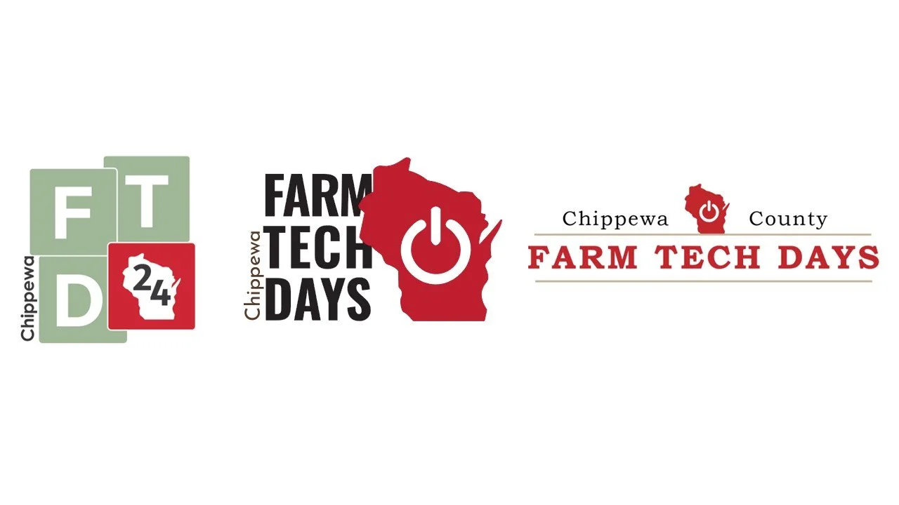
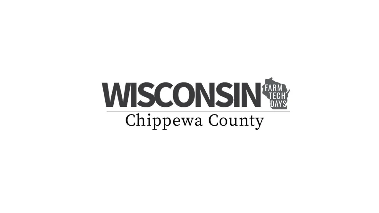
Final Presentation & Client Decision
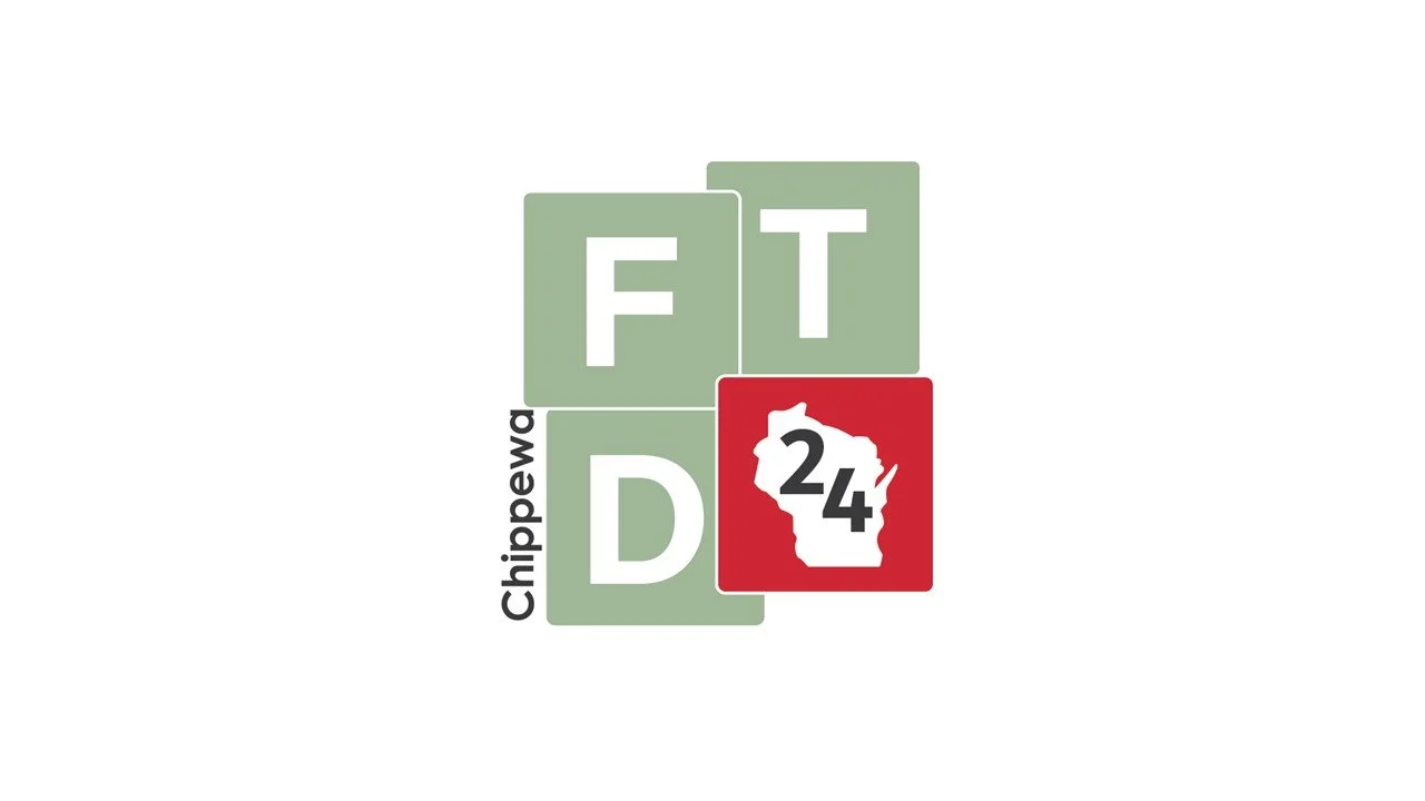
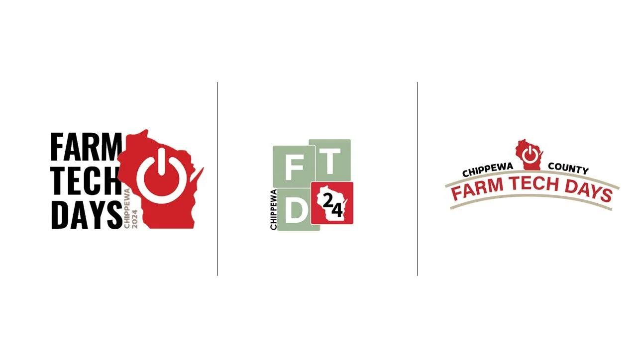
For this last presentation, I refined my work to create three final color logo designs for Wisconsin Farm Technology Days, each reflecting the client’s goals of building a modern, adaptable, and community-focused identity. These designs were informed by earlier feedback and aligned closely with the brand’s values of growth, technology, and connection.
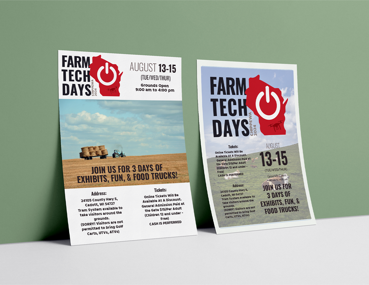
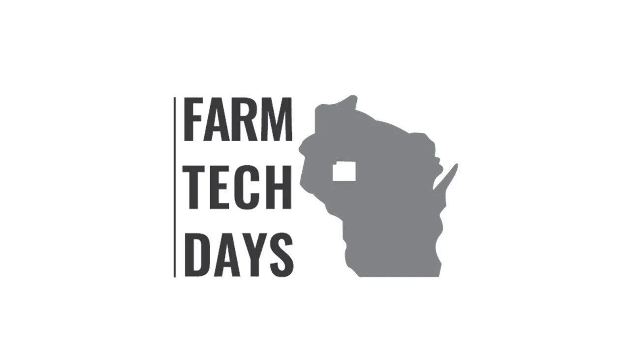
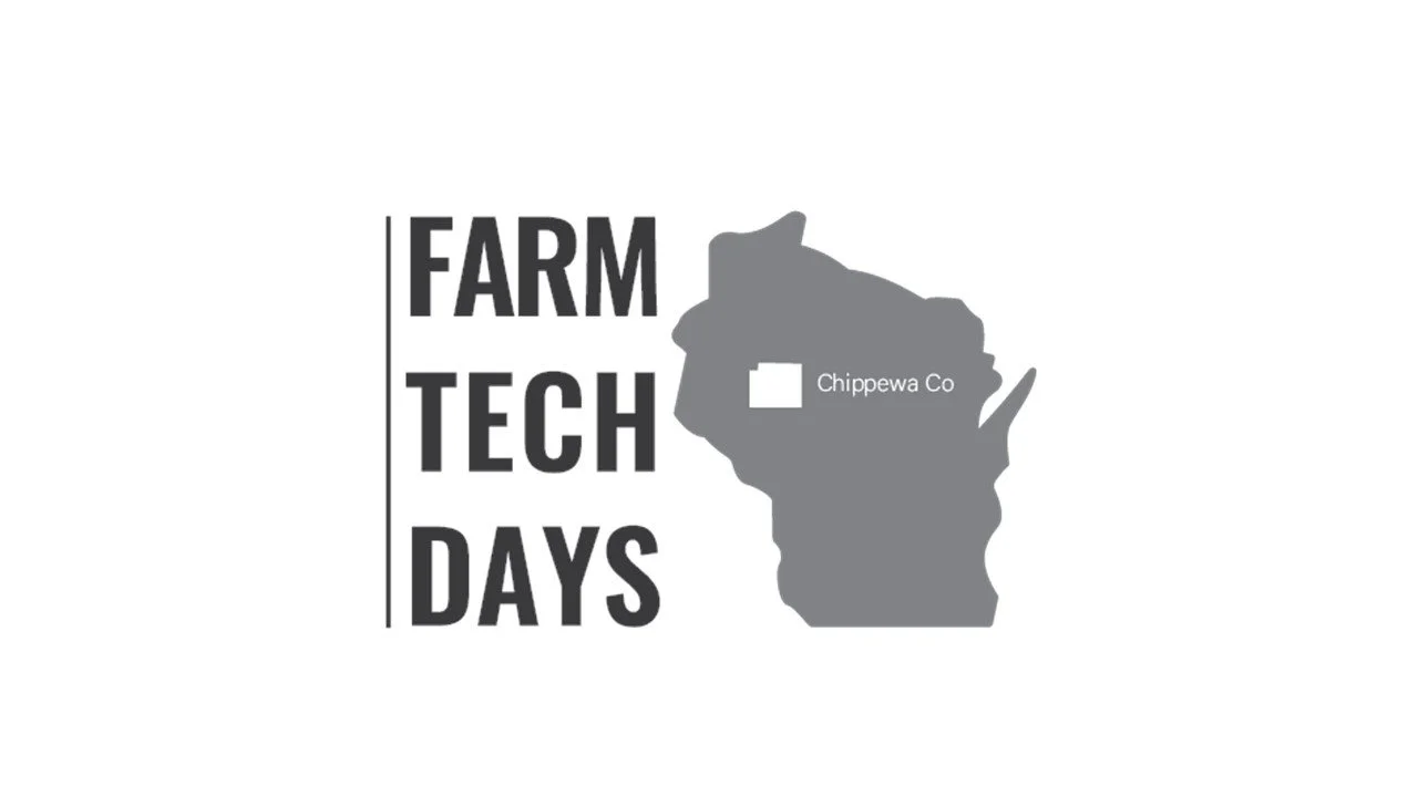
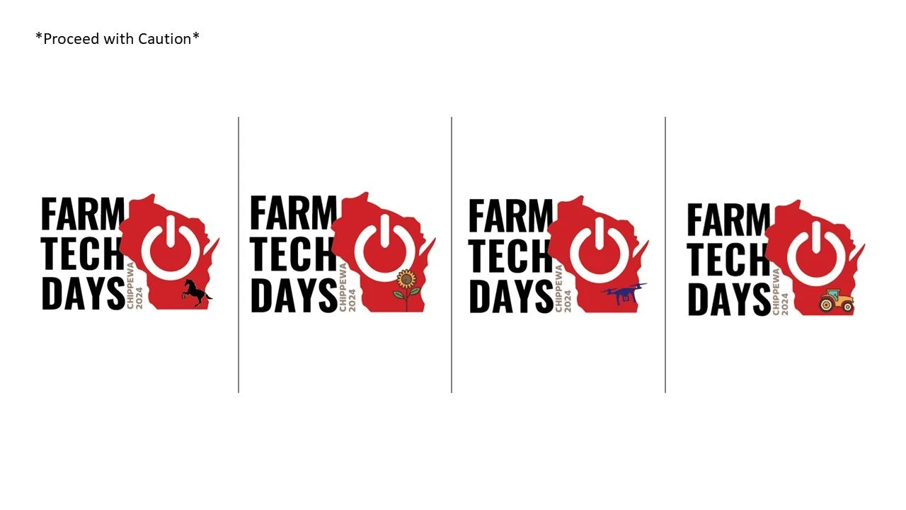
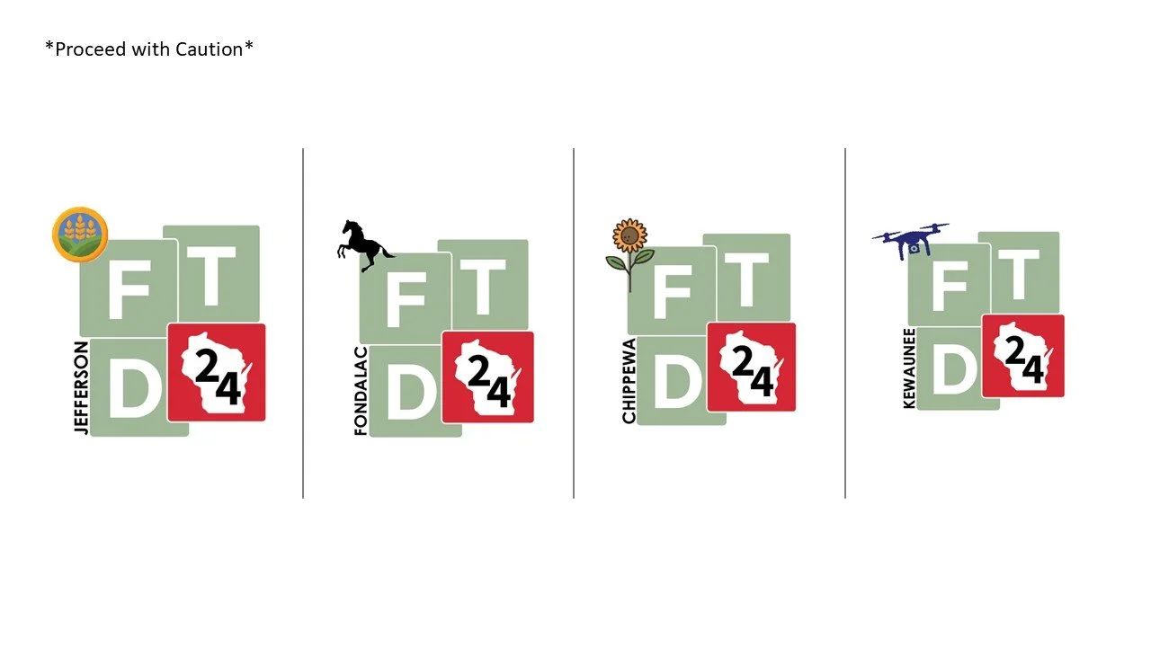
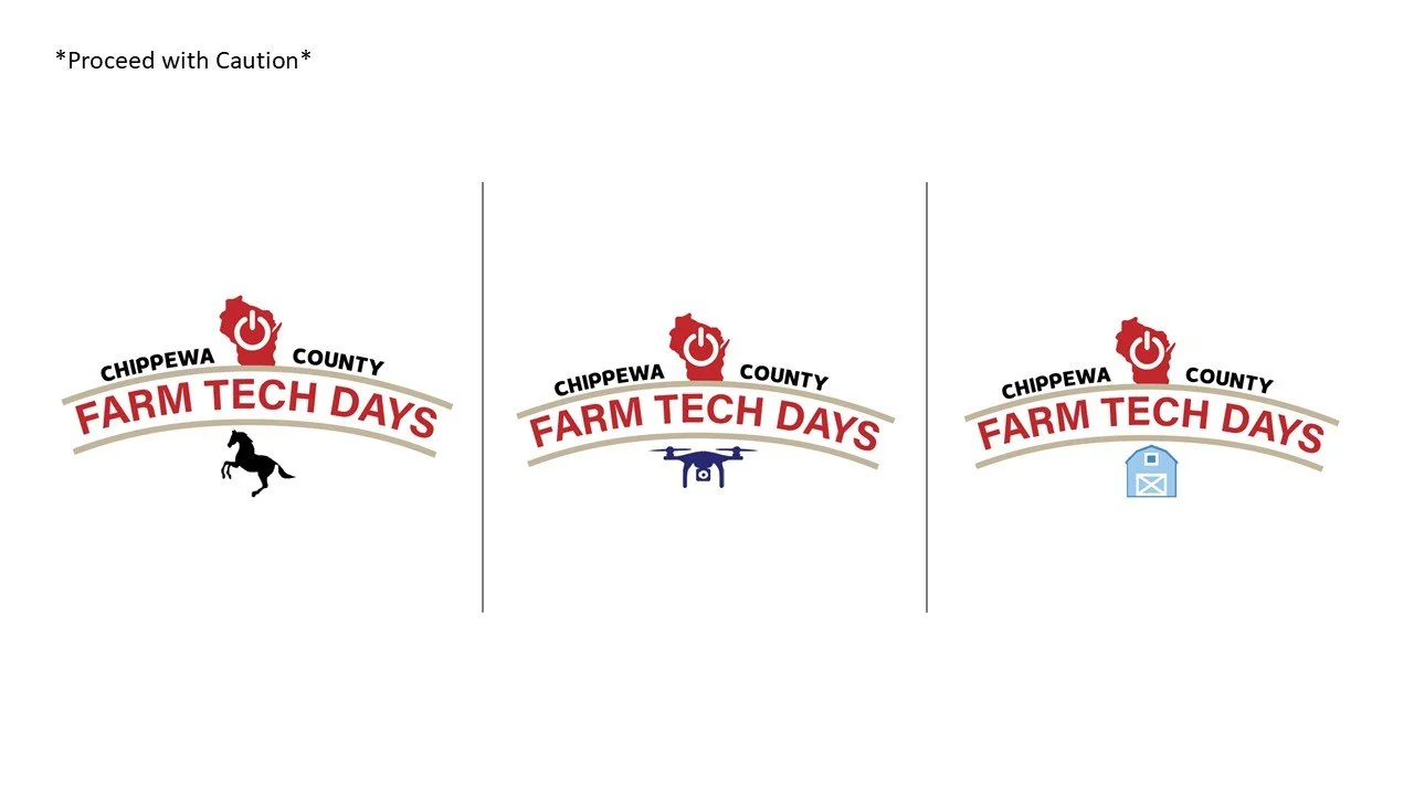
As part of the presentation, I created mockups showing how each logo could be personalized for different counties or event areas, demonstrating the brand’s flexibility and local identity. The client reviewed these options and selected their preferred direction for the next stage of refinement.
Through this process, I learned how to apply creative adaptability, present design variations with real-world context, and lead clients toward a final design decision. It reinforced the value of clear communication and strategic design thinking in building a cohesive, scalable brand identity.
03 Final Brand Identity
Case Study & Reflection
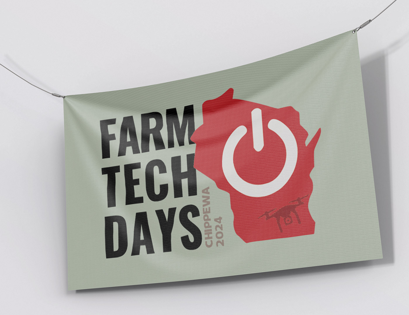
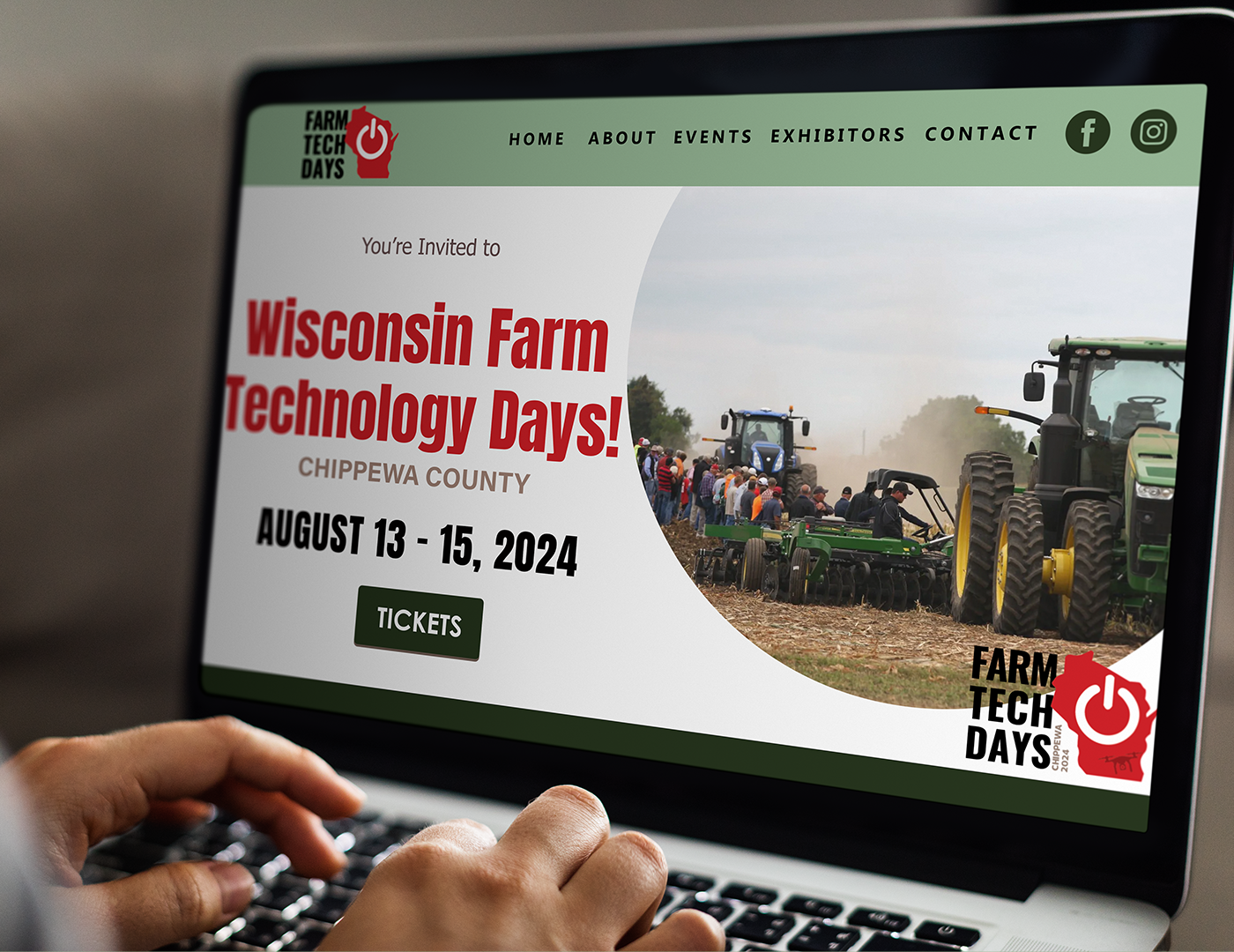
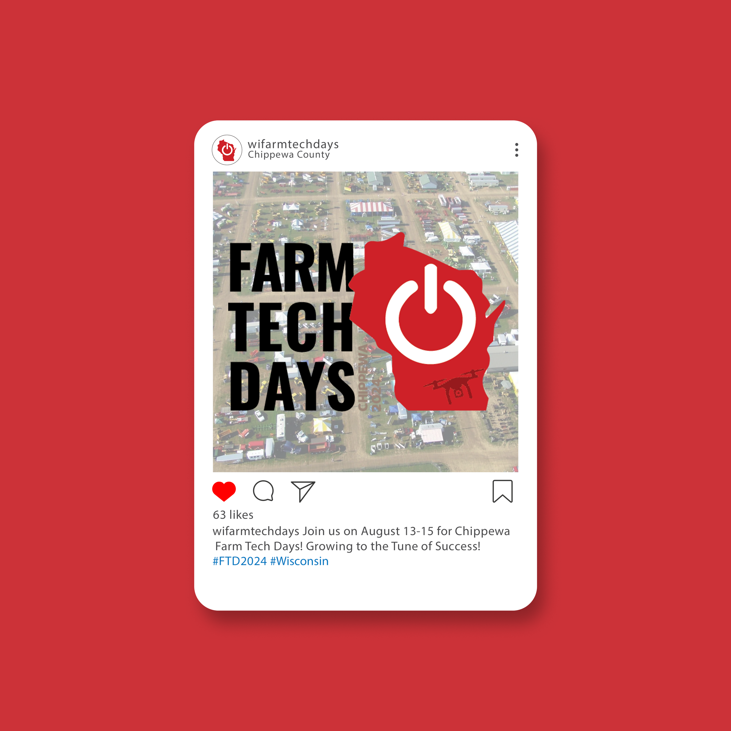
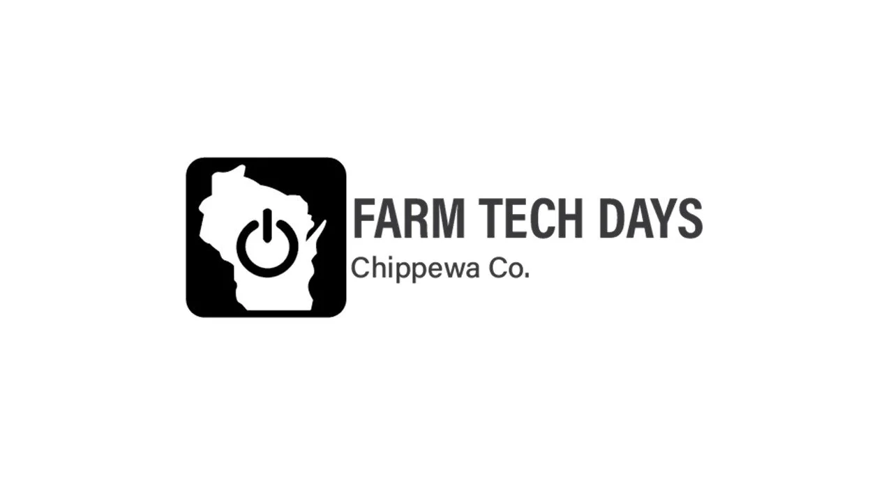
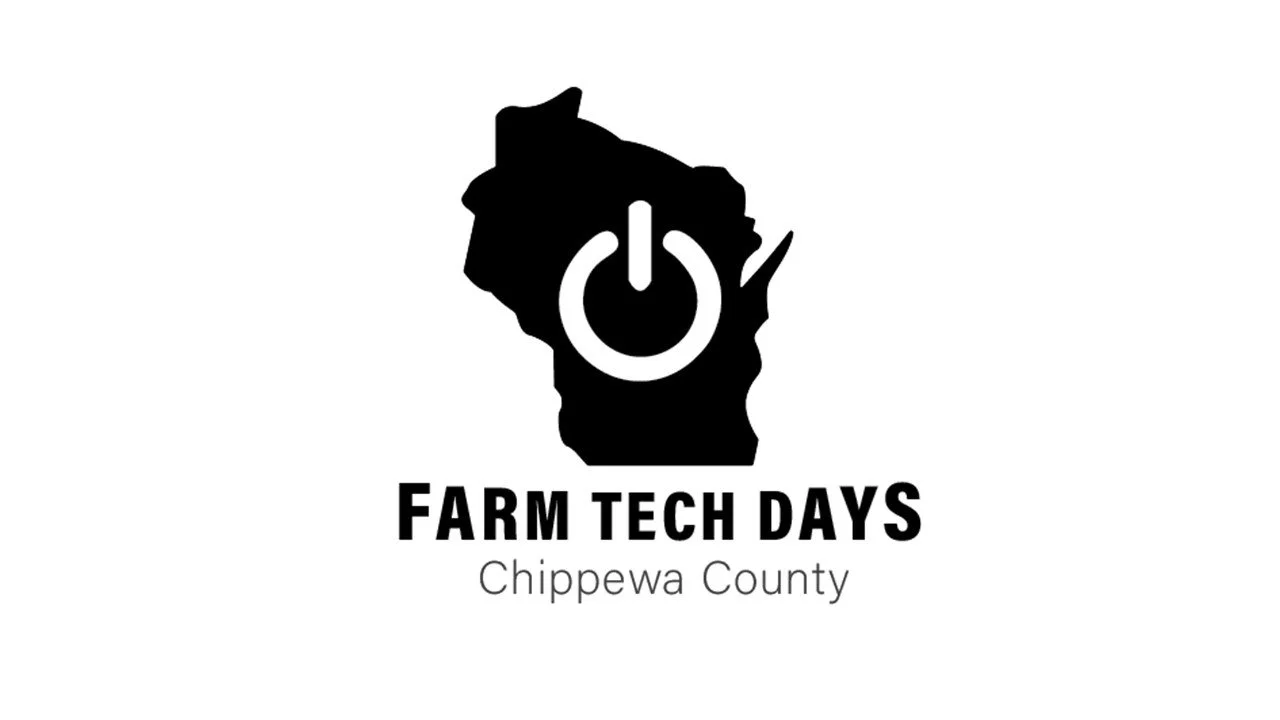
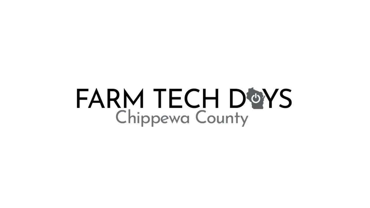
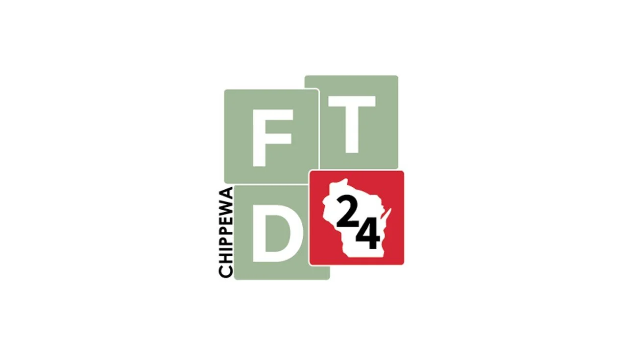
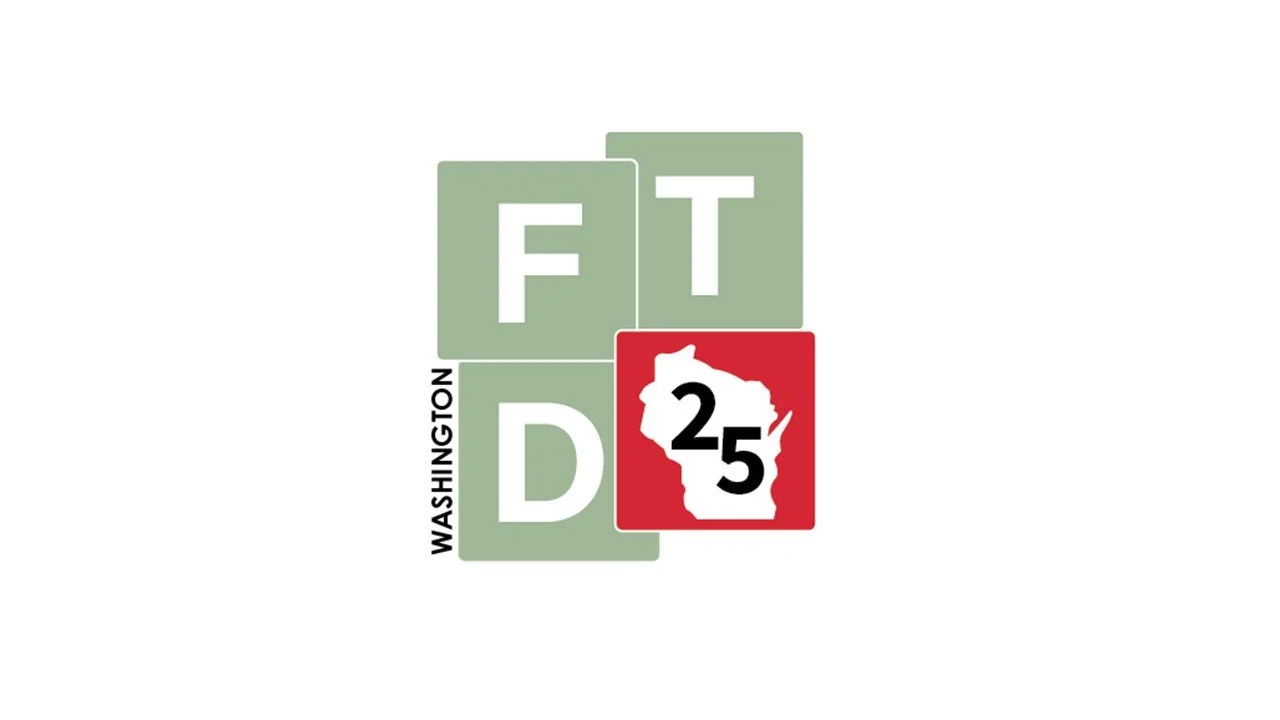
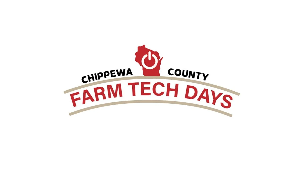
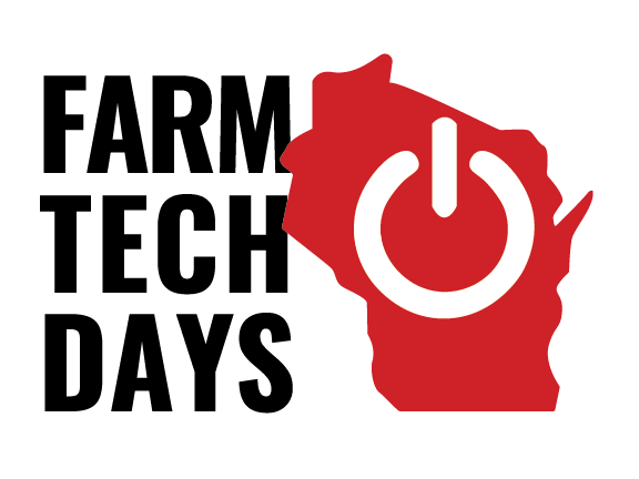
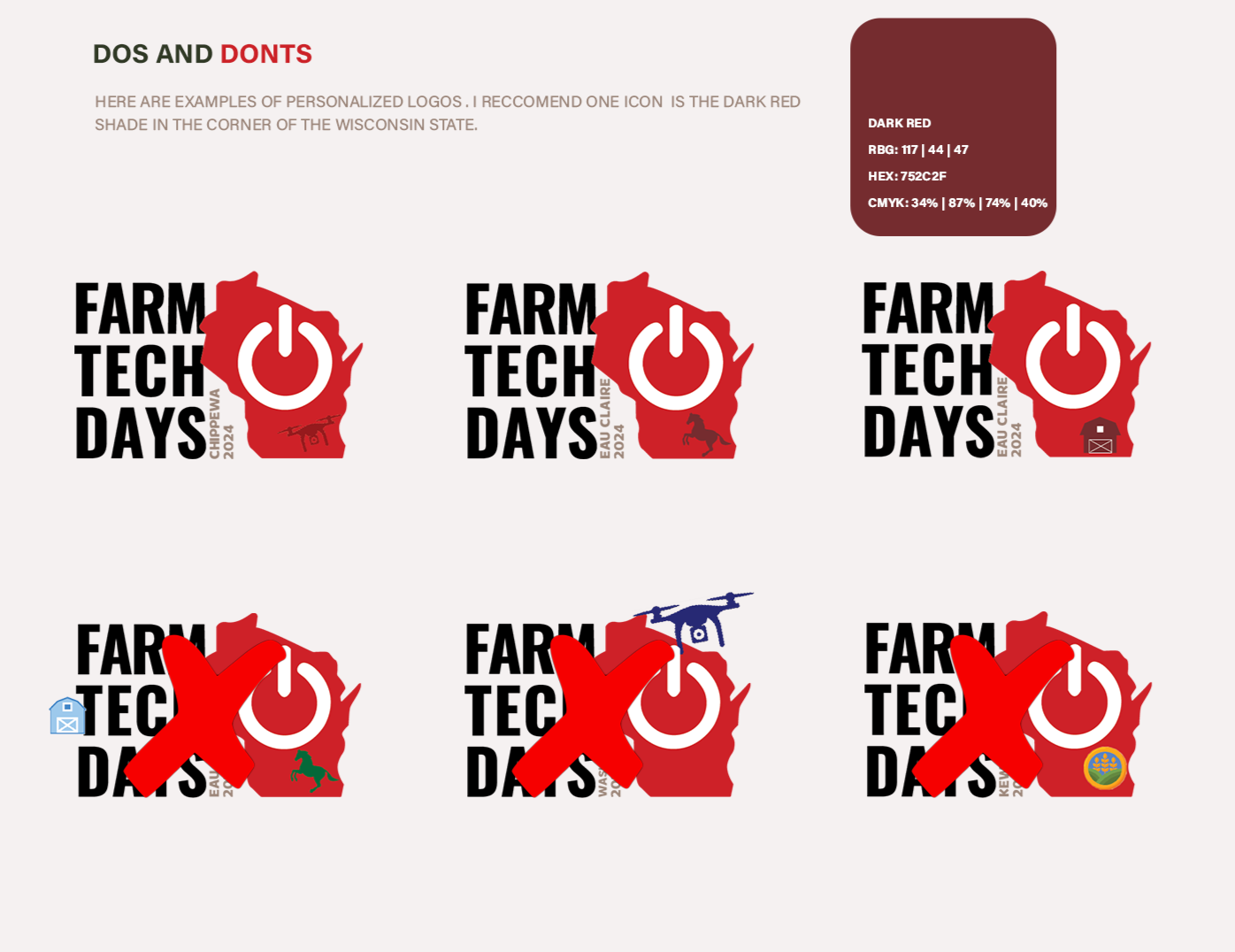
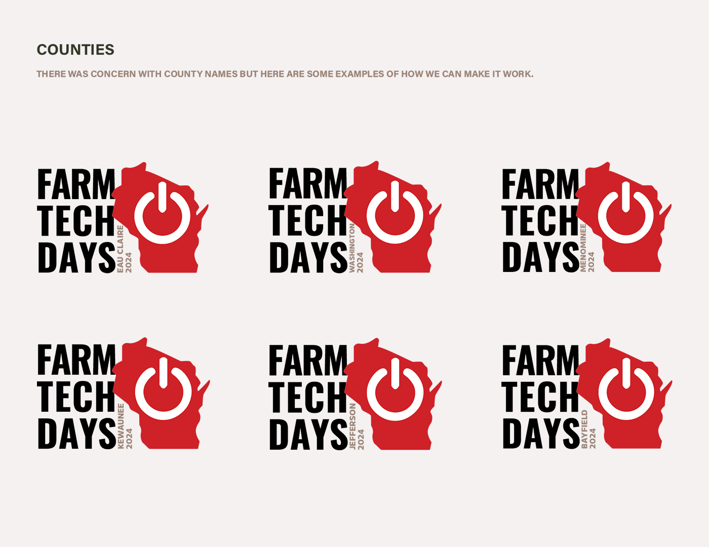
After the client selected their preferred direction, I refined the logo and built the final brand system for Wisconsin Farm Technology Days. The logo keeps their signature red but uses a flexible structure that can be customized for each location and year. I also created clear dos and don’ts for personalizing the logo, including simple rules for how county names should be placed and sized.
I then pulled everything together with typography, color choices, and mockups to show how the identity would look in use. This last phase taught me a lot about listening to feedback, iterating with purpose, and designing a brand system that can grow and stay consistent over time. Overall, this project strengthened my skills in brand strategy, design communication, and real-world client collaboration, giving me hands on experience with how a professional identity system evolves from concept to completion.
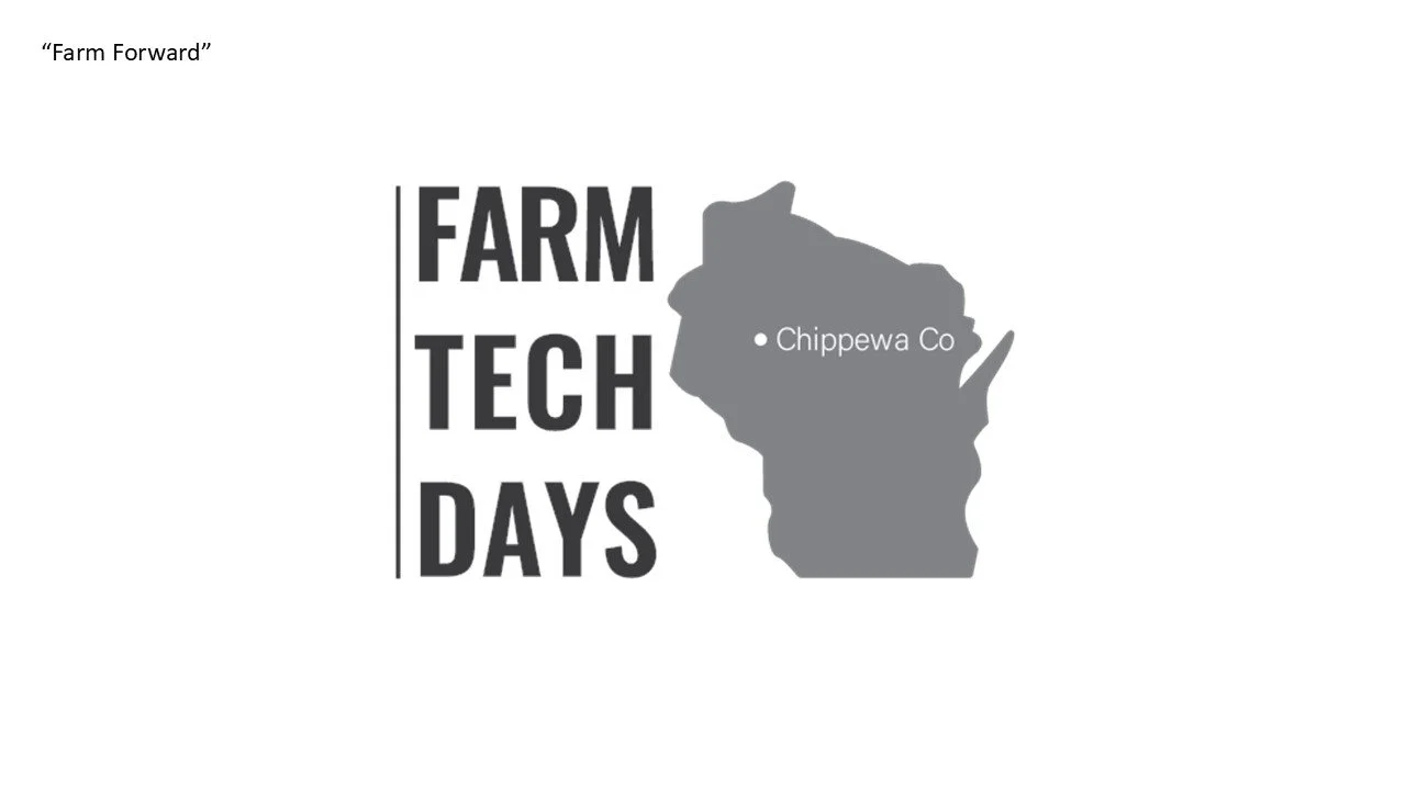
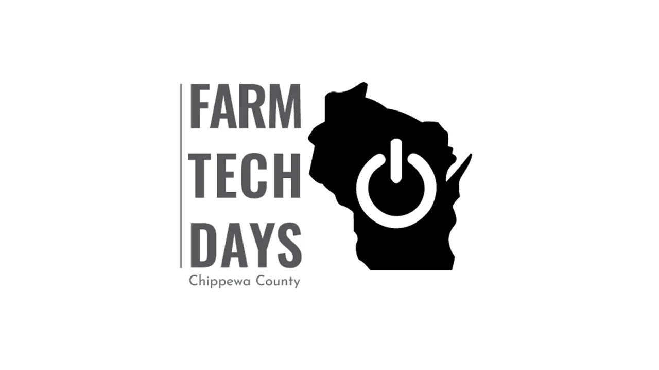
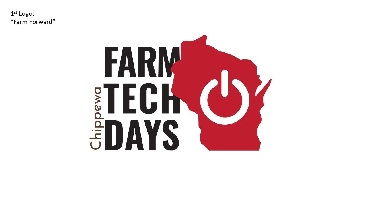
Final Logo Design
Wisconsin Farm Technology Days logo is inspired by the power symbol combined with the Wisconsin state which means Wisconsin Farm Technology Days focuses on pushing farm forward.