Mukae Matcha
Visual Identity & Website Design
Role
Brand Identity & UX/UI Design
Tools
Adobe Illustrator, Photoshop, & Figma
Goal
Express my design identity through branding and UX/UI
Background
This project started as an exploration of my identity as a designer. I created a brand called Mukae, along with a logo, matcha product designs, and a website. I explored how design can be functional, meaningful, and connected to personal experience.
Challenges
Creating the matcha labels and website content presented a challenge: I needed to balance aesthetics with usability. Every line of text, illustration, and layout choice had to support clarity while still expressing the brand’s personality.
What I Accomplished
I learned how to craft content that supports user understanding and how to design a cohesive experience across physical packaging and a digital interface. This project helped me think more critically about clarity, hierarchy, and the overall user journey
01 Define & Research
What is Mukae Matcha?
Mukae Matcha is a personal matcha brand I created, inspired by cultural heritage and meaningful memories of sharing matcha with family and friends. The name “Mukae” comes from my mother’s maiden name and means “welcome”. I chose this name because it is personal and meaningful to me.
I developed the full brand identity, logo, and website, with the theme of matcha at the center of the project to reflect warmth, tradition, and personal connection.
Competitor Analysis
From this research, I identified the essential pages my site needed:
Home
About
Shop
Learn
Contact
I found that the most popular matcha varieties on the market include:
Ceremonial
Uji
Okumidori
Strawberry Matcha
I included a matcha kit and ceramic cup as well, since many brands offer them to help beginners get started.
Pricing was another important consideration. After comparing industry standards, I positioned Mukae’s matcha to be more affordable, with products ranging from $15–$65. Each product page explains what makes the blend special and helps customers understand the variety they’re choosing.
The Learn page became a key component of the site. It guides new matcha drinkers through the basics, what tools they need, and how Mukae’s blends make the best cup of tea. The “What You Need” section has a link to the matcha kit, providing a smooth and supportive path for beginners.
I also incorporated features common to strong e-commerce experiences, such as one-time purchase or subscription options and the ability to create an account for returning customers. These additions help build brand loyalty and offer users flexibility in how they shop.
02 Brand Identity
Project Brief & Analysis
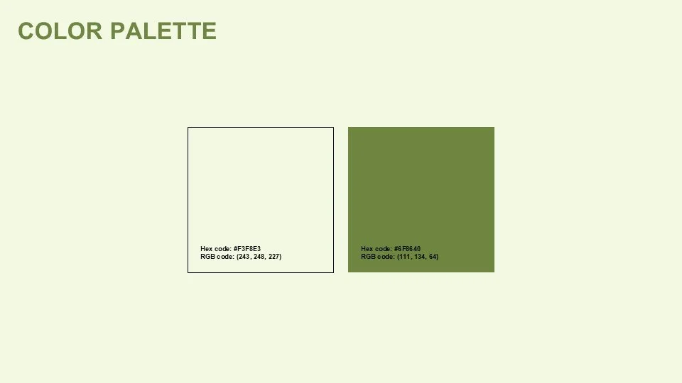
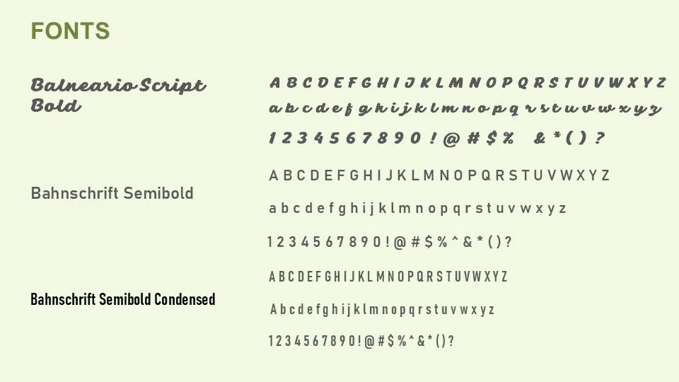
My next step was defining the new brand identity. This included selecting a soft/calm color palette and choosing some flowy and readable typography.
Green was chosen for the color palette because it reflects matcha’s natural tones and brings a sense of calm, balance, and grounding. While still vibrant, it offers a soothing presence that supports the brand’s focus on relaxation, wellness, and mindful enjoyment.
A cursive font was selected for the logo to bring in a handwritten, personal touch. Since both my mom and I enjoy writing in cursive, this choice reinforces the brand’s emotional connection and gives the identity a softer, more expressive character. The secondary typeface introduces a subtle charm that echoes the playful spirit of the logo.
I also included the traditional Okinawan pattern, called “Minsa”. It is a sequence of four and five rectangles. This textile can be seen throughout Okinawa and on my home island of Ishigaki. It represents eternal love. Through this project, I explored how design can be both functional and meaningful, bridging personal experiences with interactive storytelling.
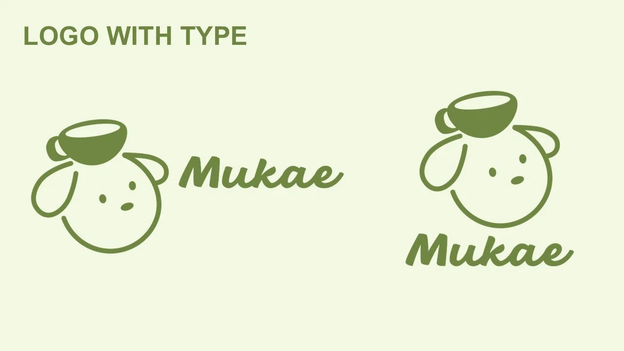
Logo Design

The logo depicts a friendly dog carrying a cup of matcha, capturing the warmth and playful spirit of the brand.

03 Packaging & Label Design
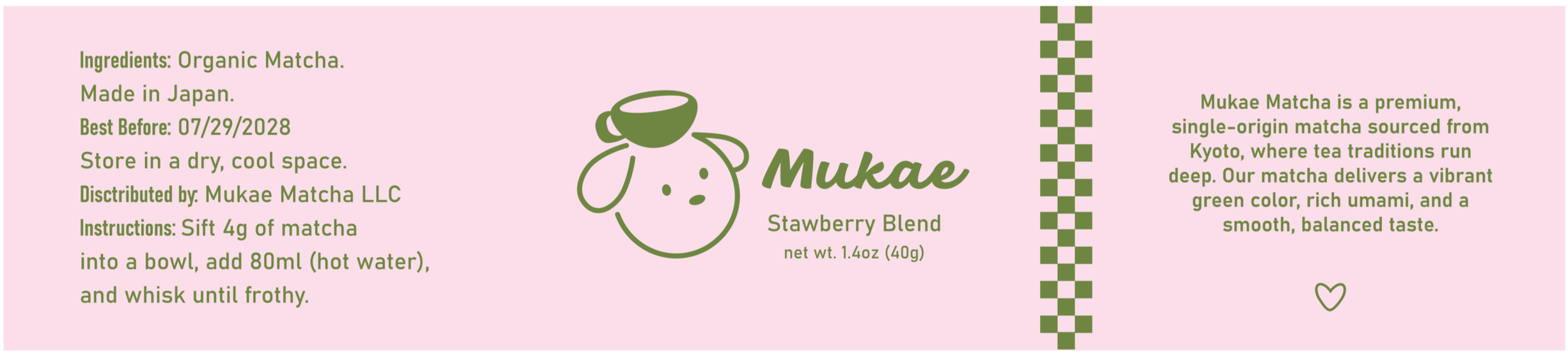
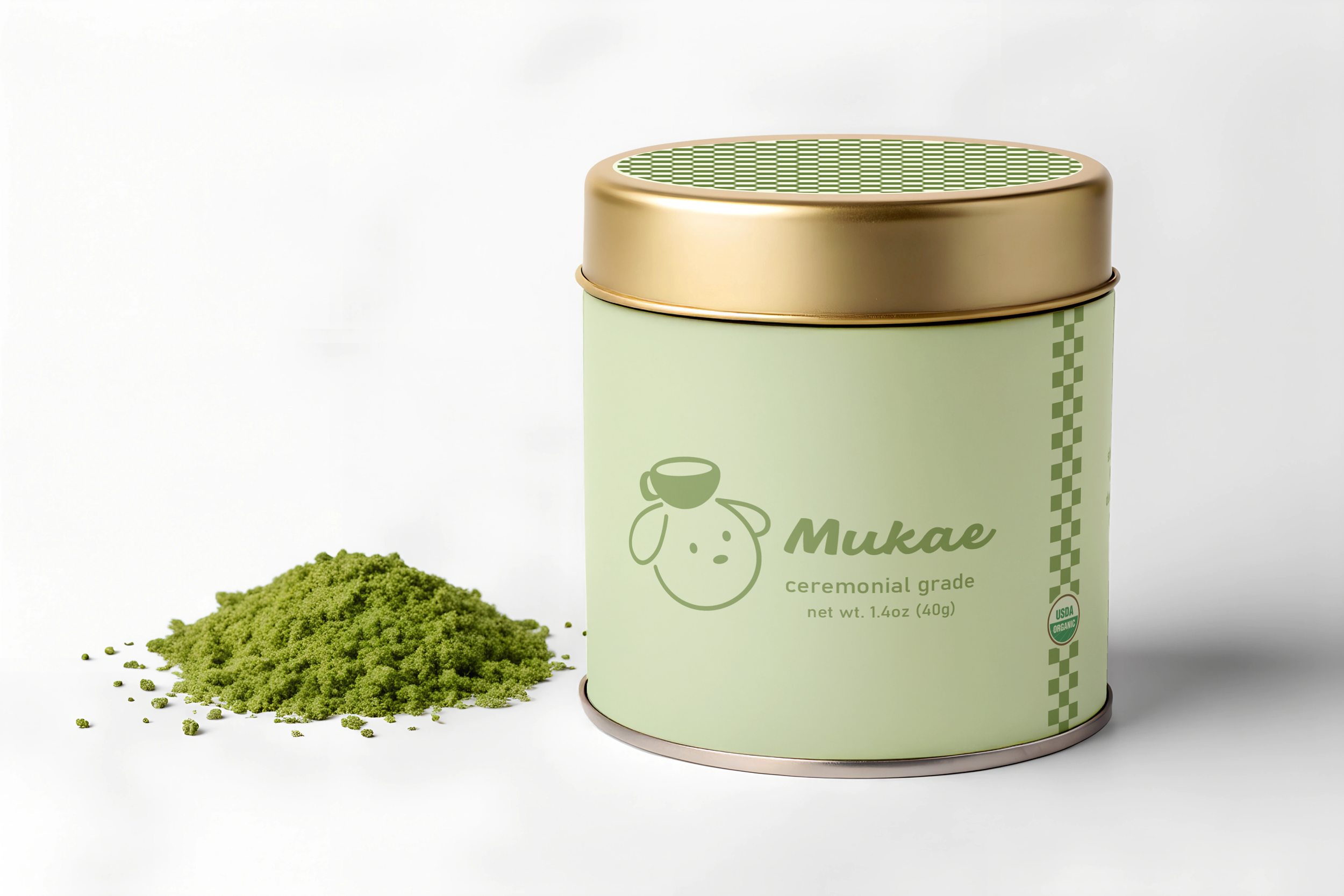
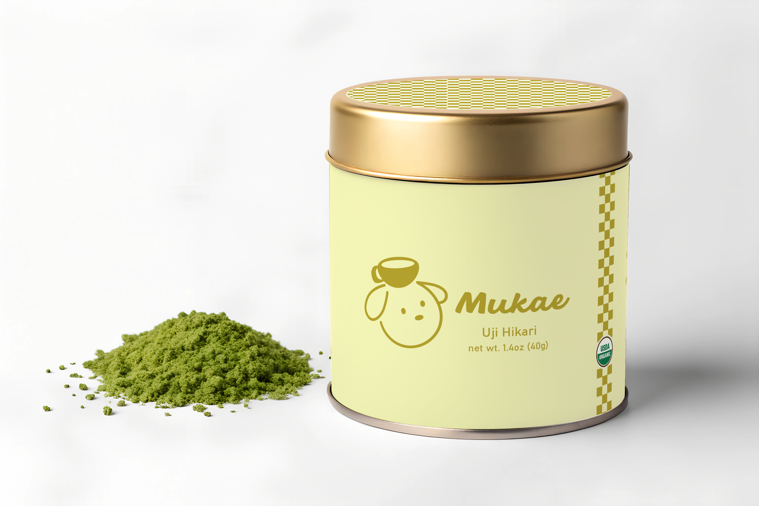
Label Design
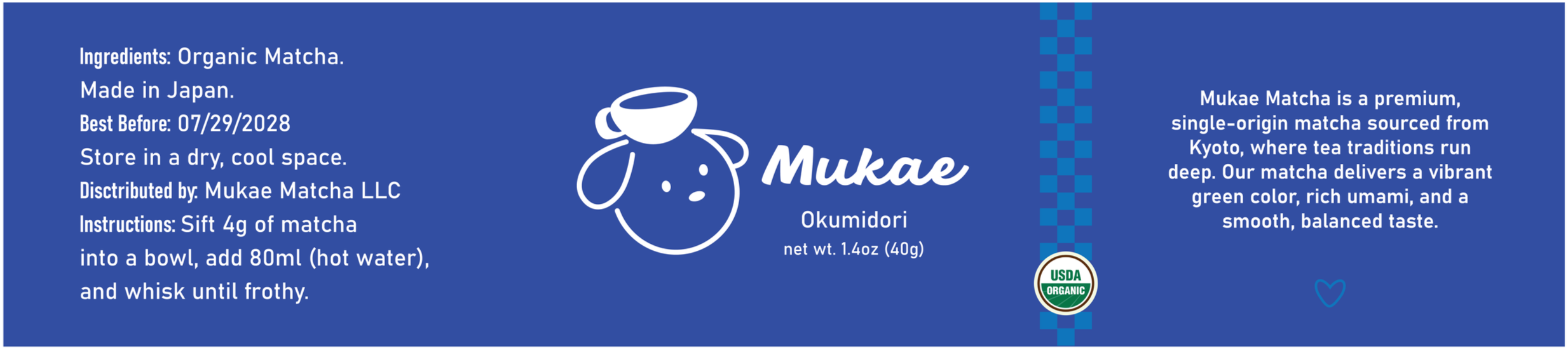
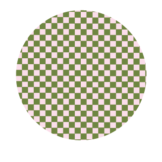
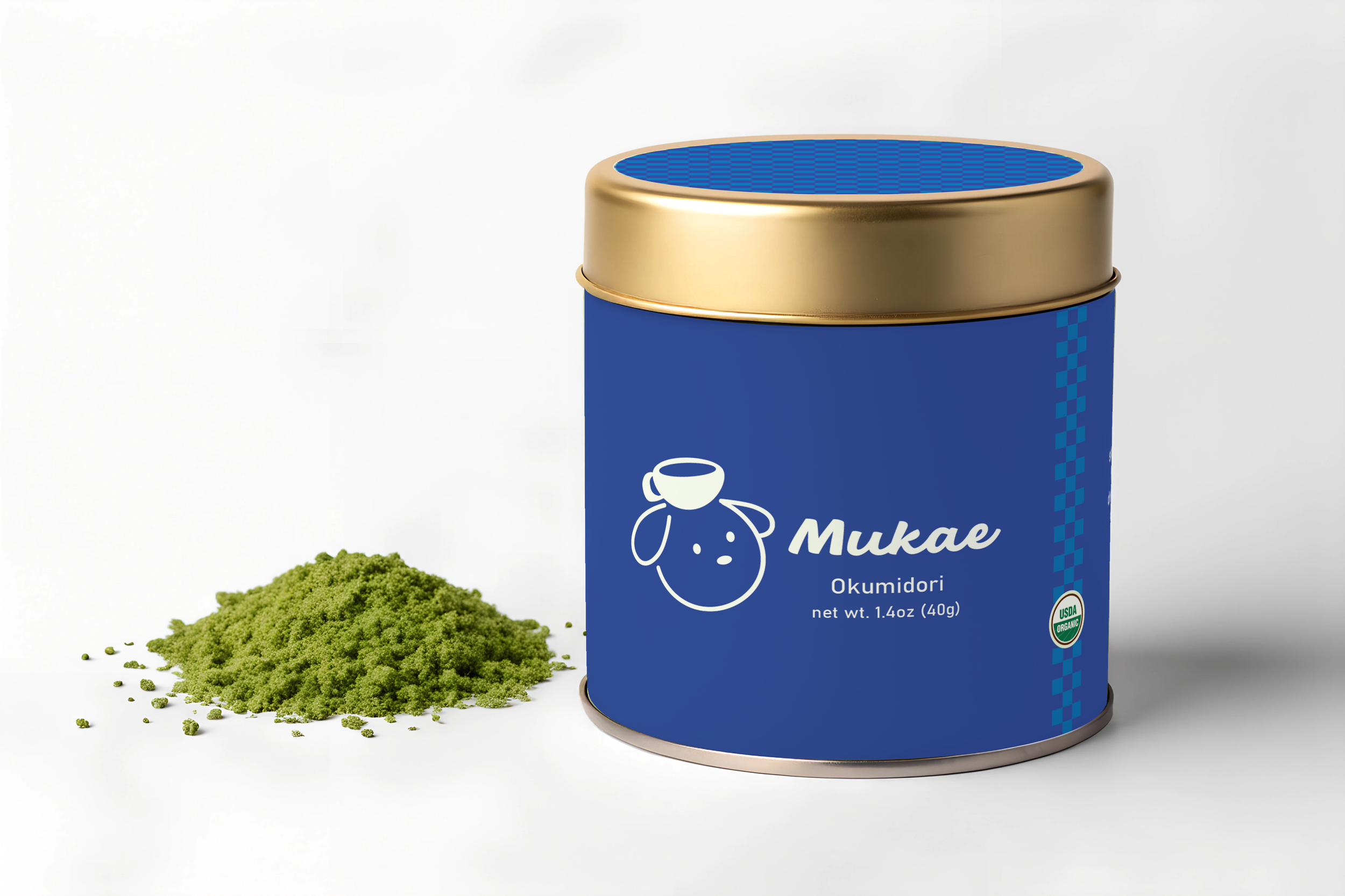
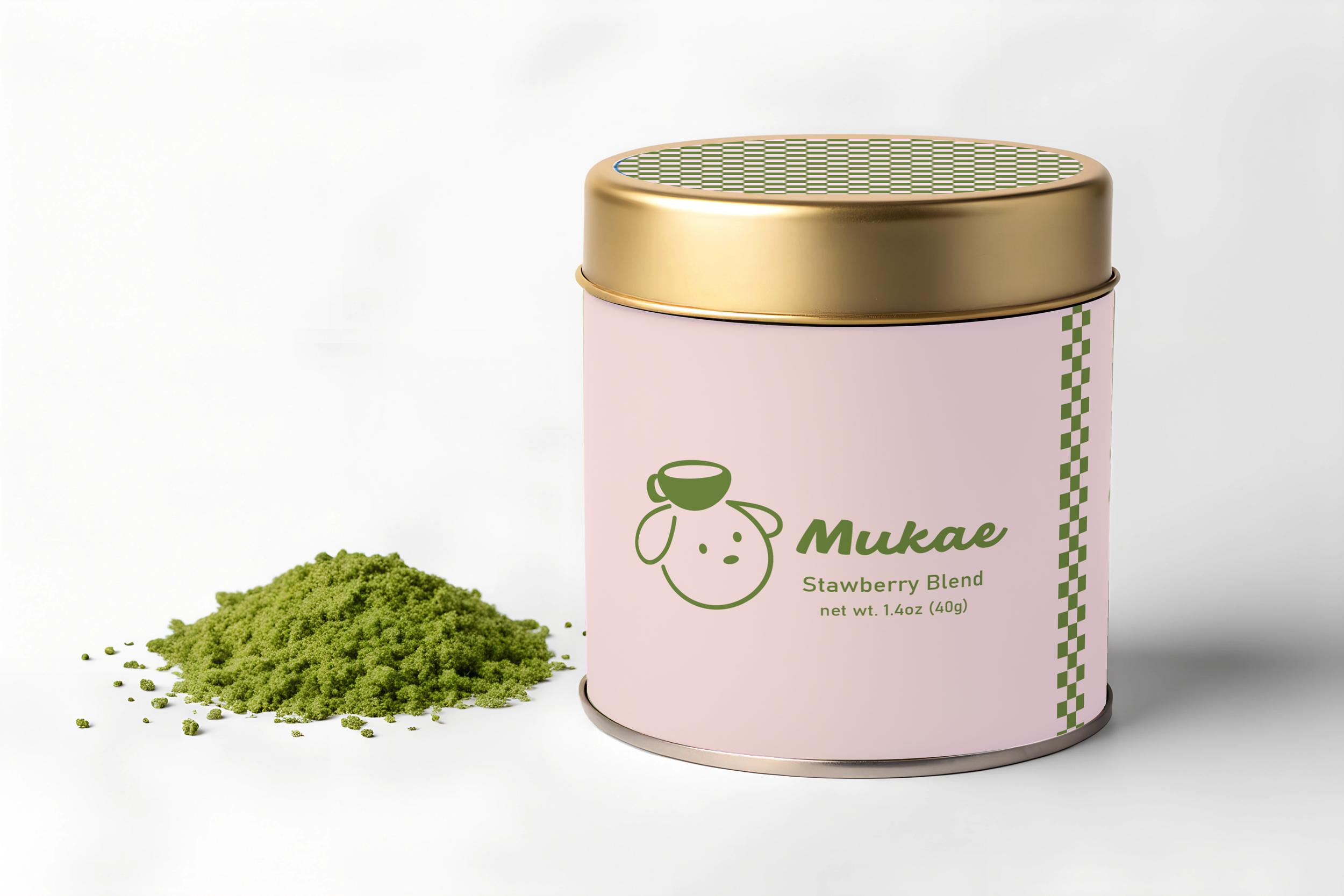
Each label includes essential product information: an organic sticker (on three flavors), ingredients, a best-before date, distributor details, and simple preparation instructions. The circle graphics are the lid stickers designed for the tops of the matcha cans, helping customers quickly recognize each flavor.
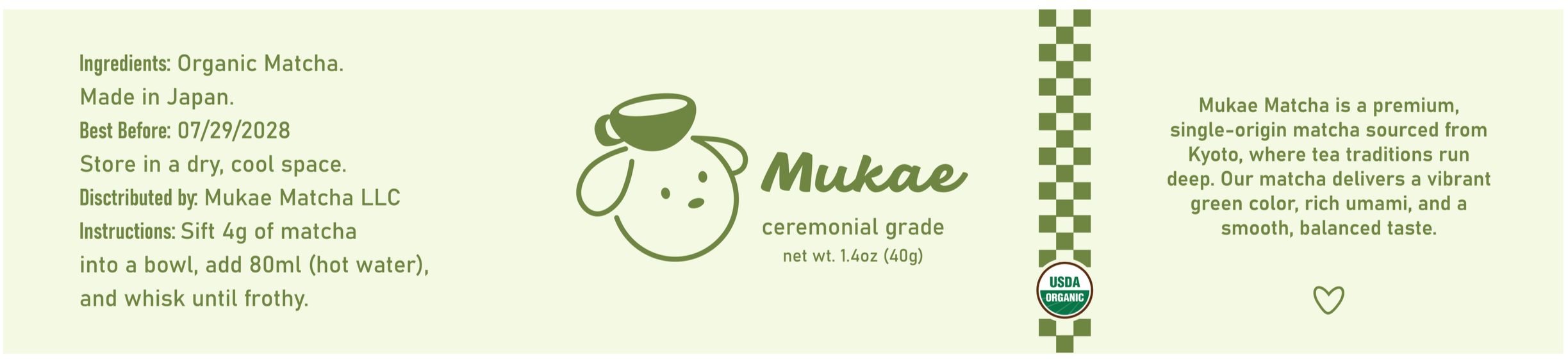
Ceremonial Matcha: Deep greens represent tradition, richness, and the authentic roots of ceremonial matcha.
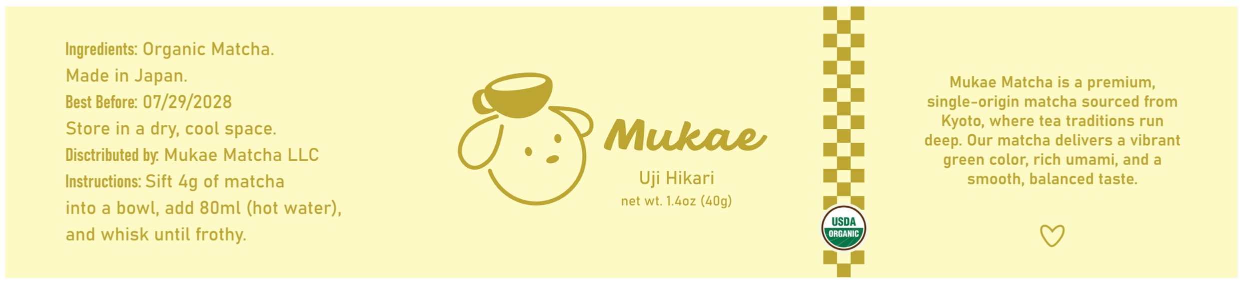
Uji Matcha: Warm yellow and mustard tones reflect the bright, uplifting flavor Uji matcha is known for.
Okumidori: Blue and white convey clarity, smoothness, and the refined nature of this single-cultivar blend.
Strawberry Matcha: Pink and green capture the fun, fruity sweetness of strawberry.


04 Website Design
Walk through the Final Website
Final Website Walk Through
Get a Closer Look!
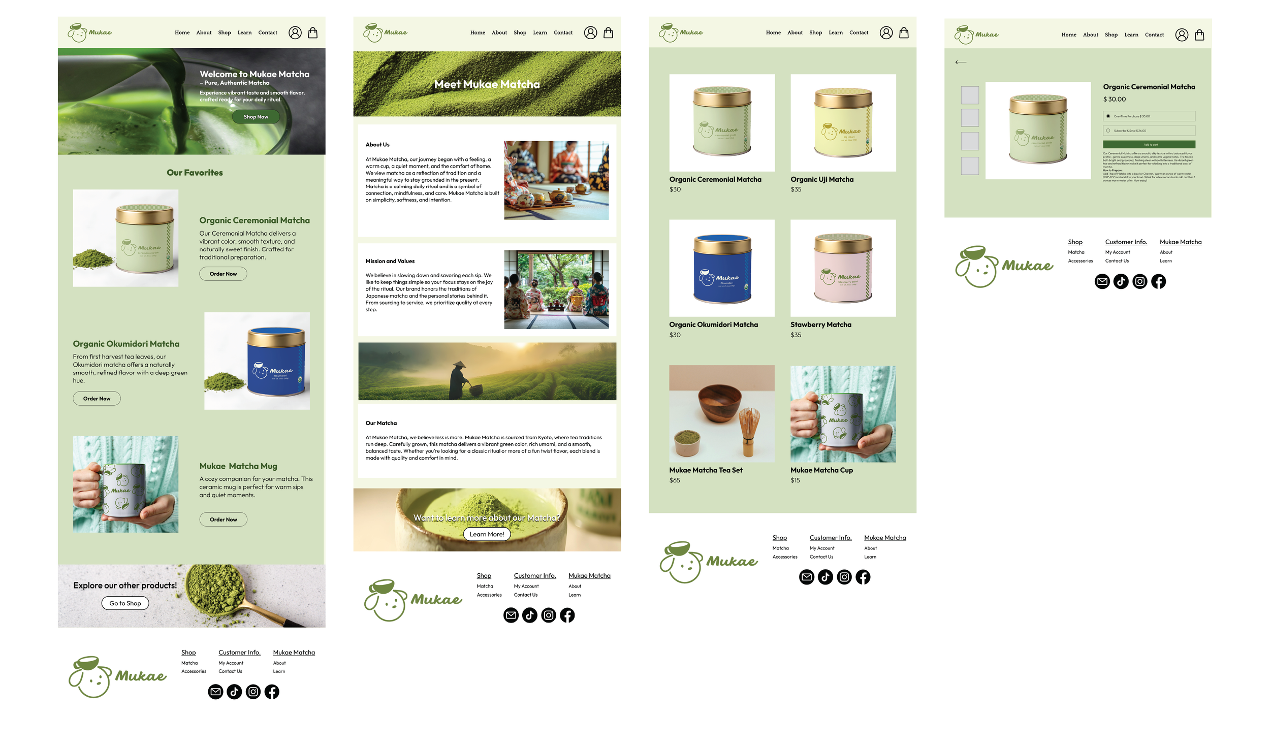
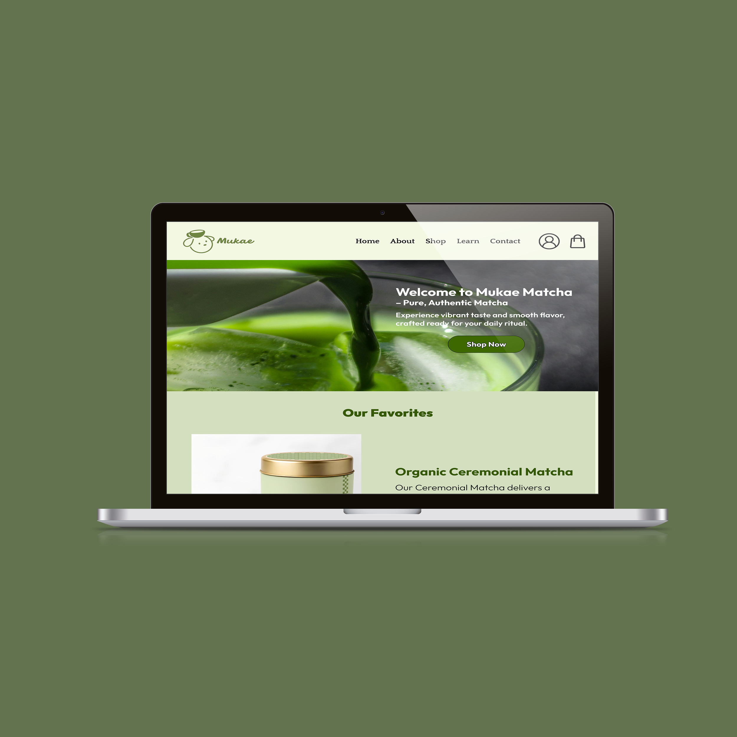
Homepage
Designed to feel clean and easy to navigate. Highlights the core matcha products right away while using space, soft colors, and a minimal layout to create a welcoming first impression.
About
It introduces the brand’s personal roots and explains its mission/values. Tells a little about our matcha and links to learn more about it.
Shop
The shop features a clean grid layout that makes it easy to browse all matcha products at a glance.
Product
Each product page showcases its matcha flavor and includes flavor profiles and simple product photography. Pricing, purchase options (one-time or subscription), and call-to-action buttons create a smooth shopping experience.
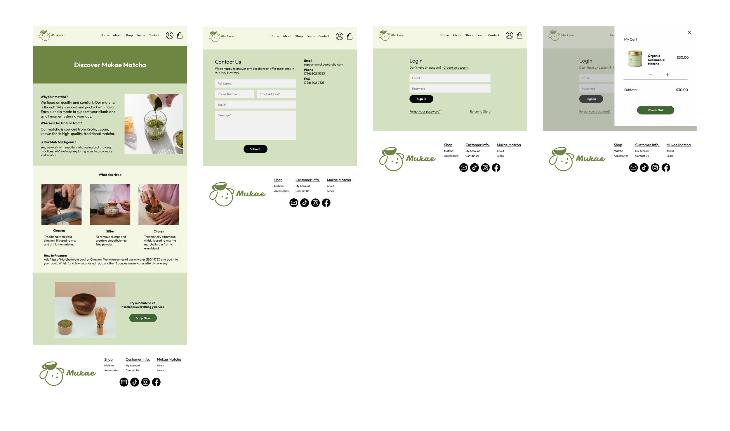
Learn
The Learn page explains why our matcha stands out, where it’s sourced, and that it’s organic. It also guides users on what tools they need, how to prepare matcha, and links directly to our matcha kit.
Contact
The Contact page is kept minimal and easy to use, offering a straightforward way for customers to reach out.
Profile
The Profile page was designed for ease and familiarity. Its gives the choice to either create an account or login to one already made.
Shopping Bag
The Shopping Bag page shows products, prices, and actions in a clean, spacious layout. A clear call-to-action guides users smoothly into checkout while keeping the shopping experience stress-free.
05 Showcase
Bringing Mukae Matcha to Life
For the final phase of the project, I created an in-class showcase that brought the Mukae Matcha brand to life. I set up a display featuring a laptop that played a looping walkthrough video of the website so classmates could experience the full user flow on their own.
To make the experience more engaging and tactile, I also produced real physical cans with custom sticker labels using the Mukae Matcha branding. Visitors were able to pick up the cans, interact with the packaging, and get a sense of how the brand would translate into a real product line.
This setup helped communicate the brand’s visual identity, personality, and usability in a hands-on way, completing the project with a polished, immersive presentation.
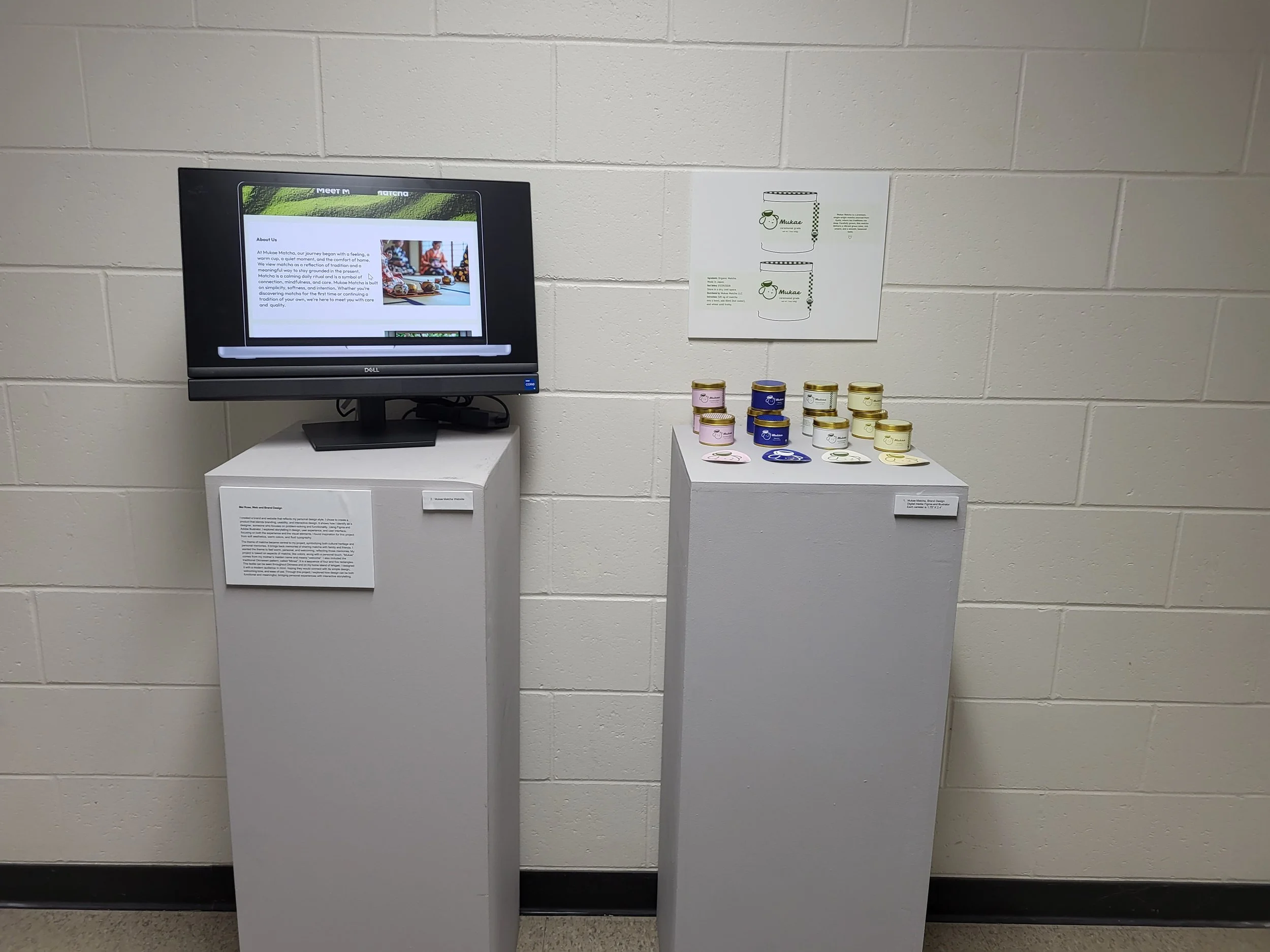
Showcase Table Setup
A look at my in-class display, featuring the looping website walkthrough and branded product prototypes
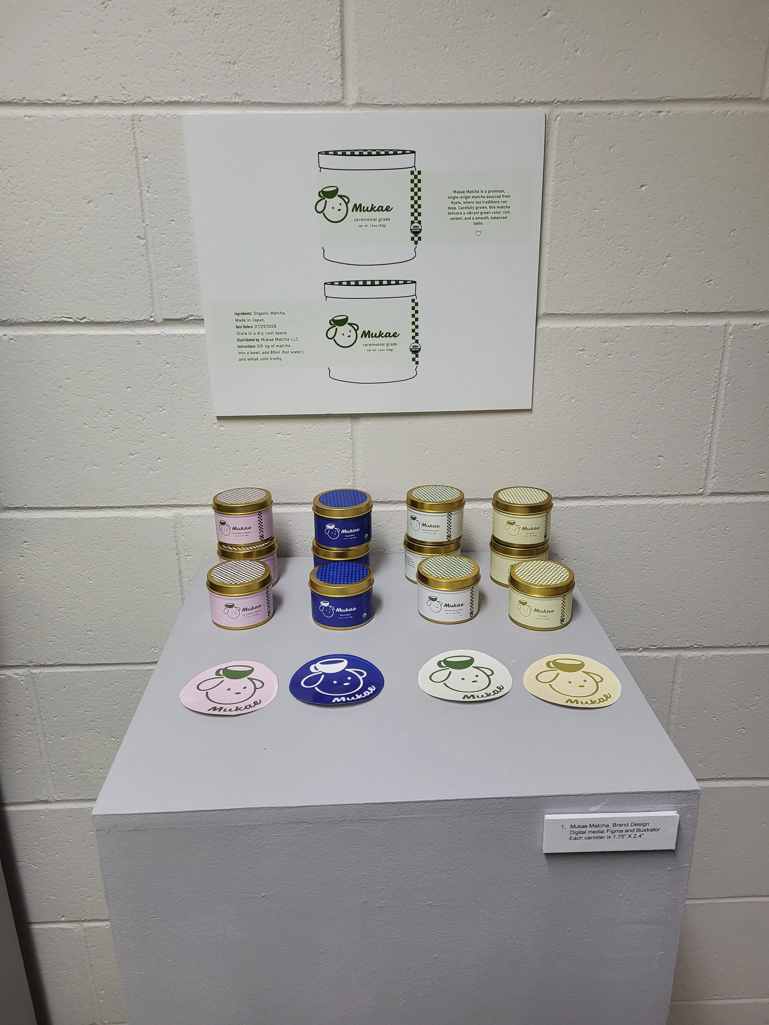
Cans Display
Mukae Matcha can prototypes displayed at the showcase. Each one features custom sticker labels inspired by the brand (note: photo shows remaining ones).