Overview
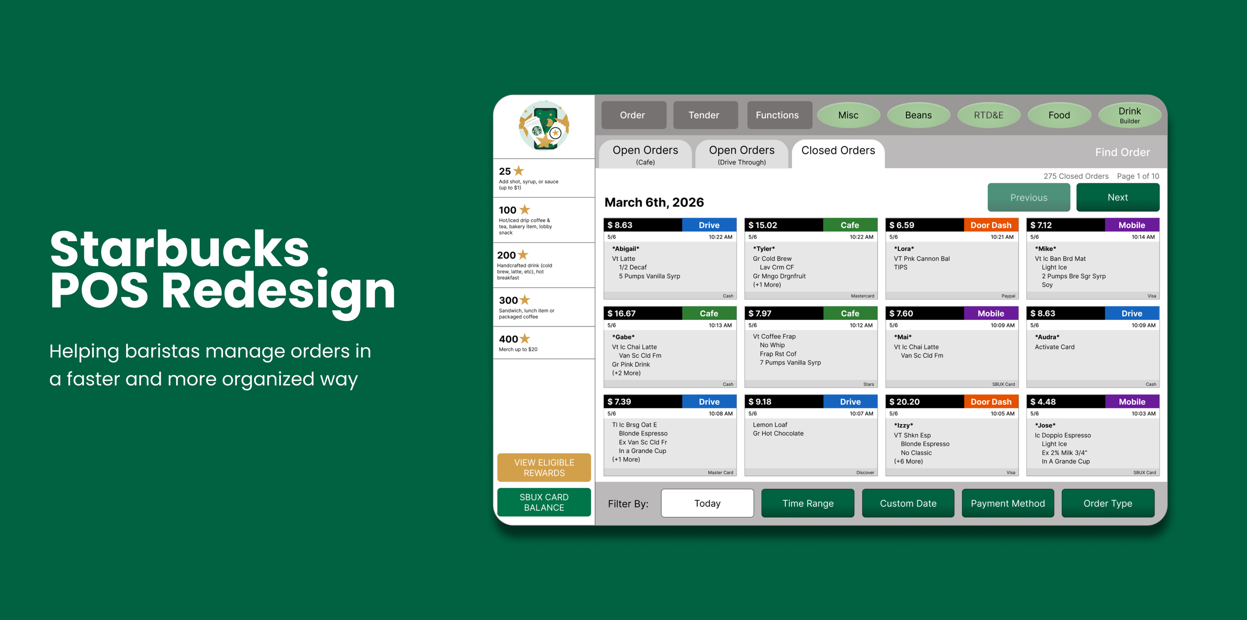
Solo UX project redesigning the Starbucks POS receipt system to simplify finding and reprinting past transactions
Timeline
February - March 2026 (6 weeks)
My Role
UX Designer
PROBLEM
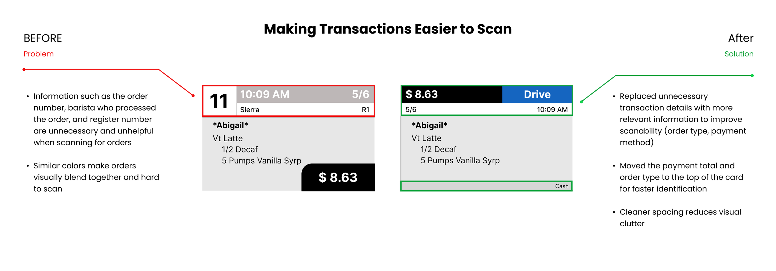
Starbucks baristas experience difficulty locating receipts quickly and efficiently.
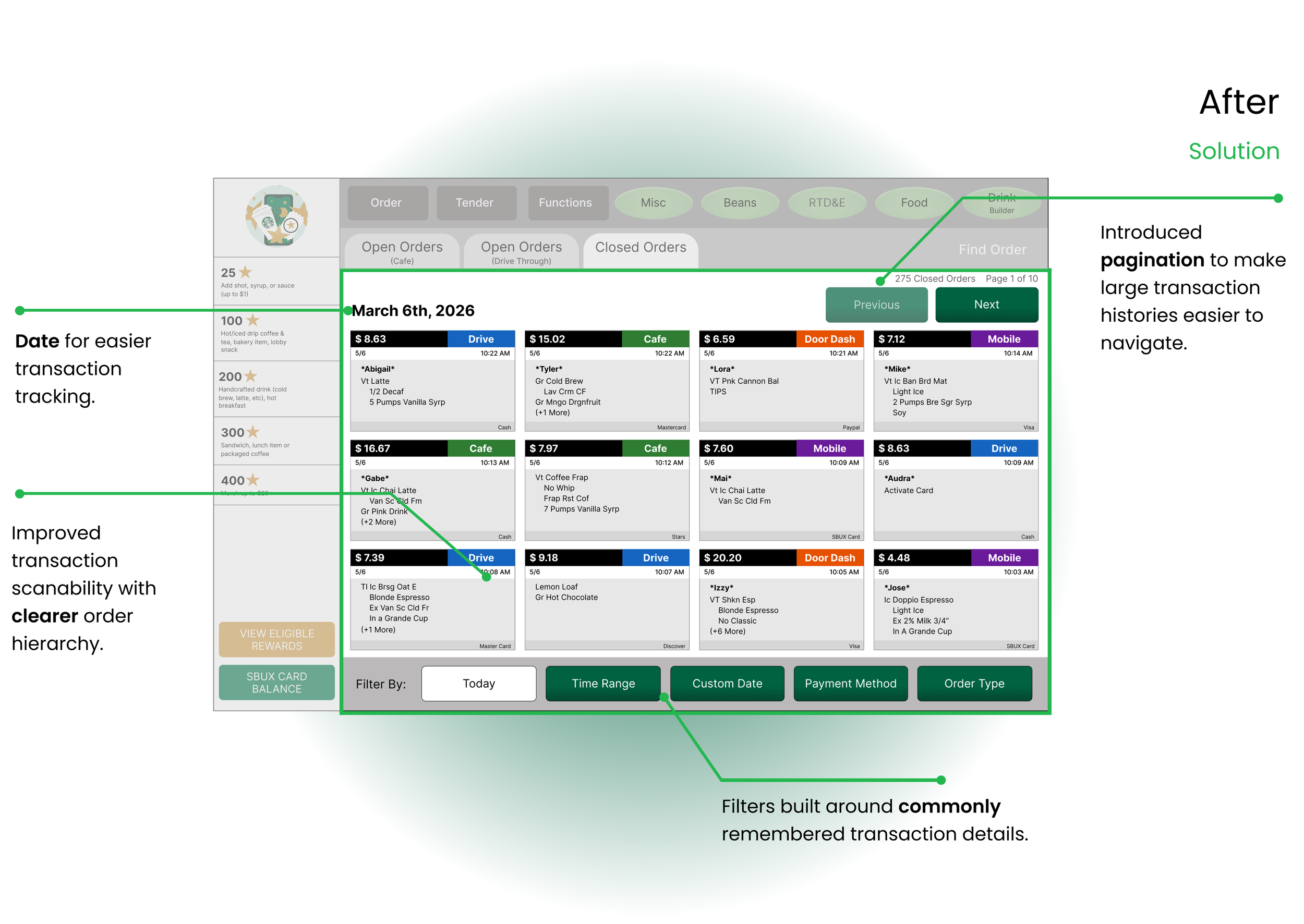
Starbucks employees need to locate and reprint receipts for a variety of reasons, such as returns, expense tracking, or when a customer simply forgot to ask for a receipt. During busy store hours, employees need to resolve these requests quickly without disrupting the checkout process.
SOLUTION
Create a receipt lookup process that helps baristas find transactions more easily and quickly.
RESEARCH
Any friction that slows customers down gets in the way of a positive experience.
Research from McorpCX shows that friction occurs whenever customers encounter resistance while trying to complete a task. In fast-paced environments, difficult receipt access can negatively impact both employee efficiency and customer experience.
“Customers want transactions to be handled without hiccups or surprises.”
USER INTERVIEWS
Employees struggled to quickly locate receipts within large transaction histories.
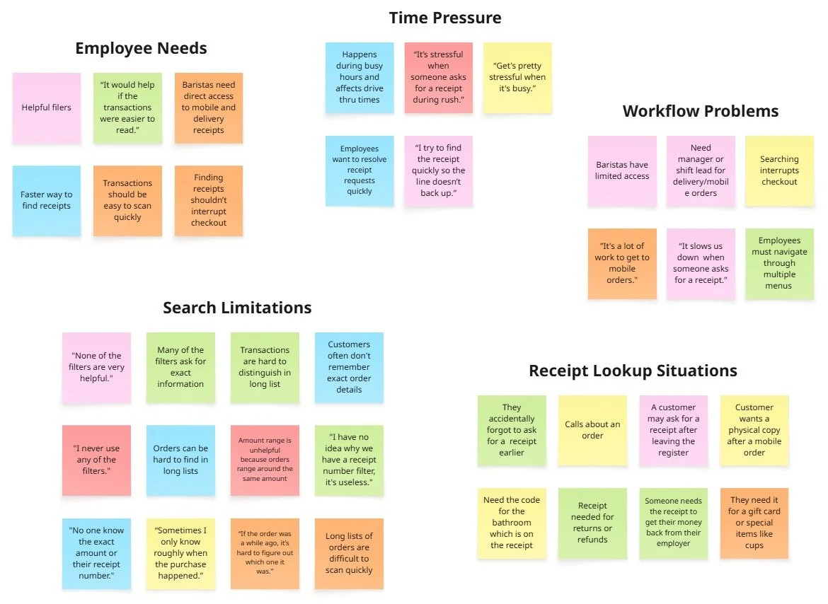
Although research showed that reducing friction creates a more positive customer experience, I wanted to better understand how Starbucks partners interacted with the current transaction lookup system. I conducted 6 interviews with employees to identify common frustrations and opportunities for improvement within the workflow. I asked the questions below to uncover pain points and patterns, then organized the findings through affinity mapping.
RESEARCH QUESTIONS:
How helpful are the current filters when locating receipts?
What information do customers usually remember when requesting a receipt?
What parts of the current receipt lookup process feel the most frustrating?
How does searching for transactions impact you during busy periods?
What changes would make finding receipts faster and easier for partners?
THE MAIN INSIGHT
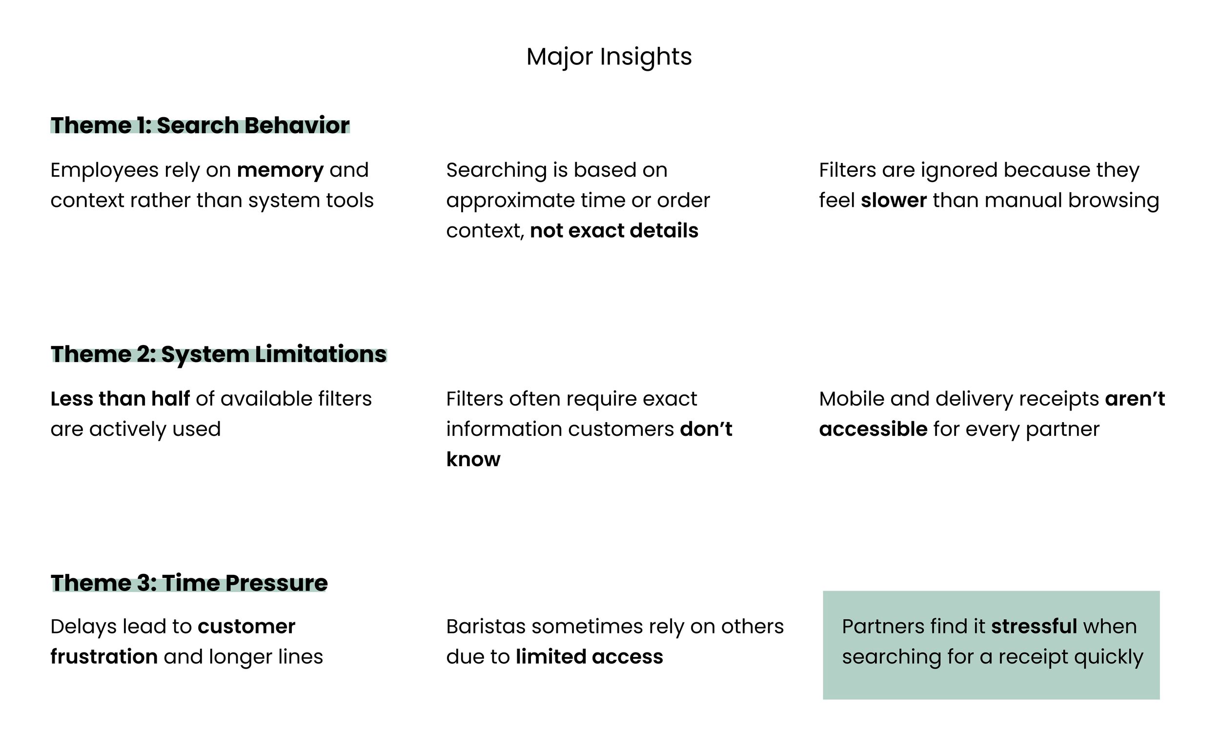
Partners find it stressful when searching for a receipt quickly
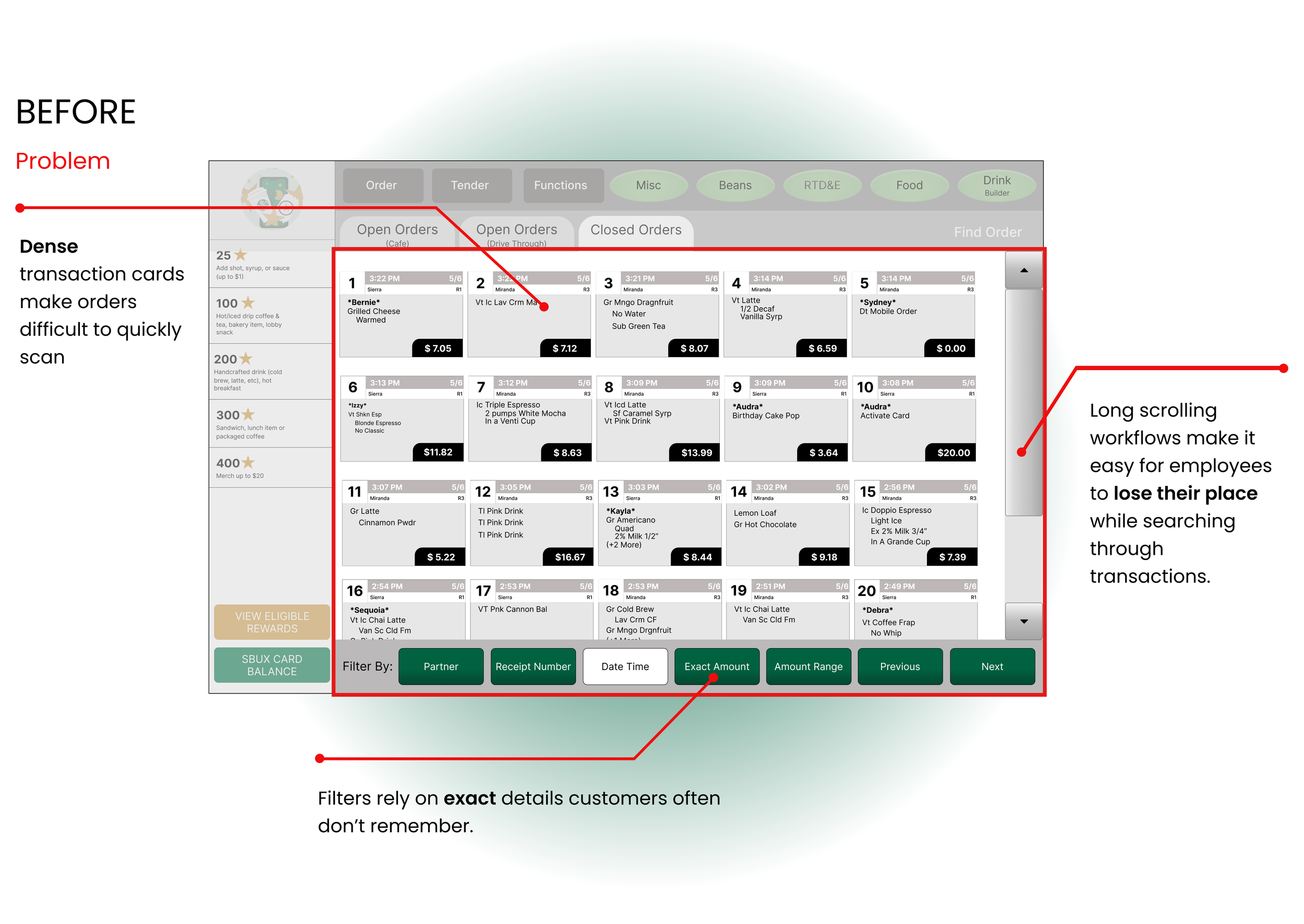
Based on trends in my affinity map, I noticed that many partners found the current receipt lookup experience frustrating. Partners rely on memory and manual browsing because the filters are unhelpful, while the transaction cards make it difficult to quickly scan orders or keep track of their place. Baristas, Managers, and Shift Leaders also expressed frustration with limited access to mobile and delivery transactions (Uber Eats and DoorDash).
PERSONA
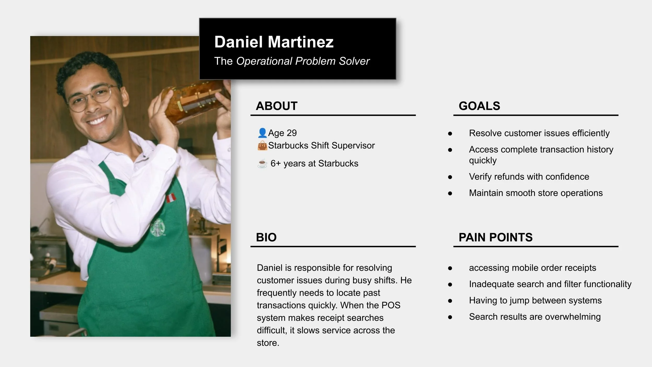
To better understand the target users, I created persona to better understand what users think, feel, and need throughout the experience.
TESTING + IMPROVEMENTS
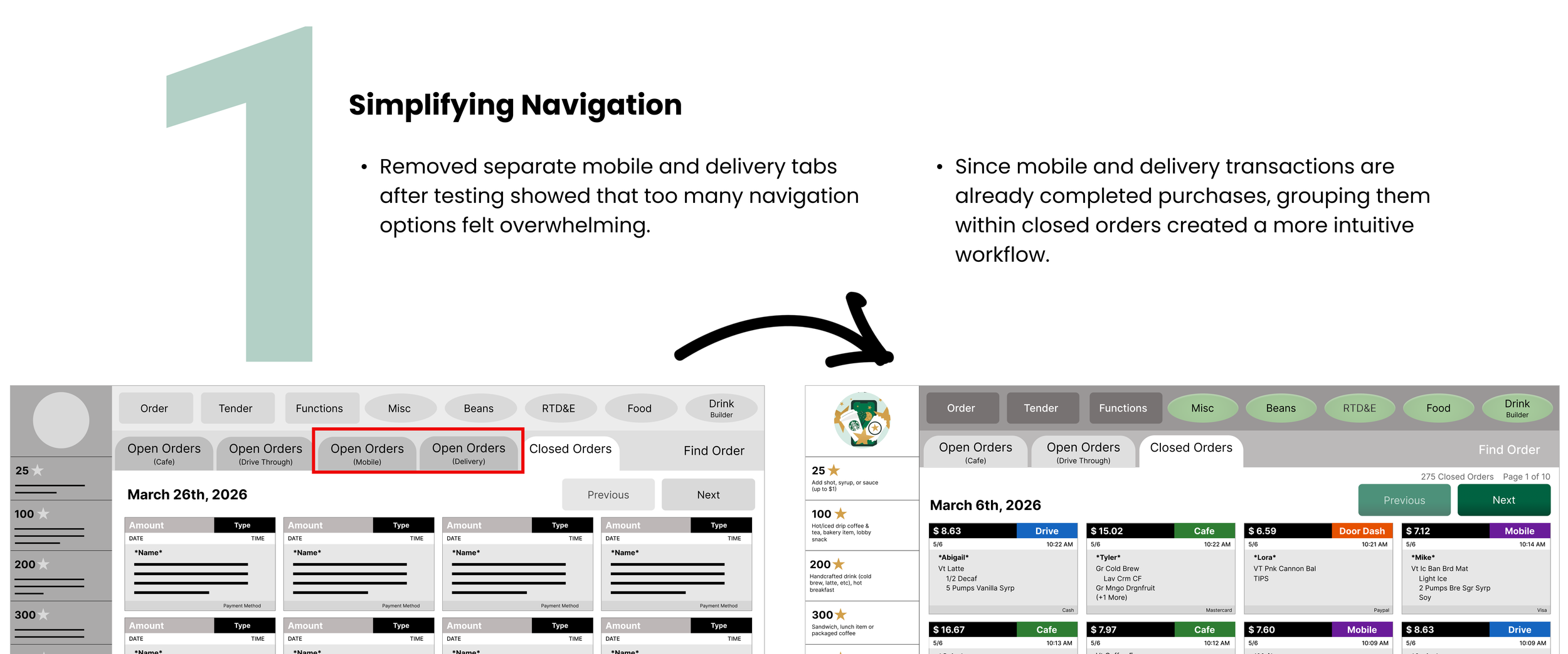
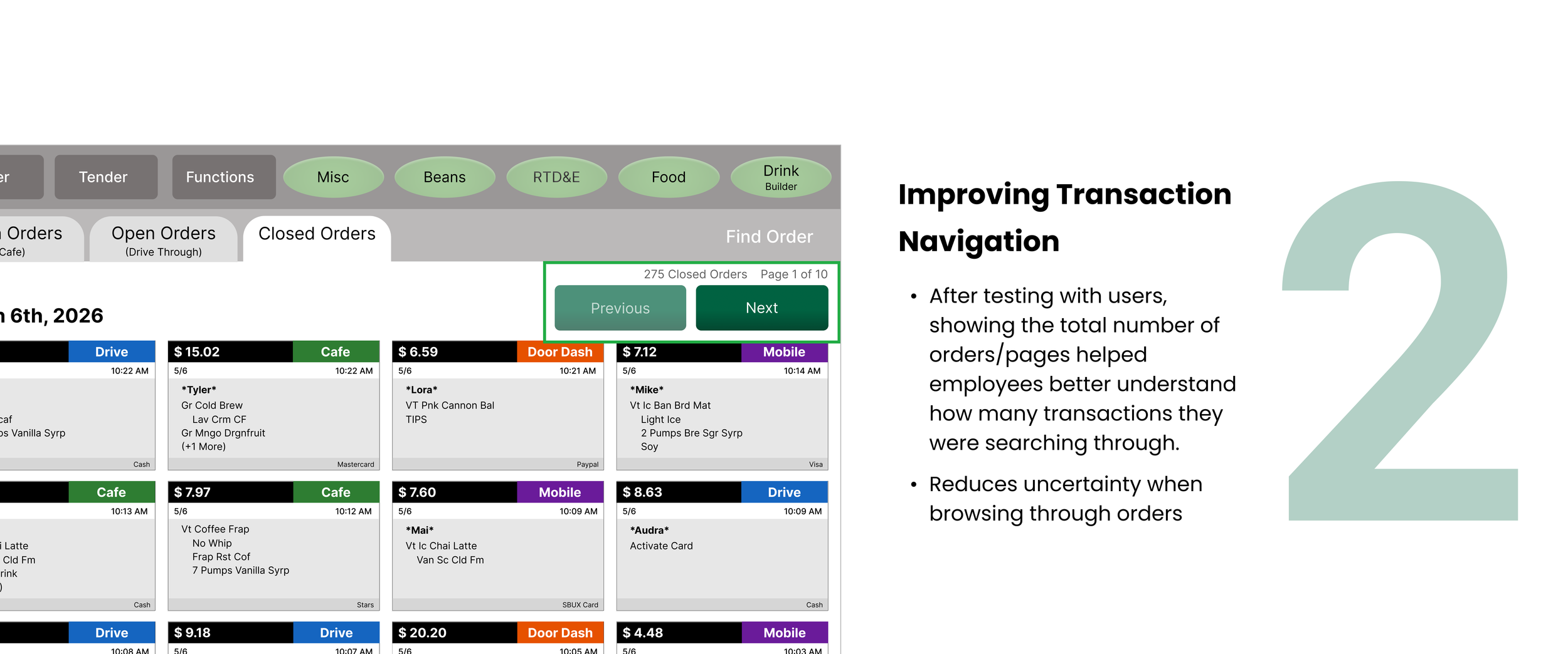
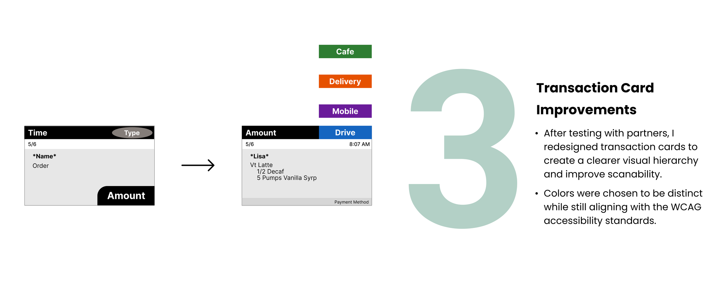
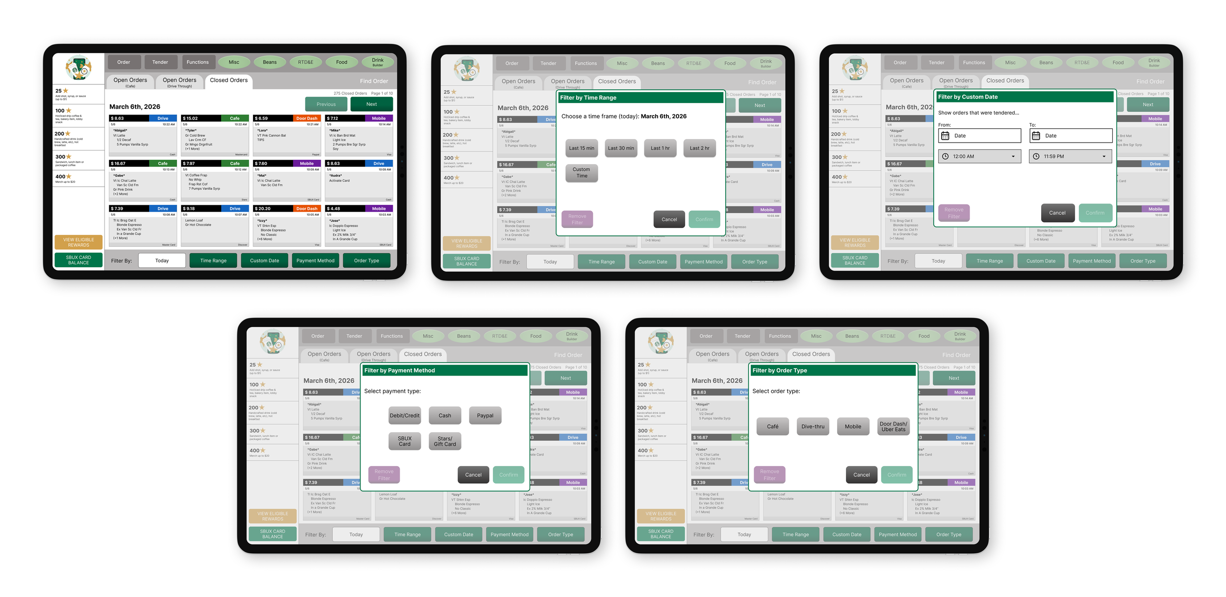
3 Major Improvements in my Design
Based on various feedback from my user testing, I continually iterated my design with 3 major improvements:
Final Flow
The Final Product
The Style Guide
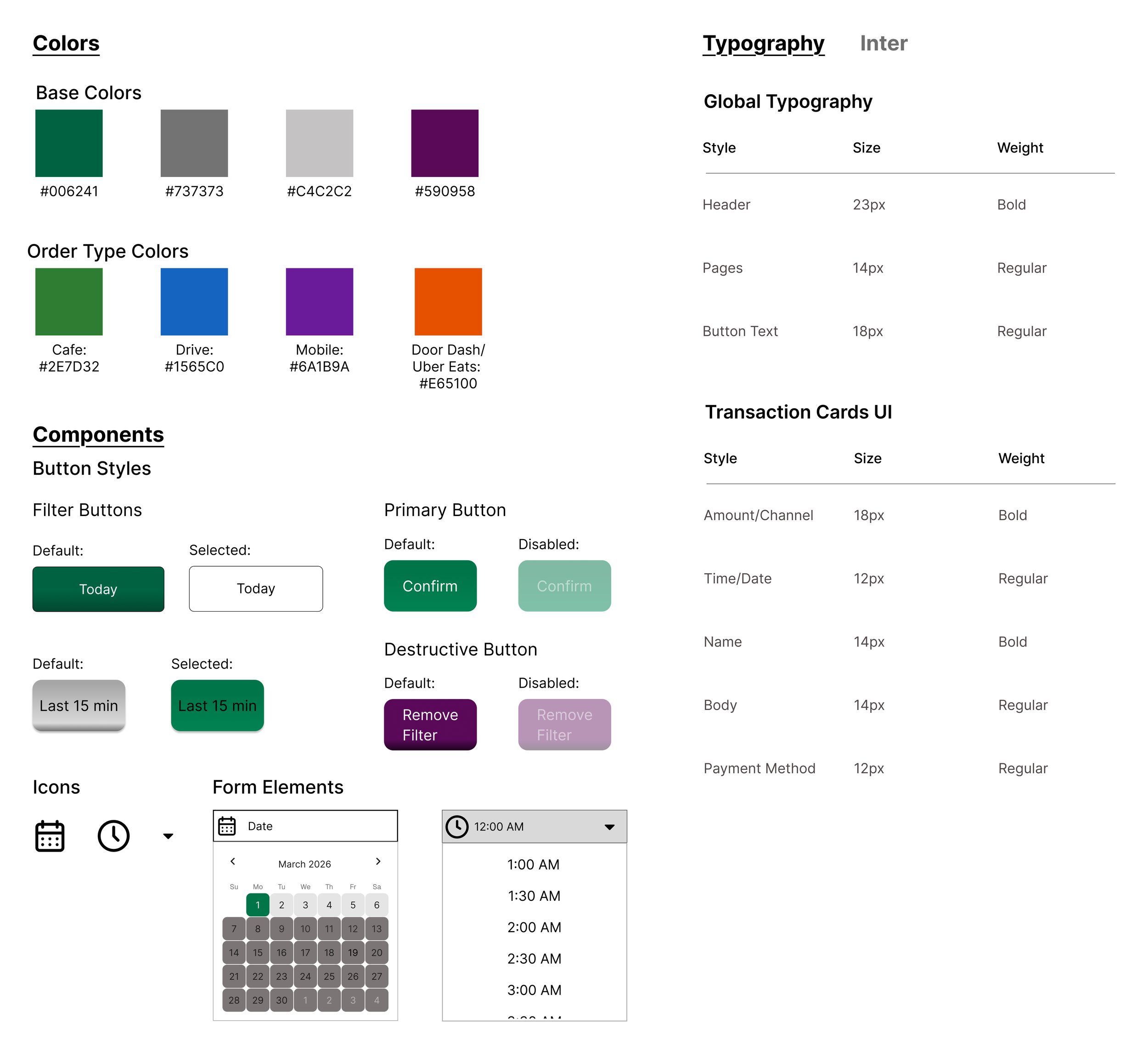
When designing, I kept many elements consistent with the existing system, including colors, typography, spacing, and button styles. Maintaining familiarity was important so partners could continue relying on their existing habits and memory of the workflow (I was not able to find an existing style guide from Starbucks).
CONCLUSION
Reflection & Takeaways
This project was so fun! I learned a lot about user testing and had so many surprises during it. I also got to redesign a real system and understand how it works. Here are a few things I learned along the way:
User testing reveals unexpected problems
Many of my original ideas changed after observing how employees actually interacted with the system. Users frequently surprised me with feedback, frustrations, and workflow behaviors that I would not have considered on my own. Through testing, I learned that successful UX design is about understanding how people naturally think, navigate, and complete tasks.
Users often know more than they initially communicate
During user testing, I learned not to shy away from follow up questions, as it is an important part of gaining deeper insight. Some of the most valuable feedback came from asking users to further explain how they felt, why they made certain decisions, and what frustrations they experienced throughout the workflow.
Colors need to be accessible
When choosing colors for the transaction cards, I initially overlooked how accessibility impacts readability and usability. After researching WCAG accessibility guidelines, I selected colors that maintain readable contrast with white text.
If you'd like to connect, collaborate, or chat about design, feel free to reach out at rosem9298@outlook.com
Thanks for reading!✨
Explore my other projects: