Timeline
6 weeks (2025)
My Role
UX/UI Designer, Brand Designer, Front-End Developer
Tools
Figma, HTML5, CSS, Illustrator
CONTEXT
About the Project
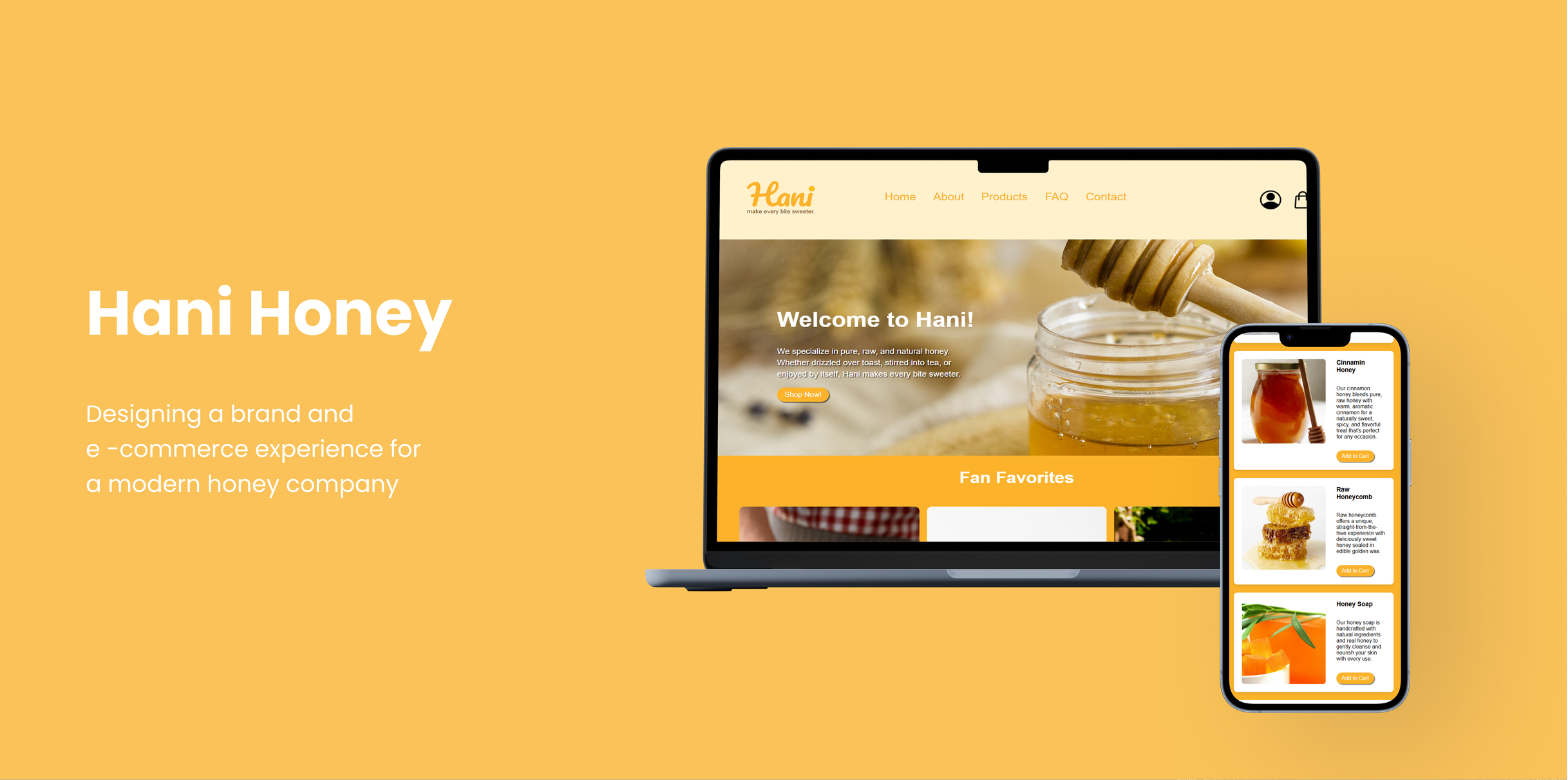
Hani Honey is a fictional honey brand I created in my Web Page Design Course. I focused on creating a warm, playful, and modern online shopping experience. The project explored how branding and UX/UI design can work together to build a cohesive e-commerce experience.
PROBLEM
Hani needed a cohesive online shopping experience that matched its playful brand identity.
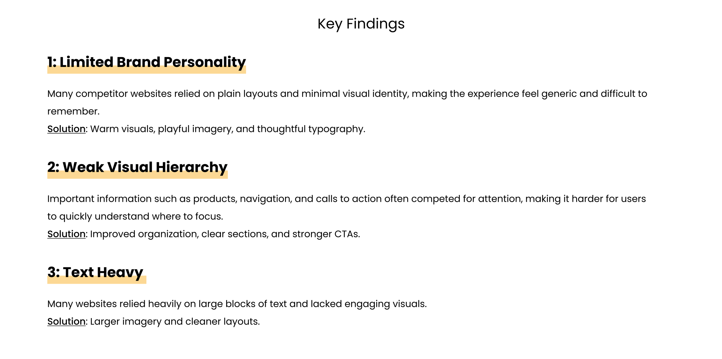
Through competitor research, I found that many honey brand e-commerce websites lacked personality and visual consistency. The overall experience often felt generic and forgettable. Hani needed a website that created a stronger connection with customers.
SOLUTION
Created a easy to use shopping experience that reflected the Hani brand.
COMPETITOR ANALYSIS + THE GAP
The Competition is Outdated
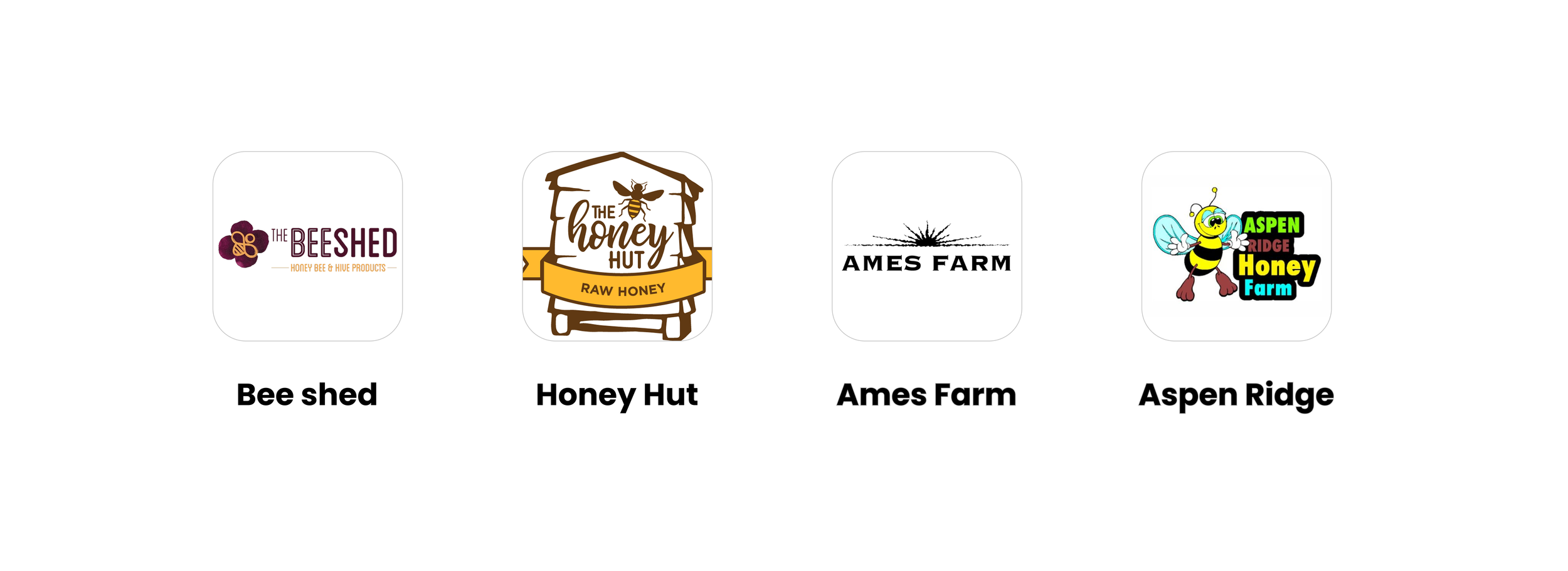
During competitor research, I found other local honey companies with e-commerce websites. I found that many relied on plain white layouts, weak hierarchy, and text heavy pages. While the websites were functional, many lacked personality, making the shopping experience feel less memorable and meaningful. I also noticed that competitors lacked high quality product photography, educational content, and fun topics such as honey benefits, recipes, and raw honey. These findings revealed an opportunity to create a warmer and more engaging shopping experience for Hani.
Before creating wireframes, I designed the initial structure of Hani’s website to organize content clearly and guide users through the main pages. This information architecture diagram maps out the key sections and how they connect to one another.
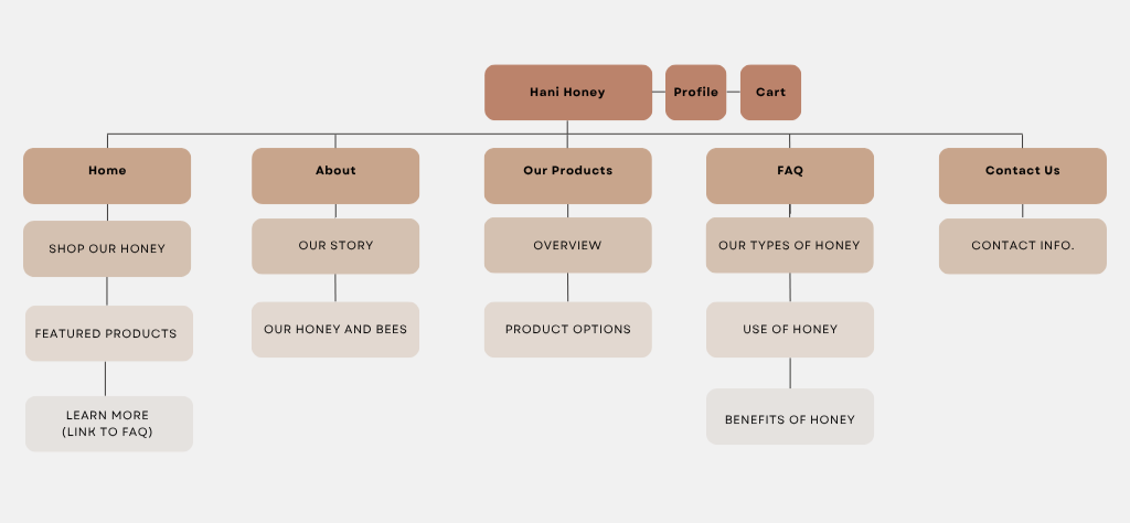
Information Architecture diagram showing Hani’s website structure.
BRAND IDENTITY & VISUAL IDENTITY
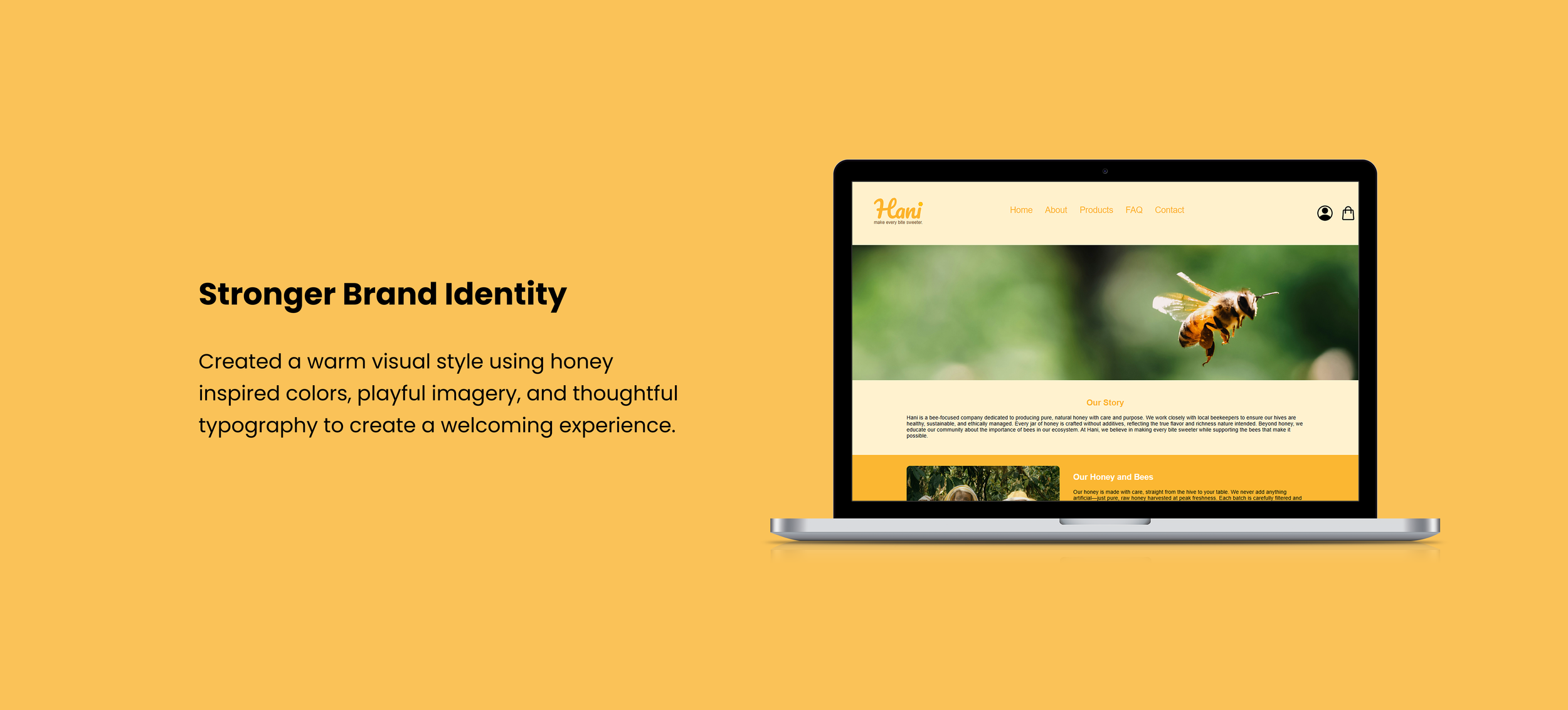
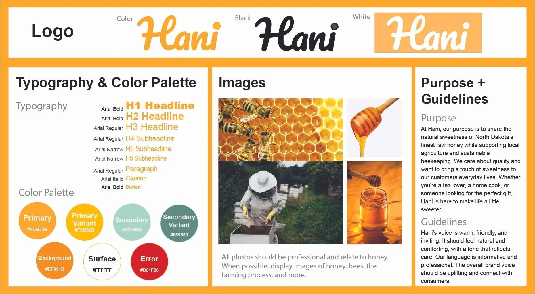
I created a brand guide to ensure consistency across all pages of the website. The visual identity was inspired by the warm tones of honey. Colors were selected to feel bright, inviting, and energetic, while typography was chosen to be simple, readable, and approachable. Images were carefully selected to highlight honey, beekeeping, and the journey from hive to table. Together, these elements create an experience that feels warm, trustworthy, and memorable.
The target audience consists of adults aged 20–45, of all genders, located in the United States, with middle class incomes and an interest in organic or natural products. They appreciate simple, genuine brands that feel warm, trustworthy, and easy to connect with.
INFORMATION ARCHITECTURE
Mobile Wireframes
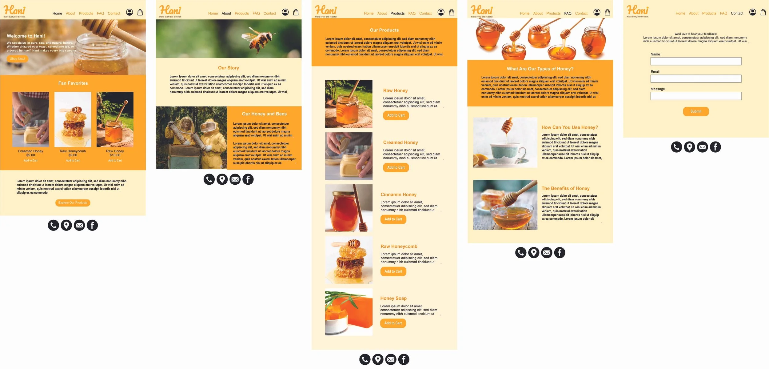
Desktop Wireframes
WIREFRAMES
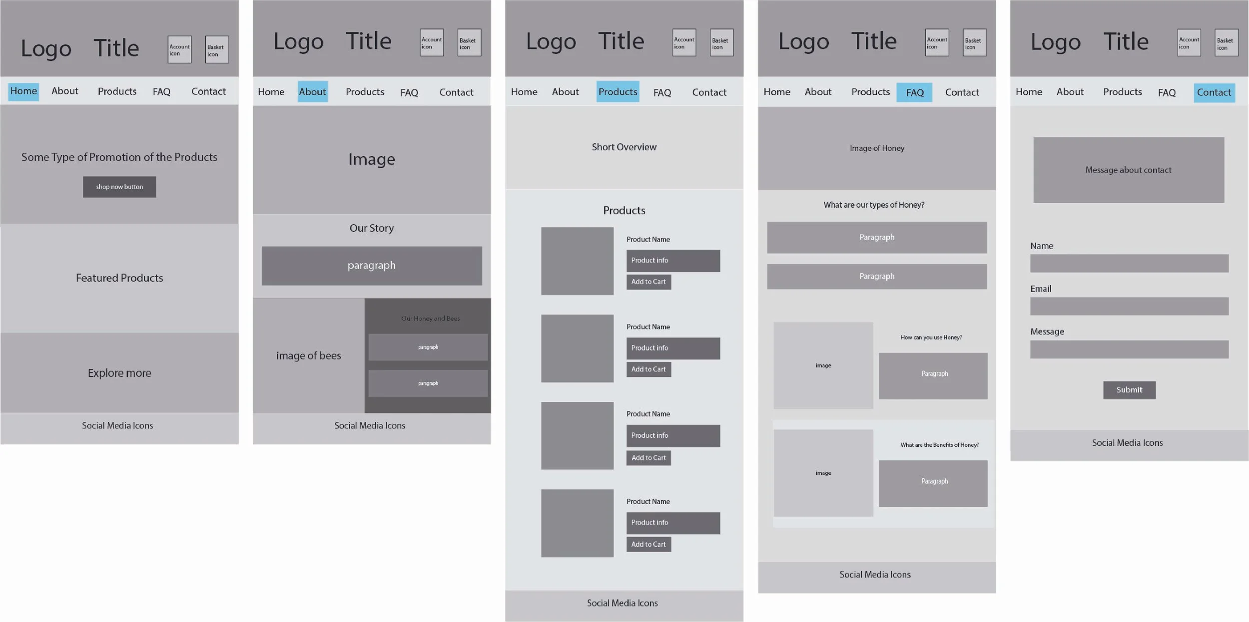
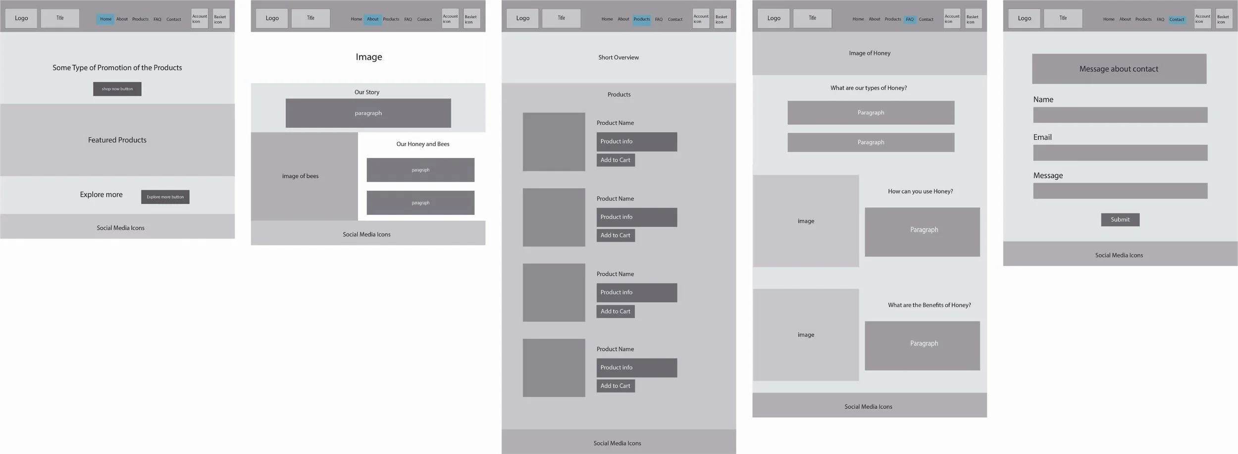
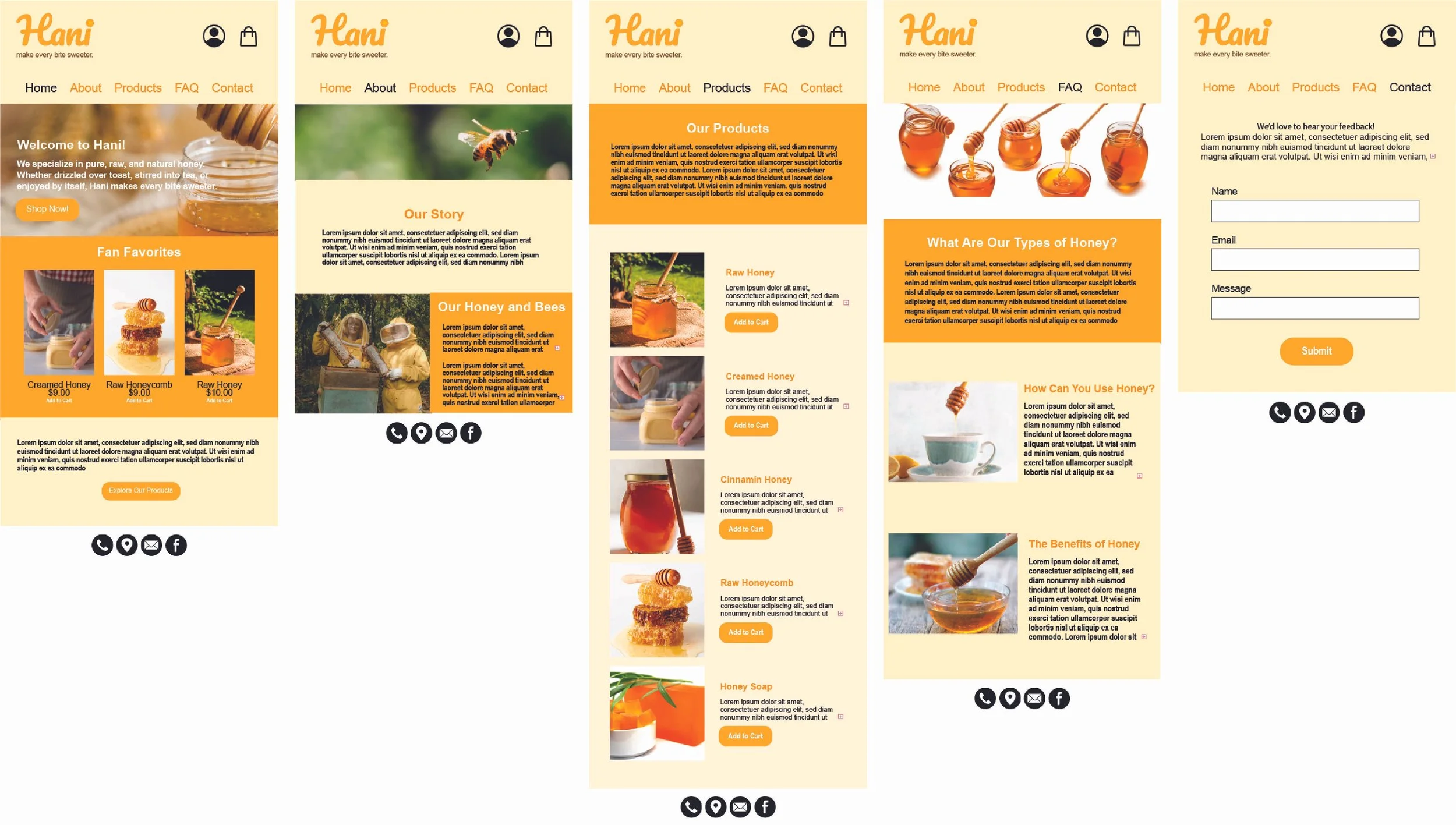
I created the wireframes in Adobe Illustrator to plan out the layout and structure of the website. The design focused on keeping a simple interface and a smooth user experience. During this phase, I gathered feedback through peer reviews and made revisions to improve clarity and flow.
Mobile Wireframes
Desktop Wireframes
TESTING + IMPROVEMENTS
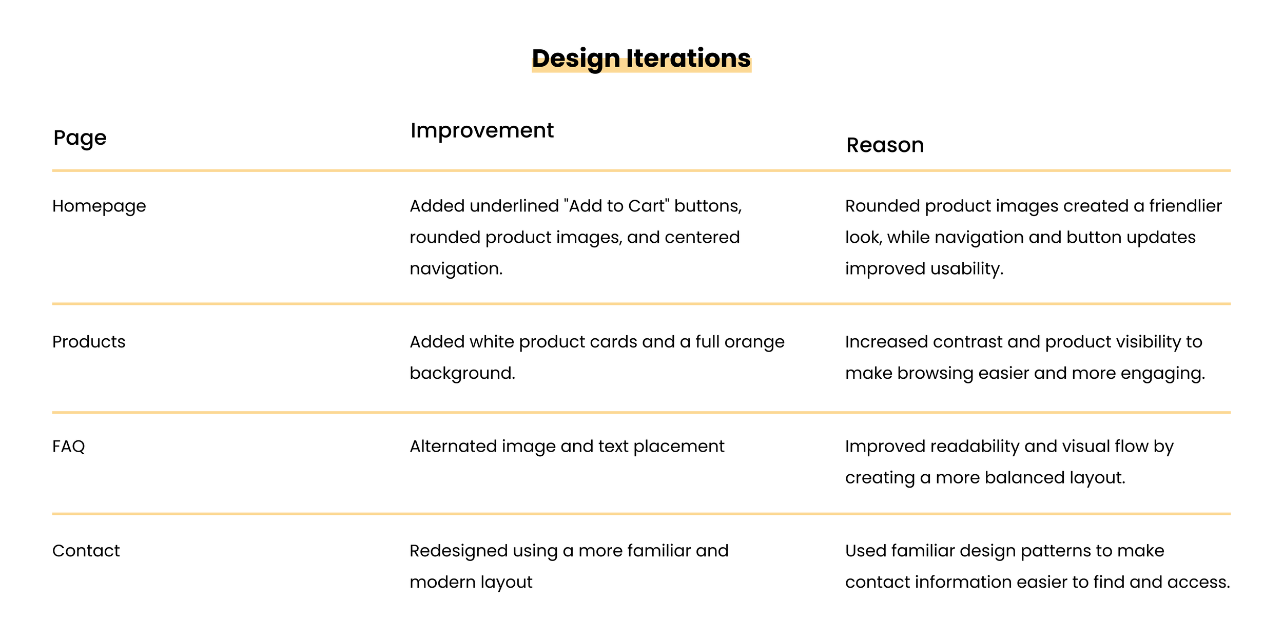
Based on various feedback from my professor and peers, I continually iterated my design with some improvements.
MID-FIDELITY DESIGNS
I created mid-fidelity designs to explore visual hierarchy, branding, and page layouts. This stage helped identify areas for improvement before developing the final design.
Final Designs
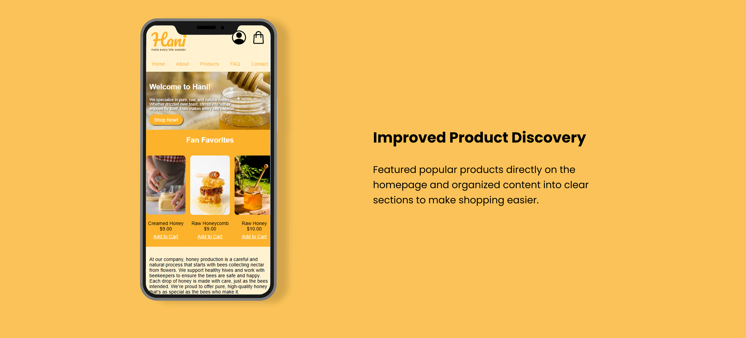
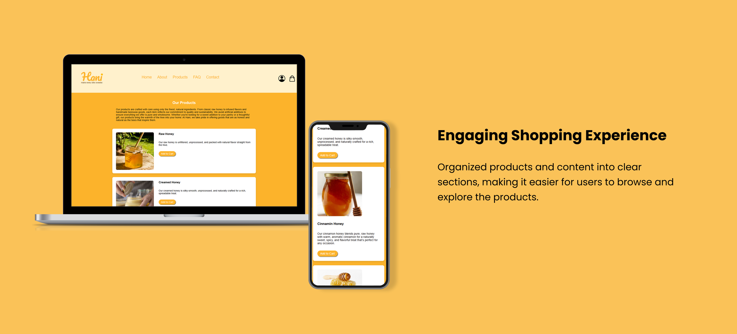
The Final Product
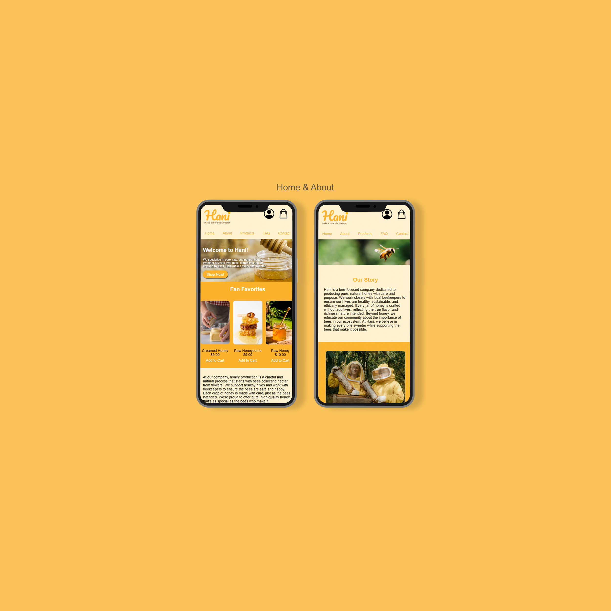
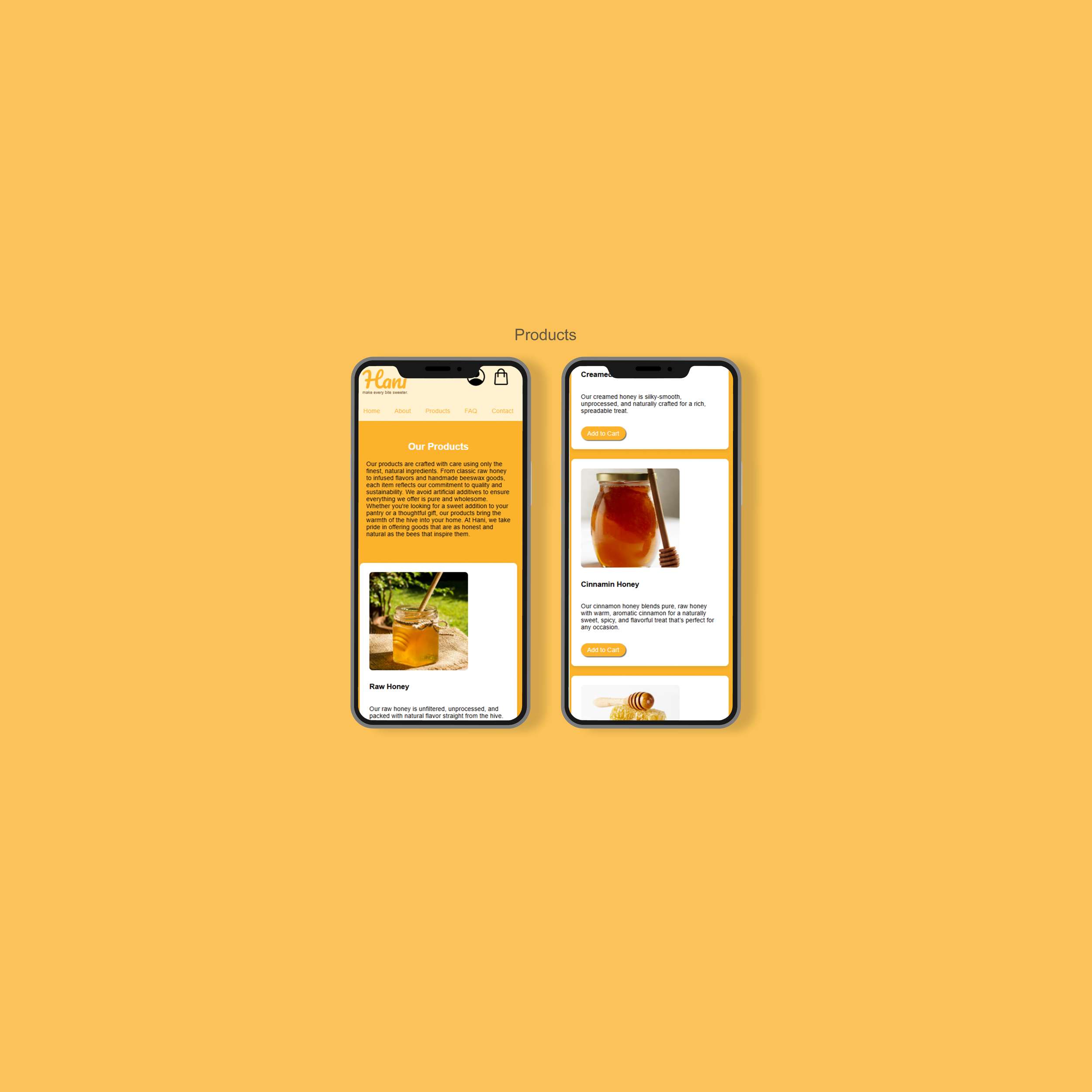
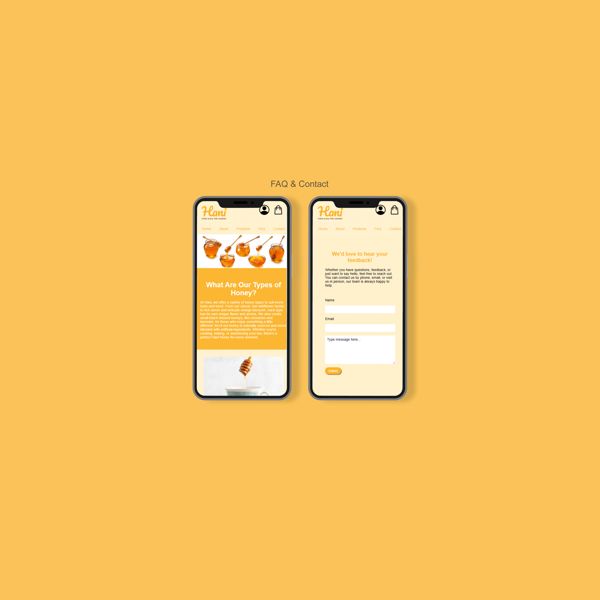
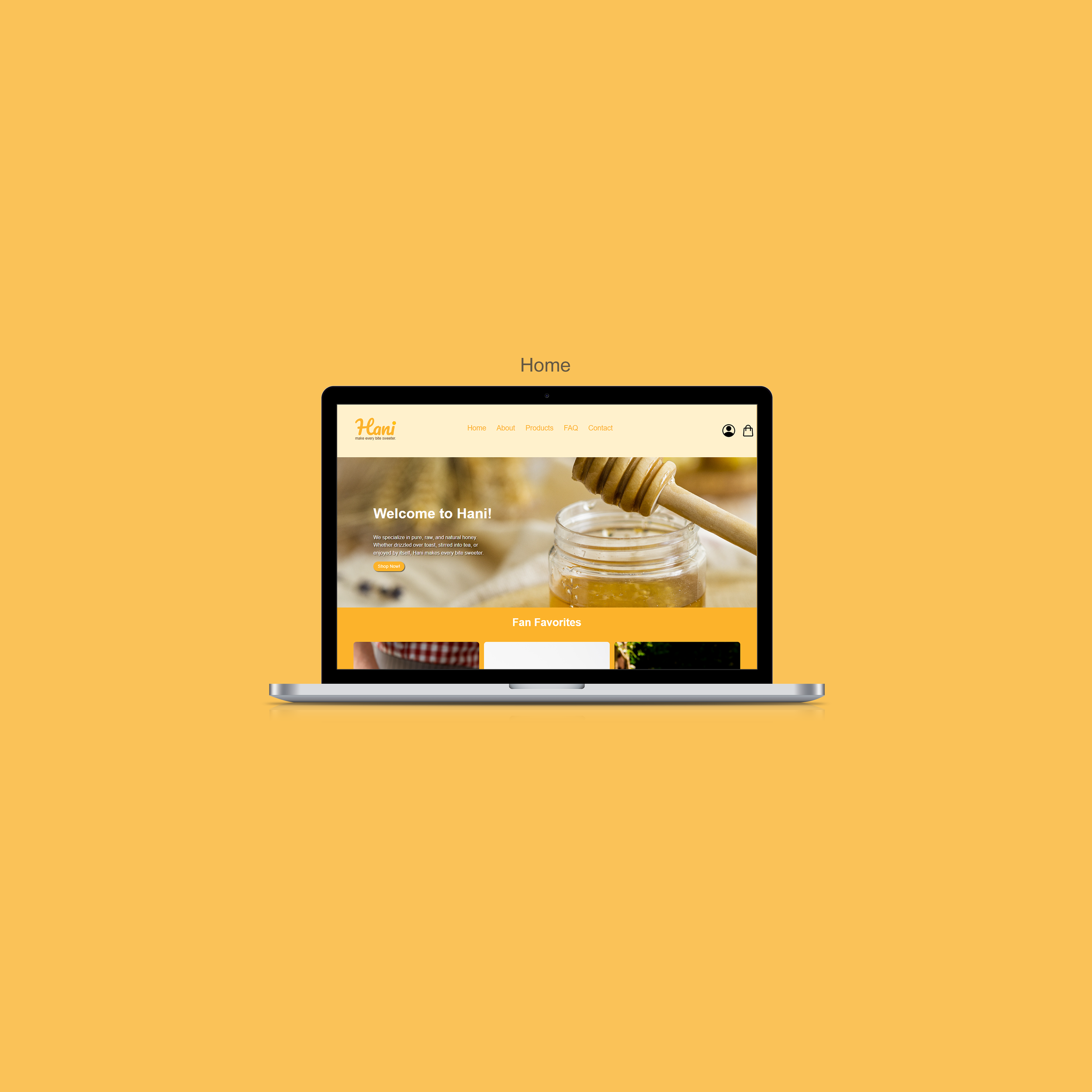
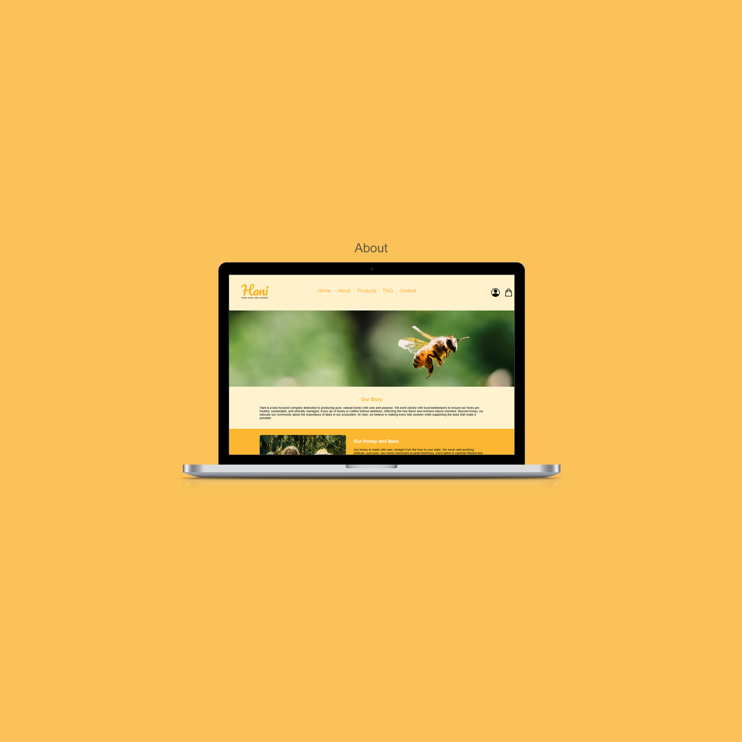
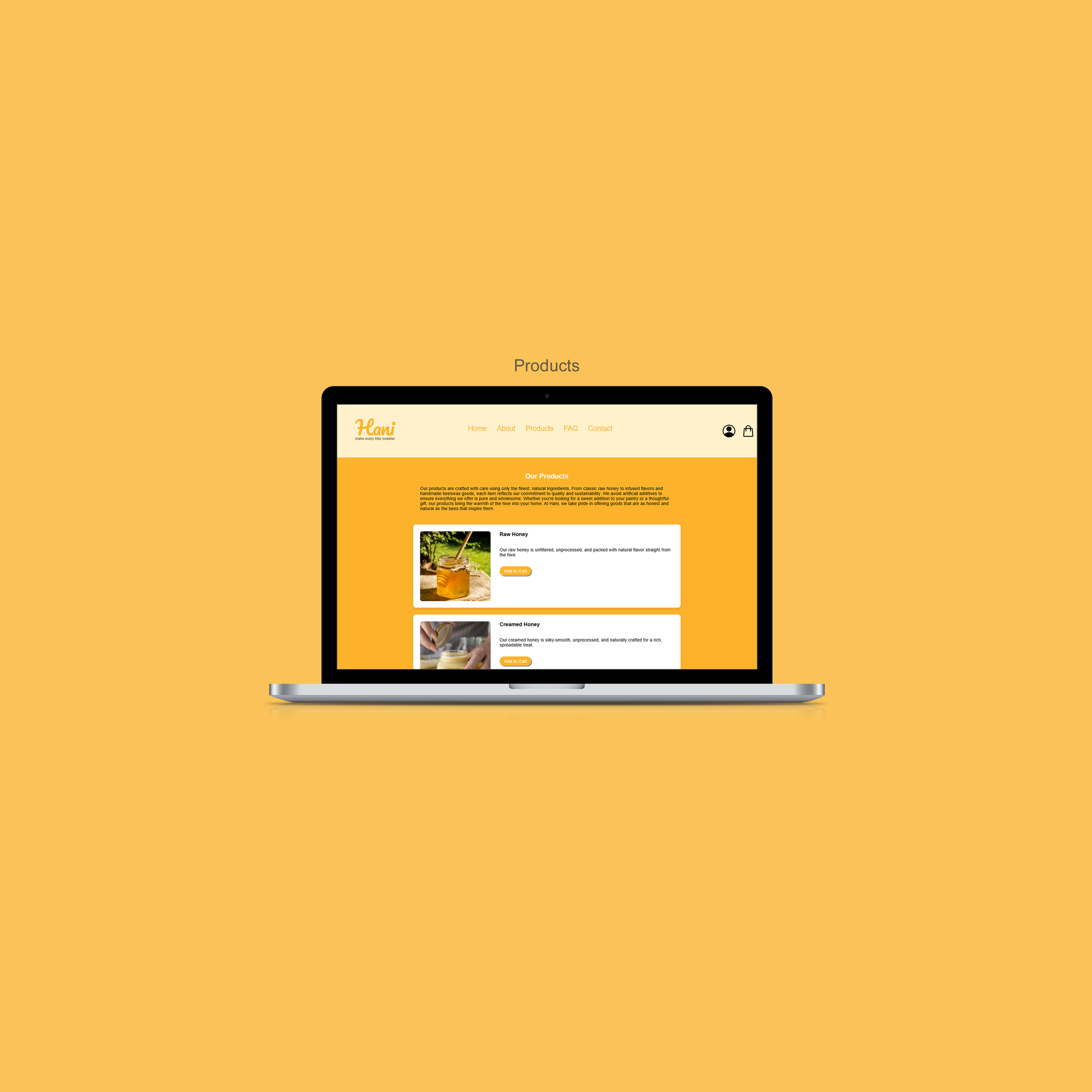
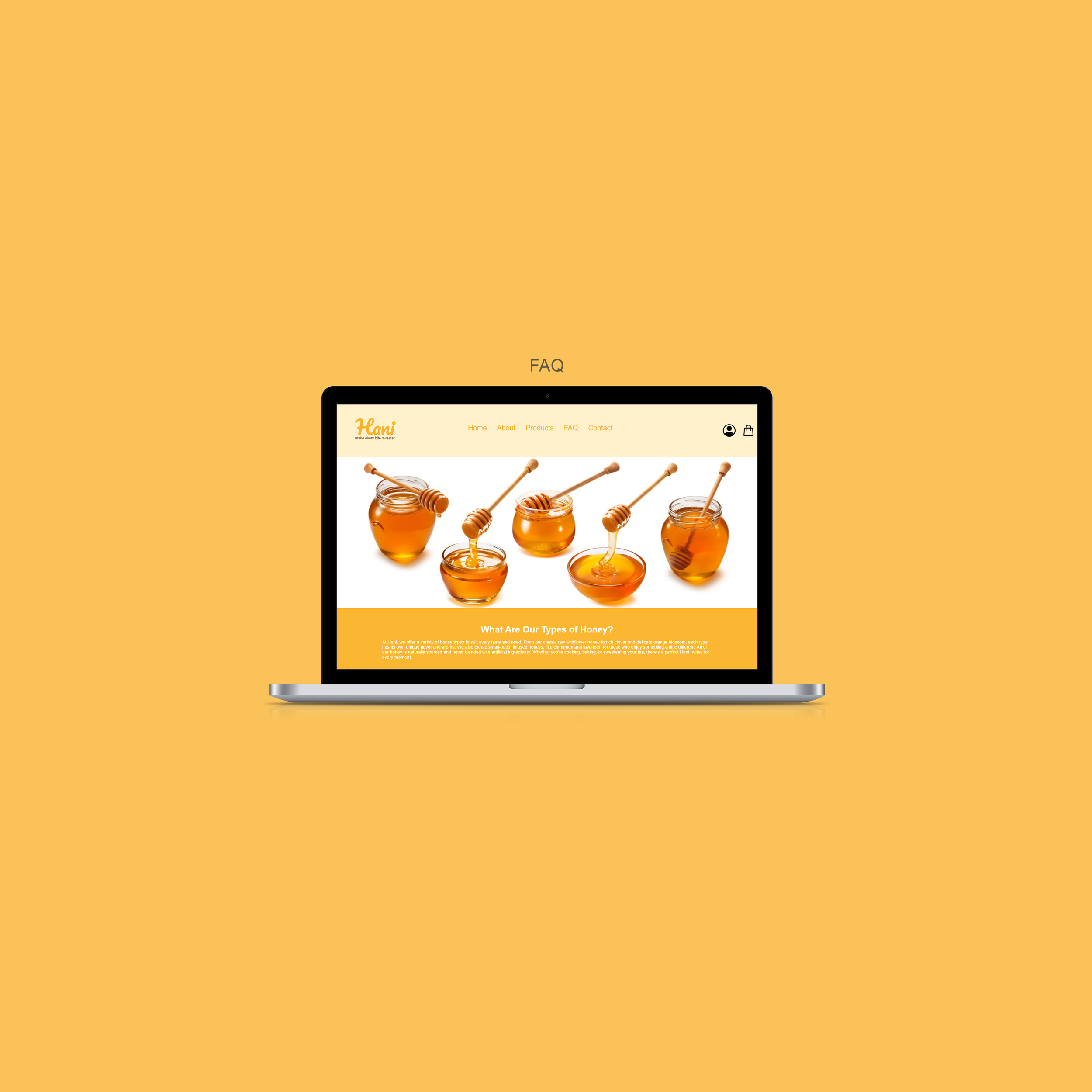
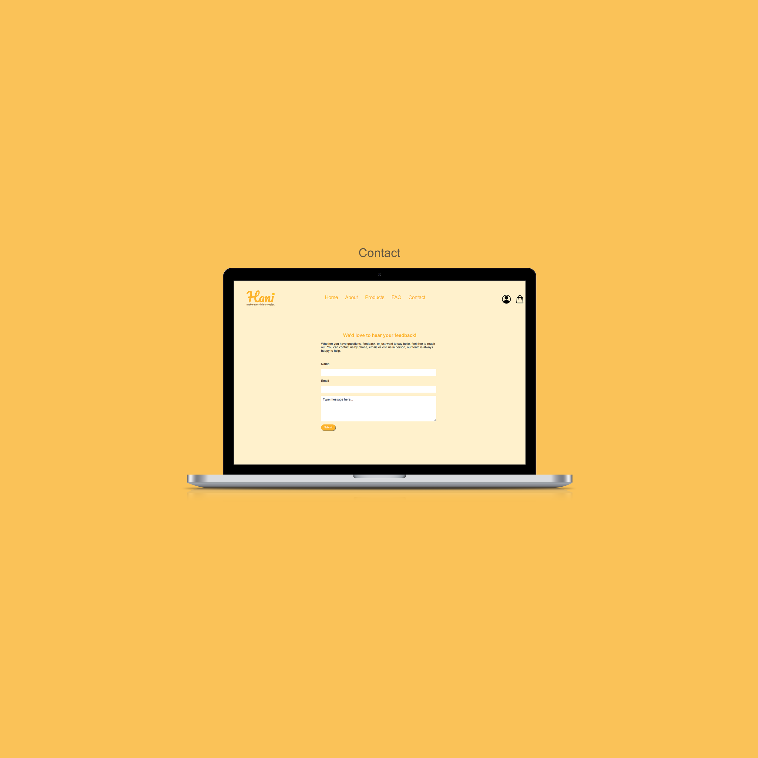
Bringing Hani’s Website to Life
The final website was built with valid HTML5 and CSS3, ensuring a clean, responsive design across desktop and mobile devices.
CONCLUSION
Reflection & Takeaways
Hani was one of my first experiences designing and developing a complete website from start to finish. Through competitor research, wireframing, branding, and front end development, I gained insight into how design decisions influence the user experience. Here are a few key lessons I learned throughout the project:
Sitemaps are SO helpful!
Creating a sitemap and researching other e-commerce before moving into design helped establish a clear structure for the website. This process made it easier to organize content and identify potential issues early on.
Design and development go hand in hand
Building the website myself helped me better understand the relationship between design and implementation. I learned how design decisions affect development and gained experience translating concepts into a functional website.
My design skills continue to grow
Looking back on this project, I can see how much my understanding of visual hierarchy, branding, and web design has developed. The experience provided a strong foundation that continues to influence my work today.
If you'd like to connect, collaborate, or chat about design, feel free to reach out at rosem9298@outlook.com
Thanks for reading!✨
Explore my other projects: