Sammie’s Gourmet Subs
Gift Card Mobile App
A responsive web design project for a fictional North Dakota honey company focused on branding, storytelling, and user experience.
Background
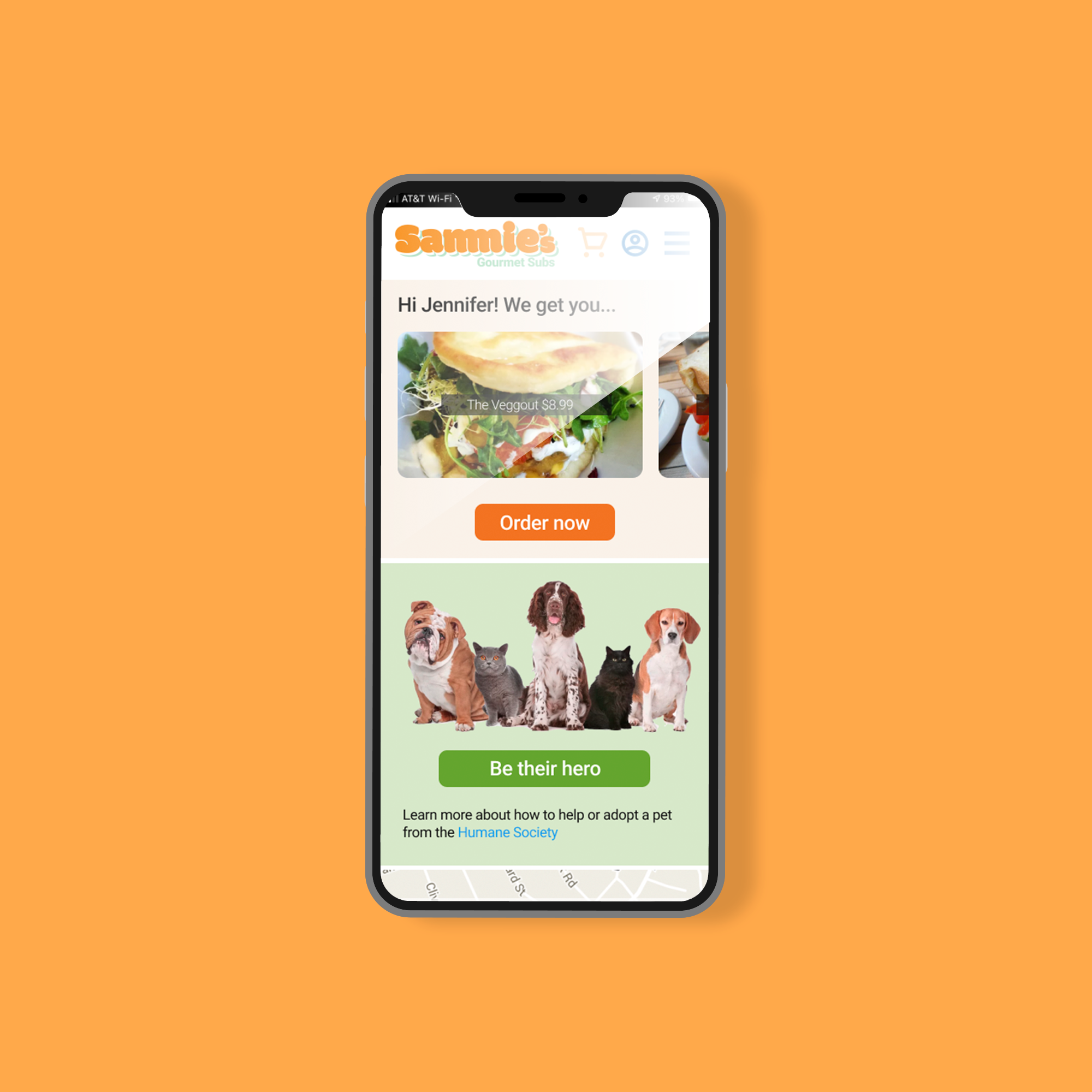
This project focuses on designing a mobile ordering experience for Sammie’s, a sub shop that partners with the Humane Society to support animal welfare.
Challenges
A challenge in this project was designing a clear and intuitive flow for sending gift cards across different delivery methods. Since the process required several inputs like recipient details, delivery choice, custom messages, and payment, the biggest difficulty was keeping the interface uncluttered.
Role
UX/UI Designer, User Researcher, Prototyping & Interaction Designer
What I Accomplished
I followed a full UX process, including user research, persona development, competitive analysis, paper prototyping, and usability testing. The final deliverable was an interactive Figma prototype that allows users to send Sammie’s gift cards through various delivery methods (text, email, and physical mail), based on real-world user needs.
Goal
Create a smooth gift card flow that lets people customize their message in many ways
Tools
Adobe Illustrator, Balsamiq, & Figma
01 Define
A Little More About Sammie’s
Sammie’s is a digital-first sub shop franchise created to help young entrepreneurs open online sub shops at a much lower cost than traditional brick-and-mortar franchises. Many local kitchens, like catering facilities, have unused prep space, creating an opportunity for entrepreneurs to run a delivery-based sub shop for under $50,000 instead of the typical $1,000,000 investment.
The goal of the digital product is to support this model by giving users an easy way to run their online shop, manage orders, and deliver great food through modern delivery channels. My project focuses on one part of this system: the gift card flow.
Requirements for Ordering Gift Cards
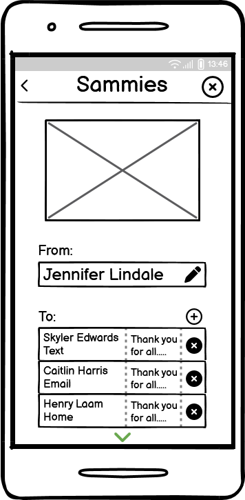
You are Jennifer, a Sammy’s Gourmet Subs fan. You need to buy three $25 gift cards for your coworkers—Skyler, Caitlin, and Henry, to thank them for helping with a big project. You want all three cards to arrive in three days.
Skyler should receive the gift card by text (SMS)
Caitlin should receive the gift card by email
Henry needs a physical card mailed to his home
Each gift card should include the message: “Thank you for all your hard work!”
Let each recipient know that a $5 donation to the Humane Society was made on their behalf.
Notify them via text about the Humane Society donation.
All gift cards should use the same design.
You are already logged into the Sammy’s app.
Your credit card is on file.
You should apply your Sammy’s Club Points toward the total before checking out ($15 in Club Points).
02 Research
Exploration and Discovery
I first started mapping out the full business model behind Sammie’s, a fictional digital sub shop franchise. I explored the company’s organizational structure, workflows, revenue model, and user groups. The goal was to deeply understand the business ecosystem (employees, owners, third-party services, and customers)before designing digital tools that support the company’s success online.
Sammy's Research Report
76% of respondents use food delivery services like Uber Eats or DoorDash.

The results of a survey focused on the viability of an idea such as Sammy’s. An initial stakeholder meeting was conducted before crafting the survey and questions. The survey engaged a total of one hundred (100) people. One-half or fifty (50) individuals fell within Sammy’s target demographic—20 to 35-year-olds. The information gained from the survey provided insight into people’s thoughts, attitudes, and motivations regarding purchasing gourmet sub sandwiches online.
We then used the survey information to prioritize findings and create recommendations for Sammy’s potential digital product design. The initial stakeholder meeting revealed that Sammy’s target demographic is primarily made up of young people from the ages of 20-35. The majority of these individuals, 82%, are very comfortable ordering food online.
Our survey questions focused on understanding online shopping habits, experiences with ordering food online, and thoughts about mobile apps and websites. We then used the results of the survey to develop a series of findings and recommendations.
Key Insights
93% of casual food diners under 35 prefer to support a small business run by someone under 35.
91% of casual diners are interested in ordering gourmet subs online and having them delivered anywhere.
86% of casual diners like the idea of delivery being part of the casual dining value proposition.
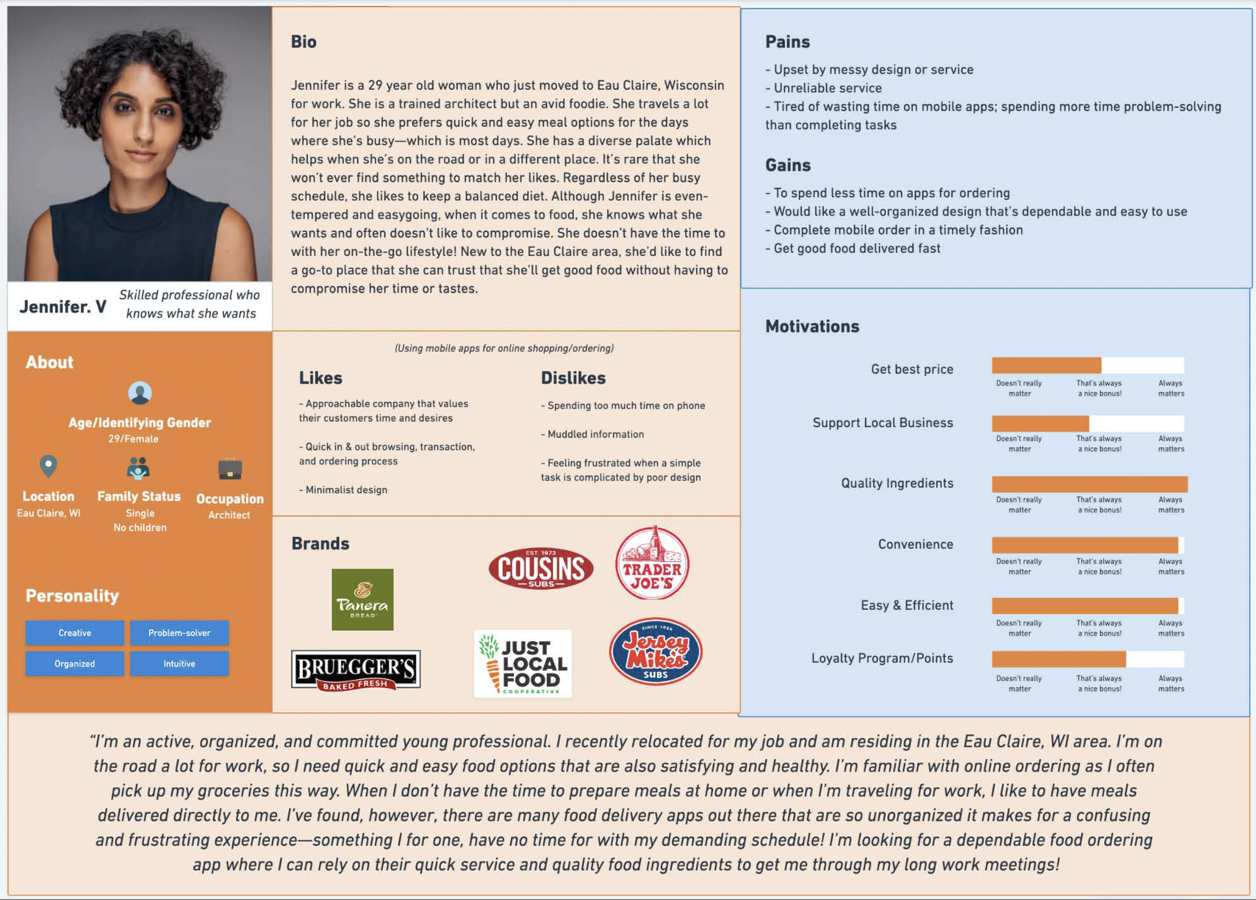
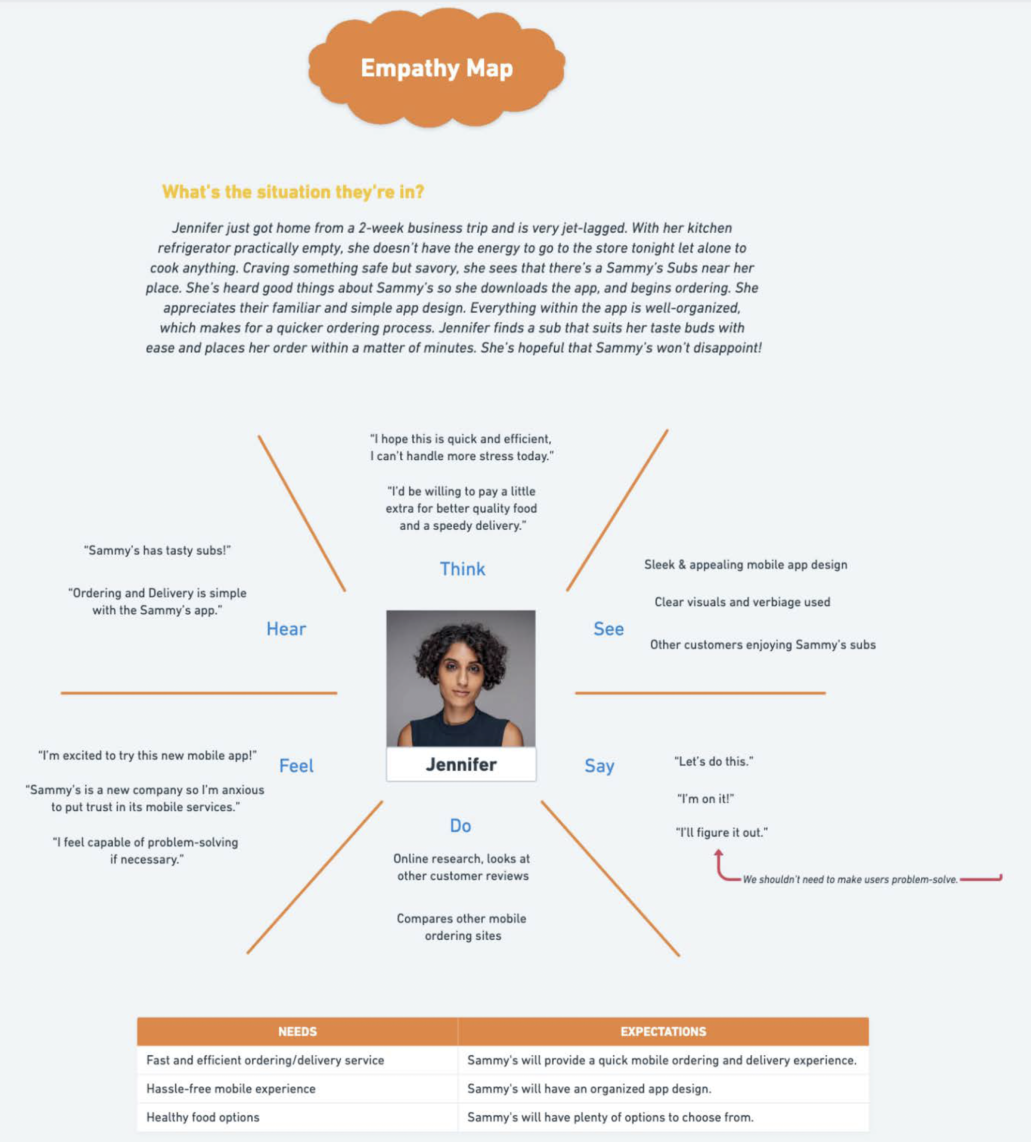
User Personas and Empathy Mapping
Competitor Analysis
Here are some UX Design Highlights I found from Crumbl’s app:
Customizations
Users can personalize their gift by adding a message, choosing a delivery date, and selecting the gift card design, making the experience feel more meaningful.Flexibility
The design supports multiple delivery methods and timing options.Instant Delivery
Users can choose to send a digital gift card instantly.Clear Instructions
Ensures users always know what to do next, reducing confusion during the gifting flow.Organization
Information is grouped logically, helping users move through the process smoothly without feeling overwhelmed.Responsive Design
The prototype works seamlessly across mobile sizes, ensuring a consistent experience no matter the device.
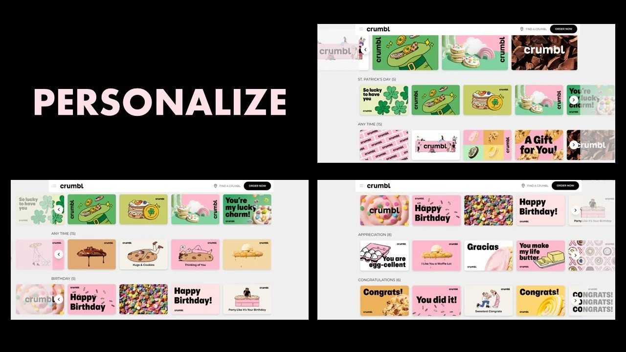
I began by reviewing top competitors like Nike, Starbucks, Crumbl, Chick-fil-A, and Etsy. Across all of them, I observed consistent strengths in usability, simplicity, clear purpose, and a seamless purchase experience. I chose Crumbl’s mobile app as my primary benchmark due to its clear instructions, responsive layout, polished interface, and flexible delivery options. Features like instant gifting, customization (messages, send dates, and gift amounts), and intuitive organization stood out and heavily influenced/inspired my own design approach.
03 Design and Prototype
Wireframing & Paper Prototyping
In this phase, I created paper prototypes to plan out how my screens would look and how they would connect. Sketching on paper helped me test ideas quickly, fix mistakes easily, and understand the flow of the user’s actions. I put the paper screens into a simple video to show how the feature would work. This step helped me organize the layout, think through screen changes, and prepare for the digital wireframes.
Low-Fidelity Prototyping in Balsamiq
In this step, I took my paper sketches and turned them into an interactive low-fidelity prototype using Balsamiq. This helped me map out the full user flow for my use case and see how the screens would work together in a more realistic format. I created the necessary screen states, built a clickable walkthrough, and wrote a clear scenario and task for testing.
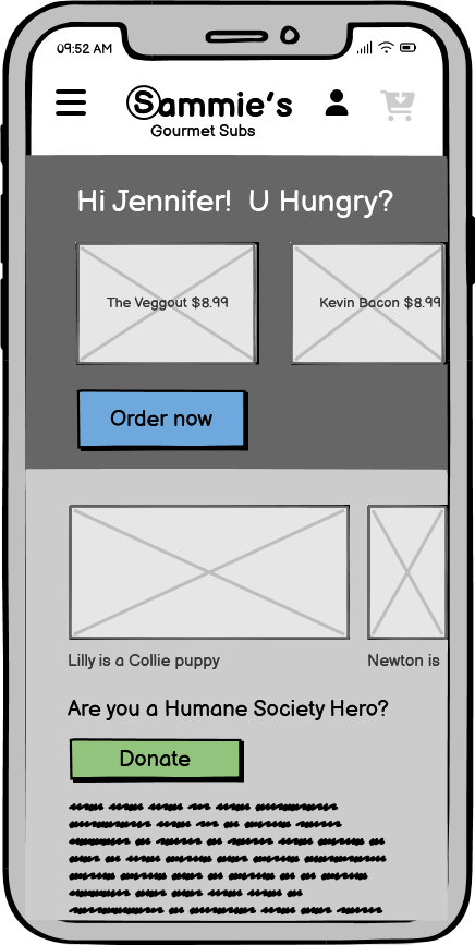
Welcome Page
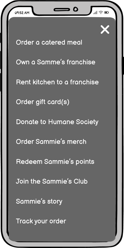
Sidebar Menu
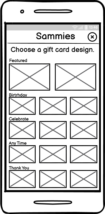
Pick a Gift Card
Apply Amount and Send Date
Amount Applied
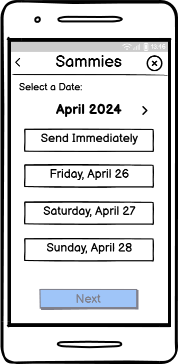
Pick Date to Send Gift Card
Date Selected
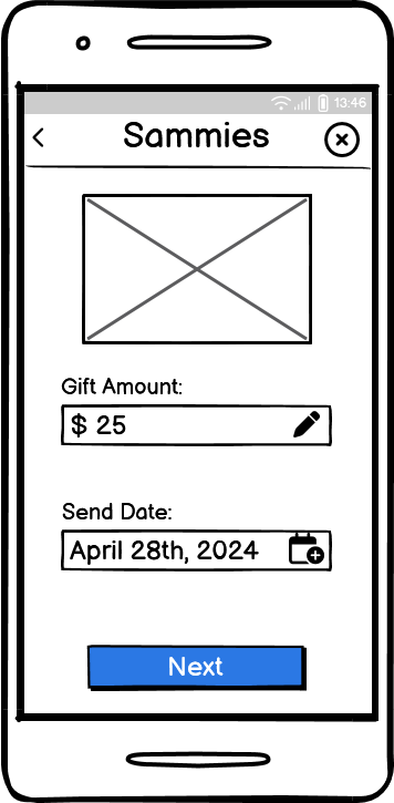
Date Applied
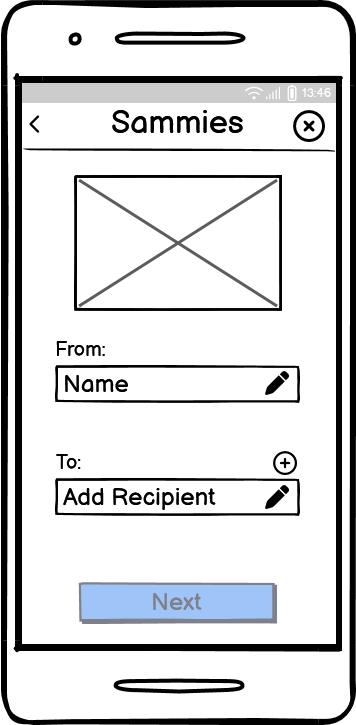
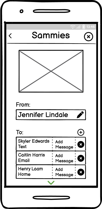
Apply From and Recipients
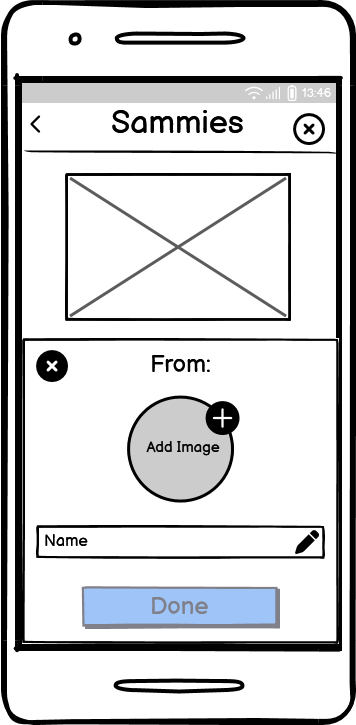
Fill Out Who the Gift Card is From
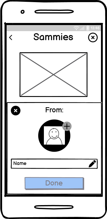
Image Applied
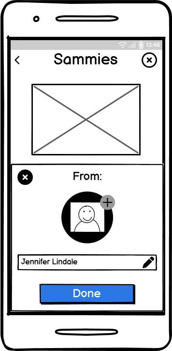
Name Applied
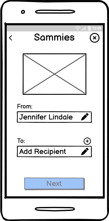
Now Apply Recipients
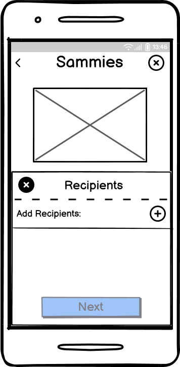
Apply Recipients
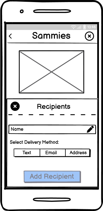
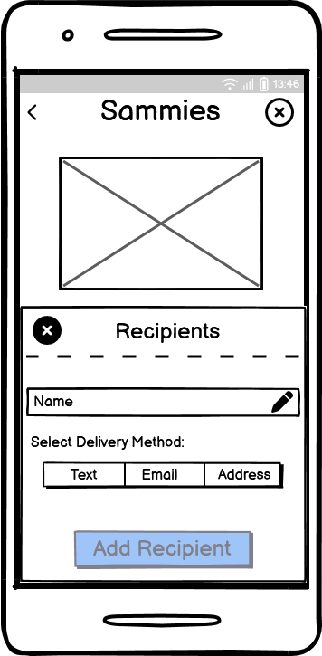
Fill Out Recipient Information
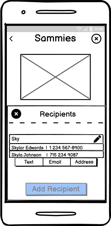
First Recipient: Skylar Edwards
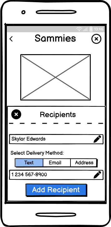
Delivery Method Selected: Text
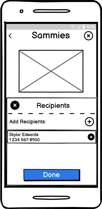
Frist Recipient Has Been Applied

Apply Second Recipient

Second Recipient: Caitlin Harris
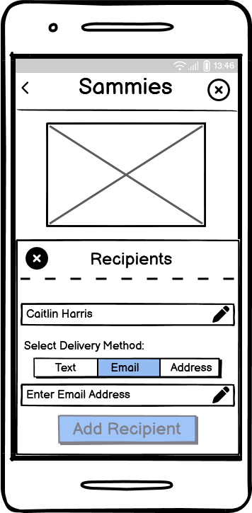
Delivery Method Selected: Email
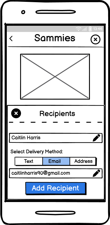
Email Applied
Second Recipient Has Been Applied
Apply Third Recipient
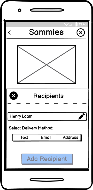
Third Recipient: Henry Laam
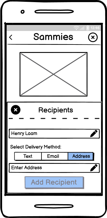
Delivery Method Selected: Address
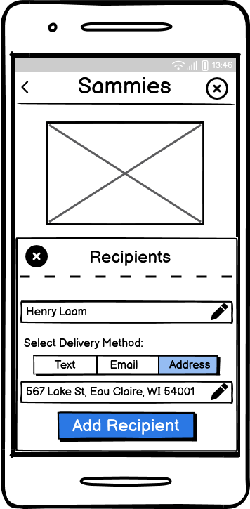
Address Applied
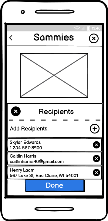
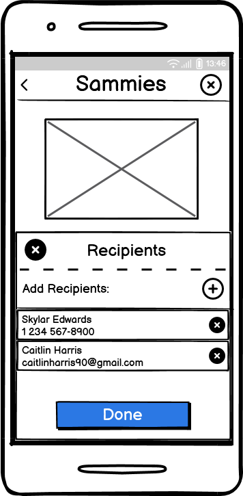
All Recipients Are Applied
Now Add a Message
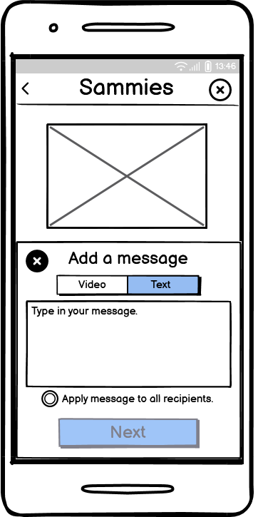
Select a Video or Text Message
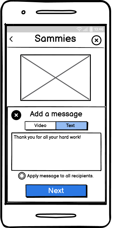
Message Typed In: "Thank you for all your hard work!"

Apply Message to All Recipients
Message has been Applied. Proceed to Scroll Down
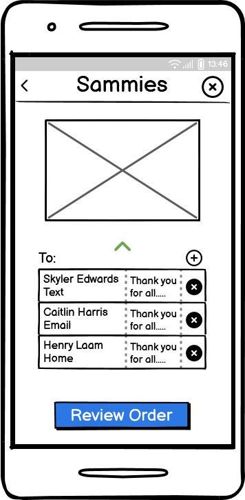
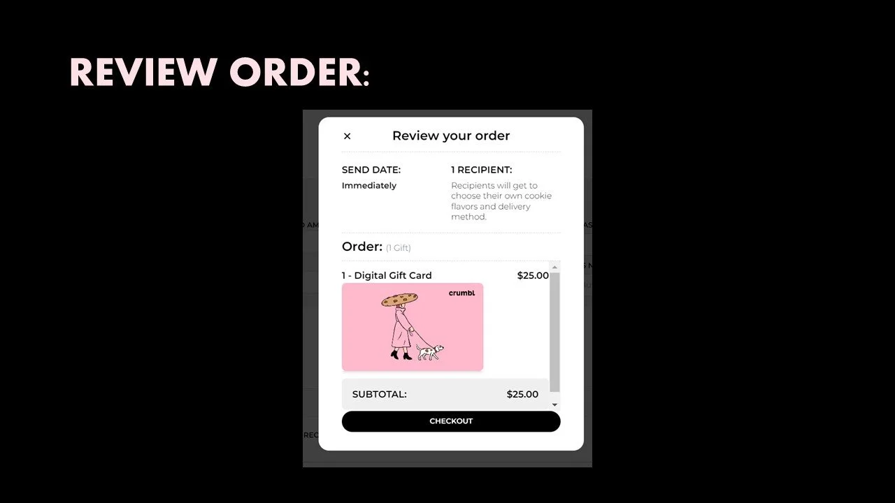
Review Order
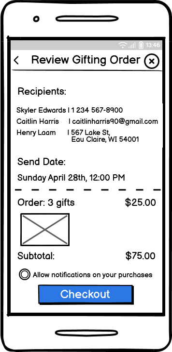
Review Gifting Order
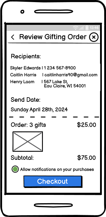
Select: "Allow Notifications on Your Purchases and Checkout"

Payment and Donations
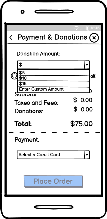
Select a Donation Amount
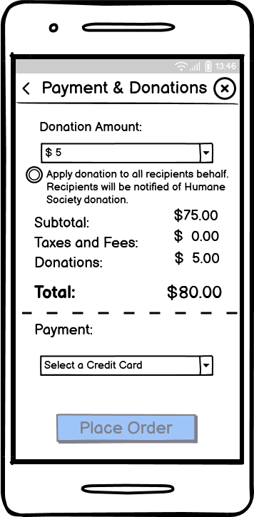
Donation Amount: $5

Select: "Apply donation to all recipients behalf. Recipients will be notified of Humane Society Donation"
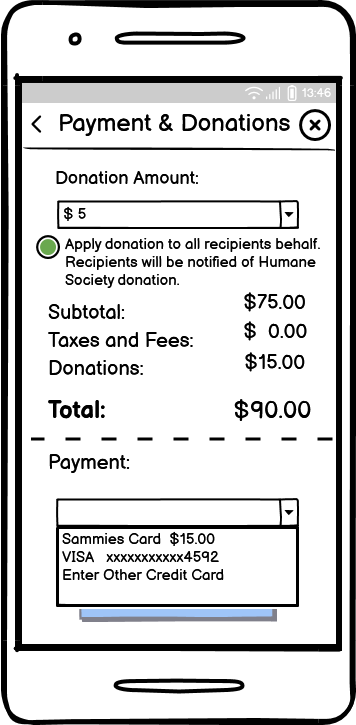
Select Your Payment of Choice
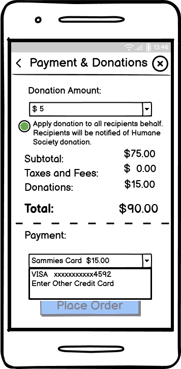
Sammie's Card Selected
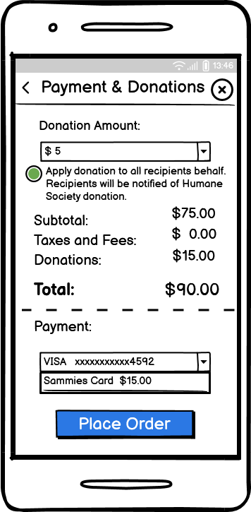
Visa Credit Card Selected as Well. Place Order
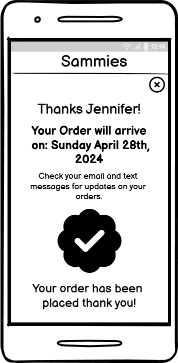
Order has been Placed
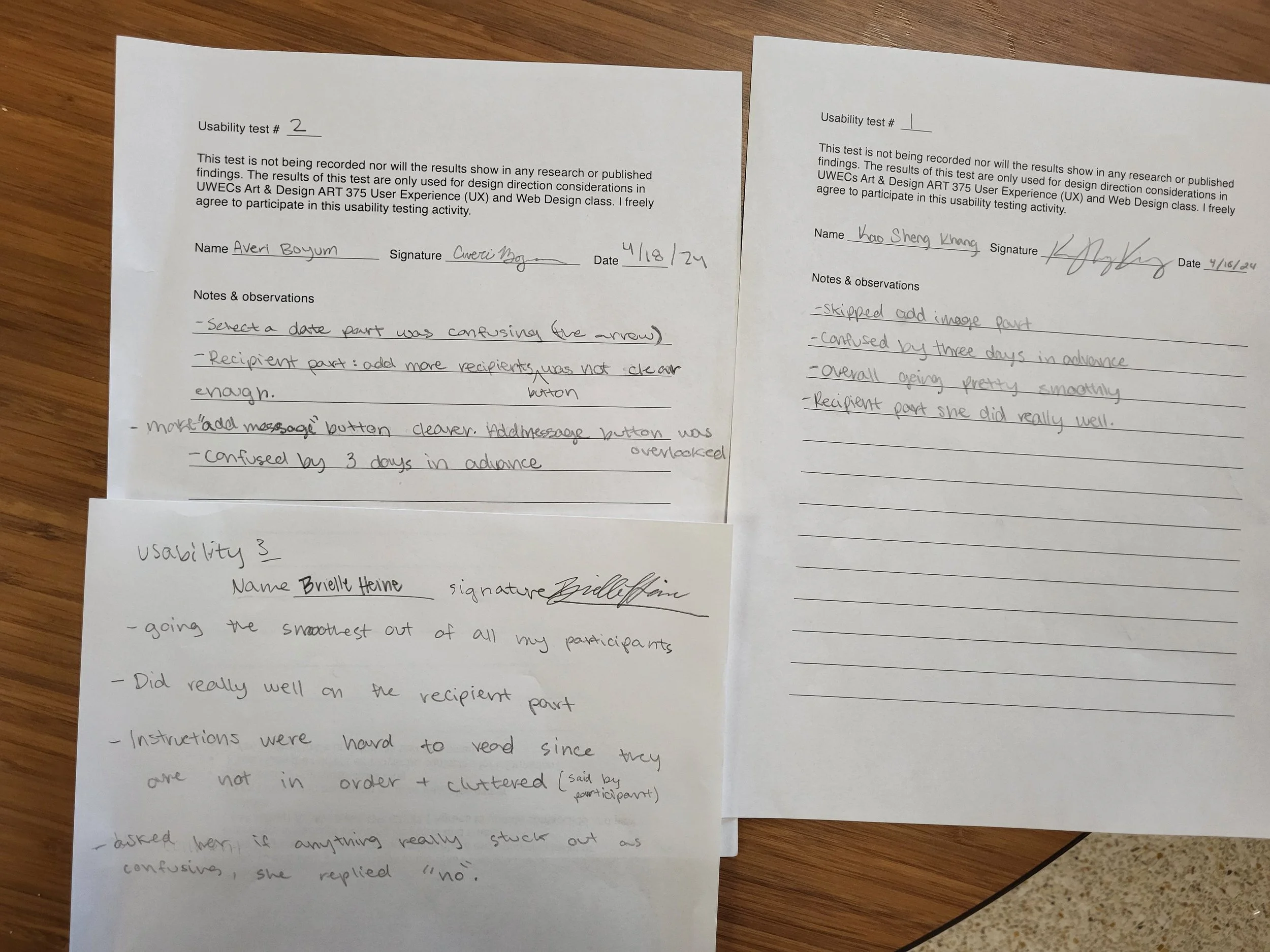
Usability Testing
I then completed usability tests with real users to observe how they moved through the prototype. Their feedback helped me identify what was working, what felt confusing, and what needed to be improved before moving into high-fidelity design.
What Worked Well
The recipient section was very smooth for most users; two participants specifically did really well with it.
The overall experience was described as pretty smooth.
What Users Found Confusing
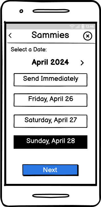
“Send date” section: Multiple users were confused by the “send 3 days in advance” requirement, and some skipped or overlooked the date-selection step.
The “Add message” button wasn’t clear enough and could easily be missed.
Recipient options: One user mentioned adding more recipients was not obvious.
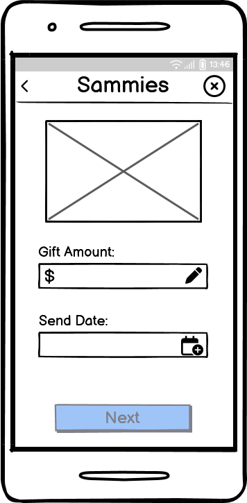
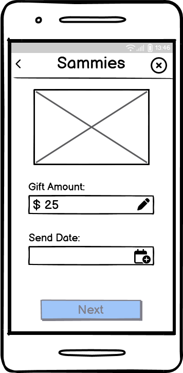
05 Final Design
High-fidelity Interactive Prototype Using Figma
For the final design, I created a polished prototype in Figma that reflects how my feature works in its finished state. I refined the layout, flow, and visuals based on the feedback I received from usability testing, making the overall experience clearer and easier to use. I also recorded myself walking through the prototype as the persona to show how the design supports the user’s needs.
Experience the Prototype Firsthand!
Explore the full step-by-step flow by clicking through the prototype.