Timeline
6 weeks (2025)
My Role
Brand Designer & UX/UI Designer
CONTEXT
About the Project
Hani Honey is a fictional honey brand focused on creating a warm, playful, and modern online shopping experience. The project explored how branding and UX/UI design can work together to build a cohesive e-commerce experience.
01 Define
Before moving into the design phase, I created the fictional client we now know as Hani. I defined what the company does, who it serves, and how it should communicate its values.
The target audience consists of adults aged 20–45, of all genders, located in the United States, with middle-class incomes and an interest in organic or natural products. They appreciate simple, genuine brands that feel warm, trustworthy, and easy to connect with.
Next, I developed a website proposal outlining the project’s overview, goals, and planned site structure. This helped clarify what the website would include and how it would represent the brand online.
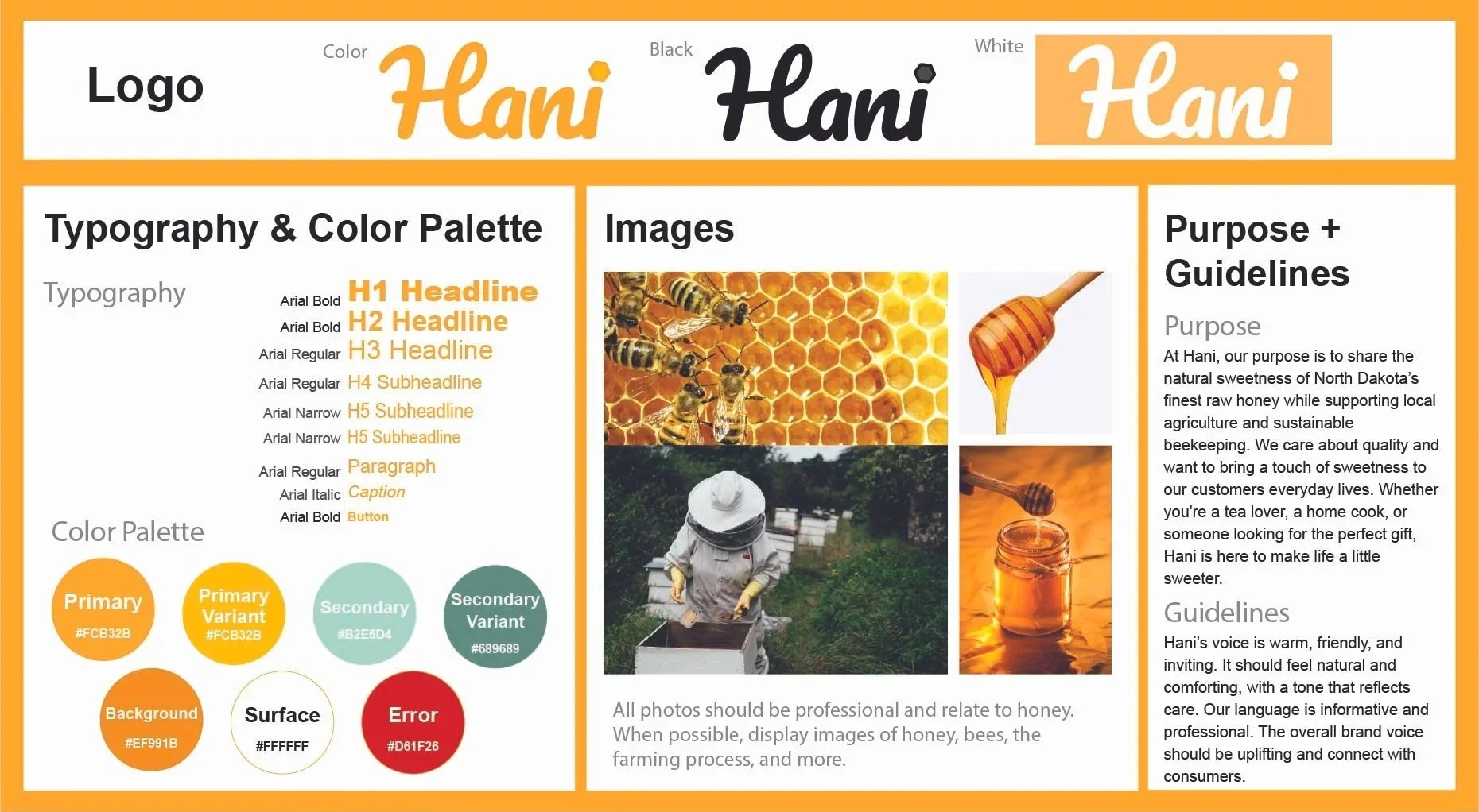
Understanding the Brand
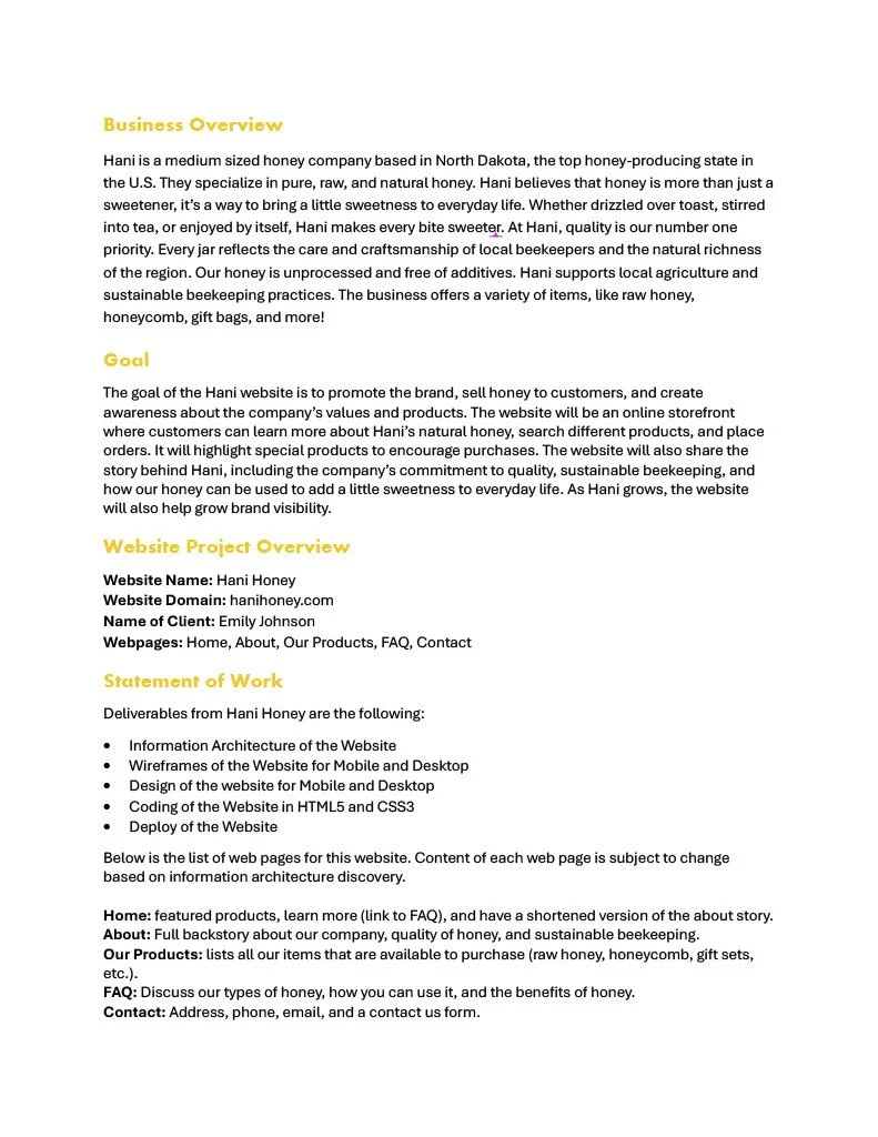
Finally, I created a brand guide to ensure consistency across all web pages. This included the logo design, color palette, typography, and tone of voice, all contributing to a cohesive, recognizable, and friendly user experience.
RESEARCH + COMPETITOR ANALYSIS
The Competition is Outdated
During competitor research, I found that many honey websites relied on plain layouts, weak hierarchy, and text heavy pages. While the websites were functional, many lacked personality, making the shopping experience feel less memorable.
This revealed an opportunity to design a honey website that is warmer, more engaging, and playful.
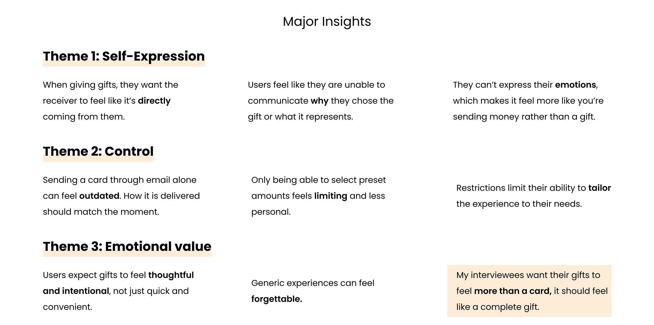
USER INTERVIEWS
My interviewees were more likely to engage with e-gift cards when personalization is available.
Although research showed that personalization increases engagement, I wanted to better understand how users perceive digital gifting experiences. I conducted 5 interviews with users to identify common frustrations and opportunities within existing e-gift card flows. I asked them the questions below to find trends on why they didn’t purchase e-gift cards, then organized my data though affinity mapping.
RESEARCH QUESTIONS:
How do you typically purchase or send gift cards?
What makes a gift feel meaningful to you?
Have you ever sent a digital gift card? What was that experience like?
What features would make a gift card feel more personal?
On a scale form 1-10, how important is customization when giving a gift and why?

THE MAIN INSIGHT
E-gift cards feel more like sending money than giving a thoughtful gift.
Based on trends in my affinity map, I noticed how many recive the current e-gift card experience impersonal. Without the ability to customize or add meaningful details, gifting felt more like sending money than giving a thoughtful gift.
02 Research
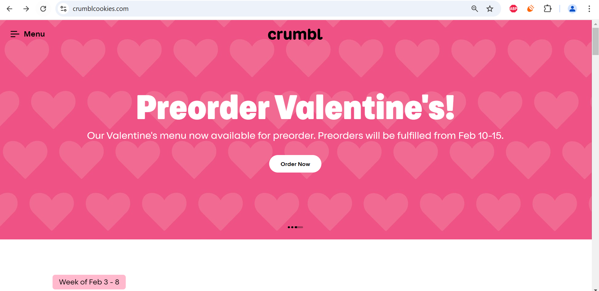
For this project, I started by analyzing the homepage design of Crumbl Cookies to better understand how information hierarchy and visual design guide users.
I compared what users are likely looking for with what the design emphasizes visually.
Website Analysis
Key Information Points
Cookie Flavors of the Week
Online Ordering/Delivery
Cookie Prices
Nutritional information
Store Locations
Expected Importance
Cookie Flavors of the Week
Online Ordering/Delivery
Store Locations
Cookie Prices
Nutritional Information
Actual Values
Preorder/Order Cookies
Cookie Flavors of the week
Description of the Flavors
Learn More Button
Menu Tab
Findings:
Expected importance didn’t match actual design emphasis.
Bright colors, bold type, and white space draw attention to “Order Cookies.”
Nutritional info is buried and takes multiple clicks to access.
The site uses contrast, color, and white space strategically to create a clean, fun, and appetizing experience. One minor drawback is that finding nutritional information requires multiple steps, which could be simplified for convenience.
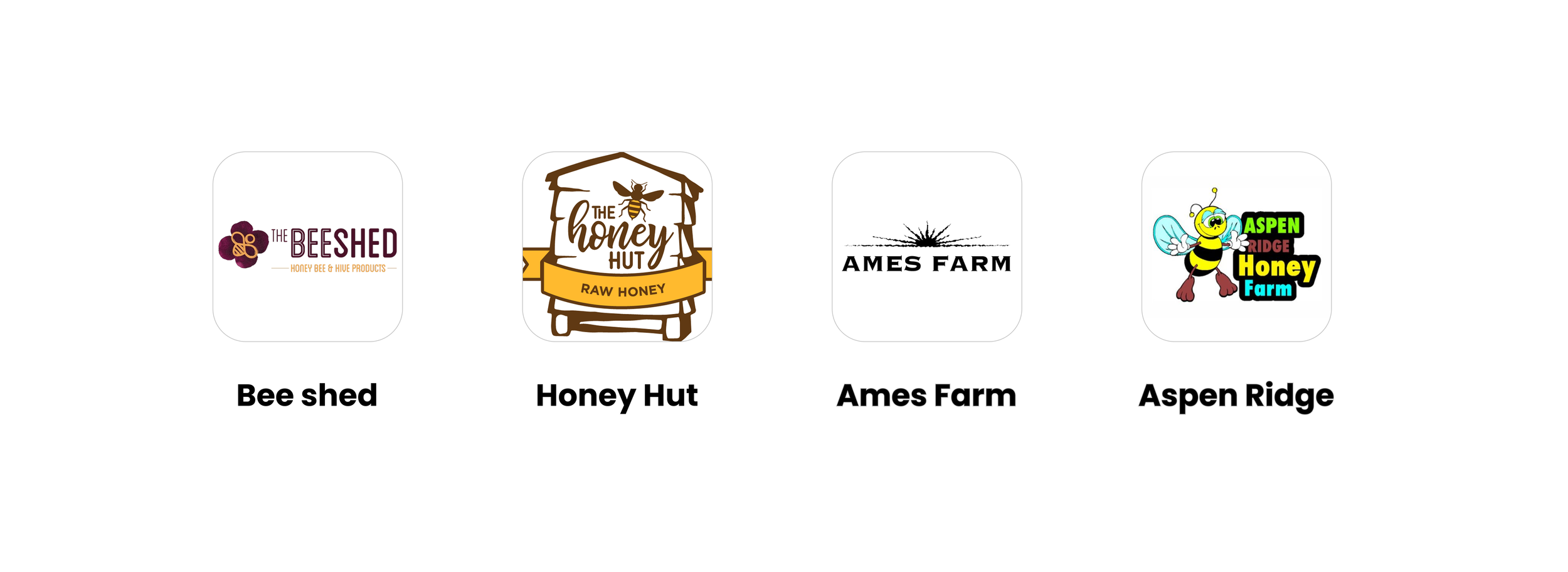
This section analyzes two of Hani’s competitors to understand their website content, design strengths, and areas for improvement.
Competitor Analysis
Content Overview
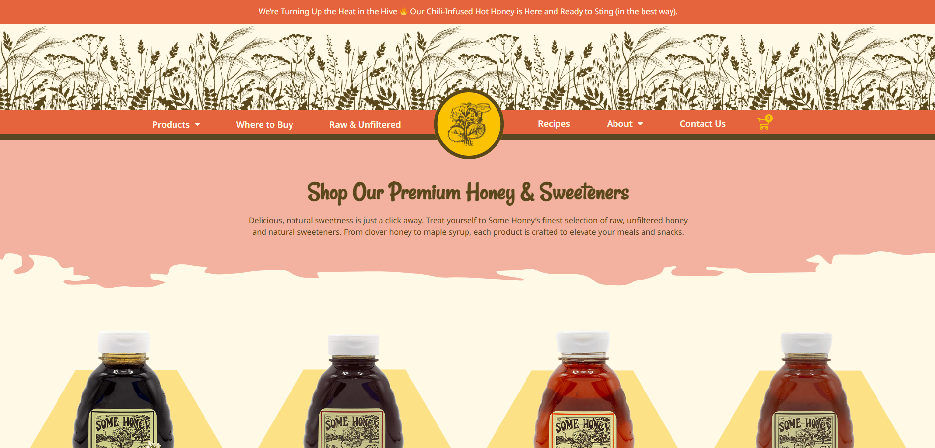
Pages include: Products, Where to Buy, Raw & Unfiltered, Recipes, About, Contact Us
Their “Where to Buy” tab features an interactive map showing retail locations.
The “Raw & Unfiltered” section explains different honey types and the value of high-quality honey.
Areas for Improvement
Slow page transitions interrupt navigation flow.
How I’d Improve for Hani:
Simplify transitions for faster page loading and smoother browsing
Pagess include: Home, About Us, Our Products, FAQ, Sustainability, Contact Us
The “About Us” page highlights their family story, local beekeeping, and community connection.
The “Sustainability” tab discusses their environmental practices and honey production methods.
The “FAQ” section addresses common customer questions about honey and the company.
Content Overview
Areas for Improvement
Small, low-quality product images
Small text size reduces readability
How I’d Improve for Hani:
Use clear, high-resolution product photography
Larger text with clean spacing for a more enjoyable user experience
Insights:
This research provided insight into how similar honey brands organize content and present their products online. The findings guided Hani’s layout decisions, emphasizing simplicity, readability, and visual appeal. I also found competitors commonly use keywords such as what is honey, how can I use honey, honey farm, honey recipes, how does honey work, natural honey, honey benefits, organic honey, pure honey, and raw honey to improve search visibility and attract customers interested in learning about or purchasing honey products.
03 Design
Before creating wireframes, I designed the initial structure of Hani’s website to organize content clearly and guide users through the main pages. This information architecture diagram maps out the key sections and how they connect to one another.
Site Structure Design
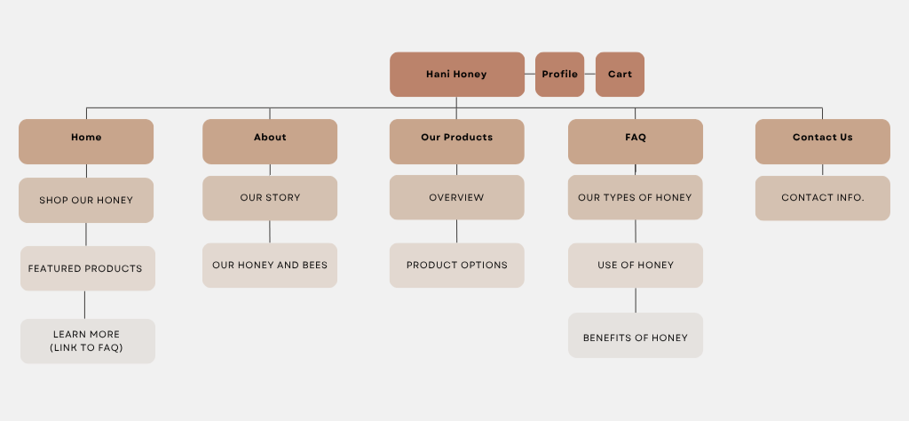
Information Architecture diagram showing Hani’s website structure.
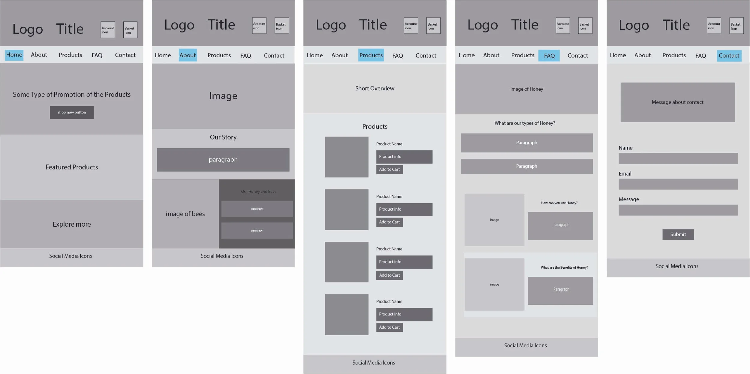
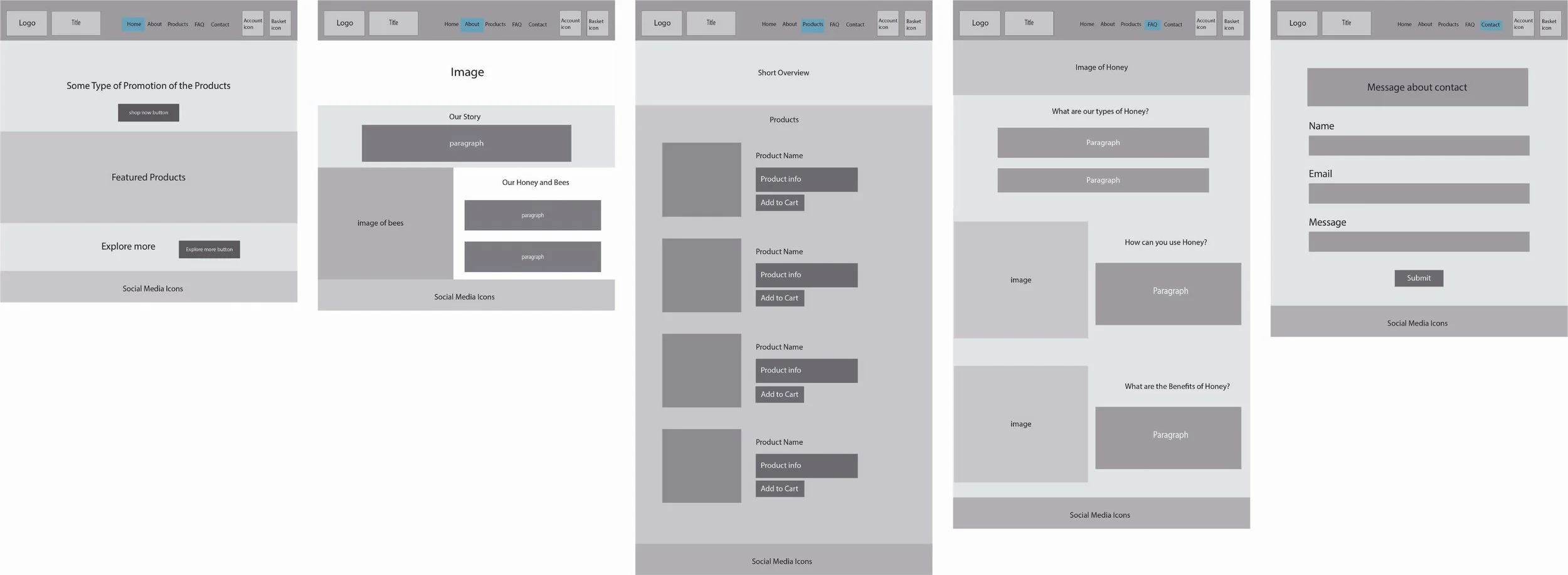
I created the wireframes in Adobe Illustrator to plan out the layout and structure of the website. The design focused on keeping a simple interface and a smooth user experience. During this phase, I gathered feedback through peer reviews and made revisions to improve clarity and flow. The main critique from fellow designers was to increase the size of the account and basket icons, which helped enhance visibility and overall usability.
Wireframes
Mobile Wireframes
Desktop Wireframes
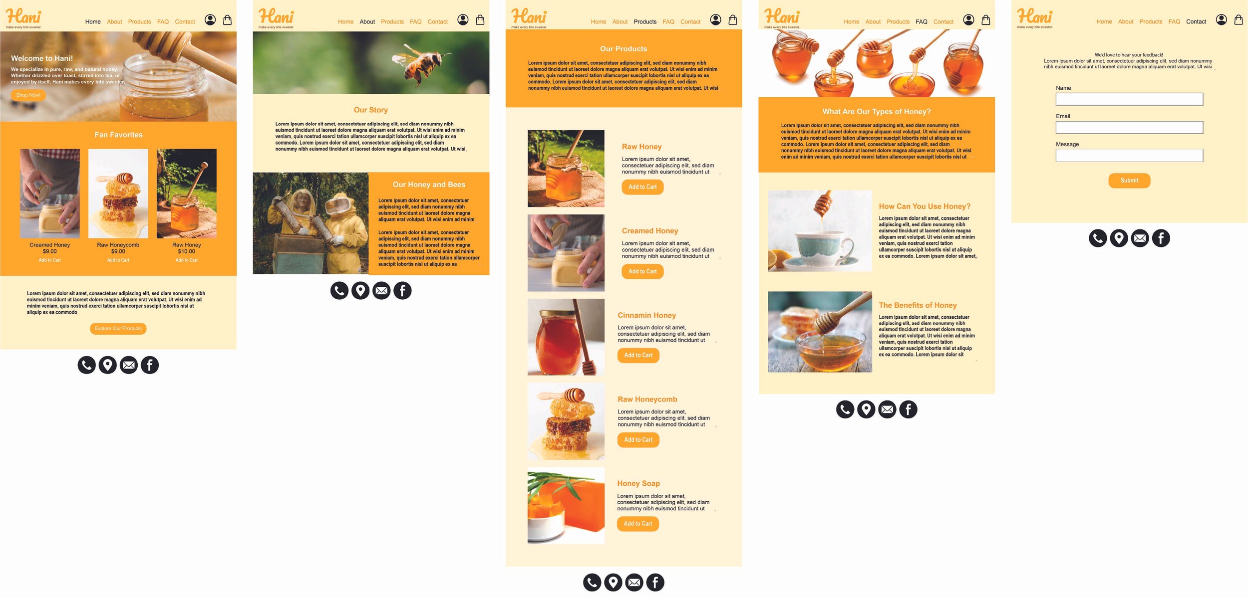
The UI mockups were created by applying visuals, colors, and typography to the wireframes, focusing on a clean and user-friendly design. The goal was to reflect the warmth of the brand.
User Interface Design
Mobile Wireframes
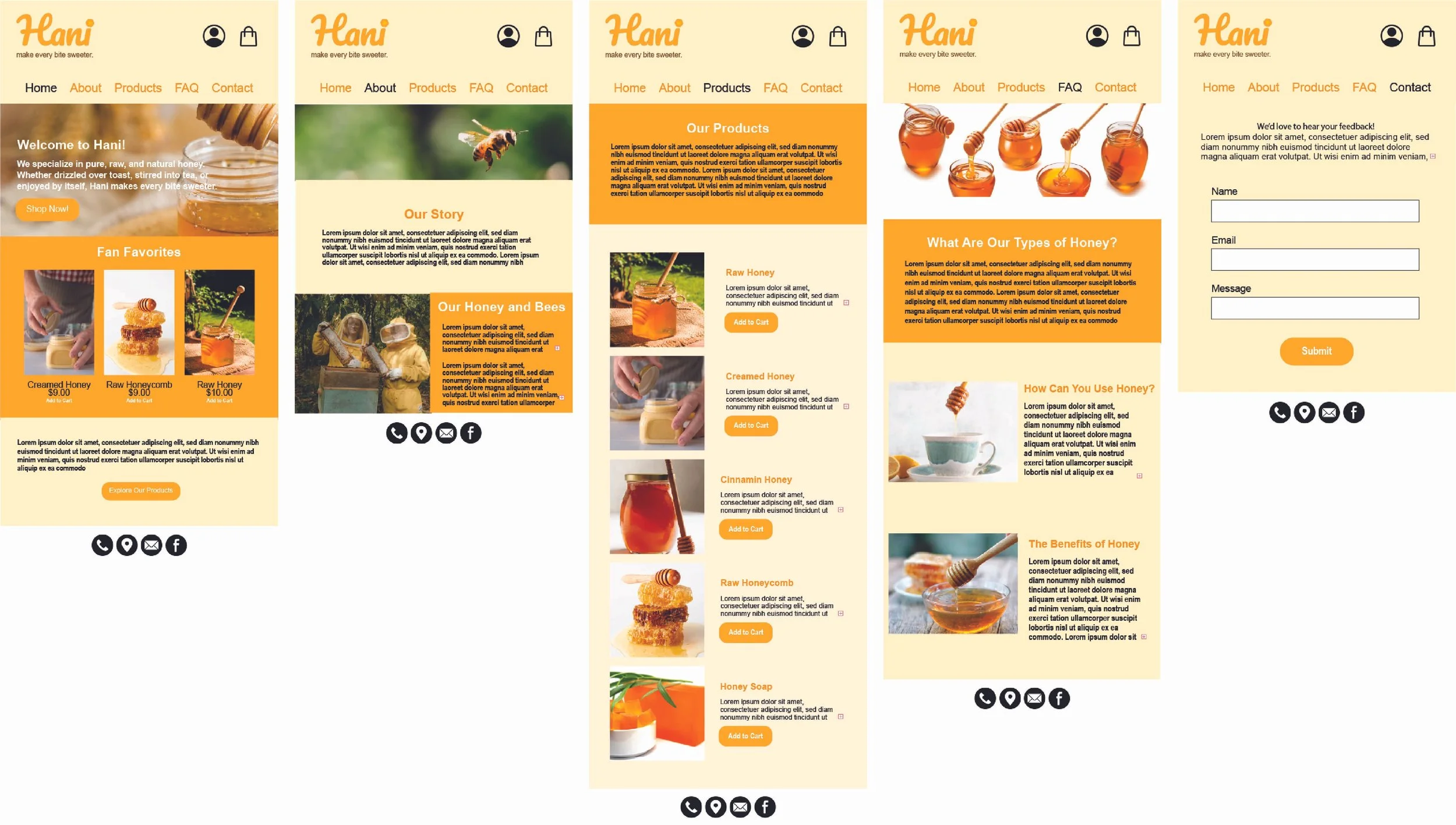
Desktop Wireframes
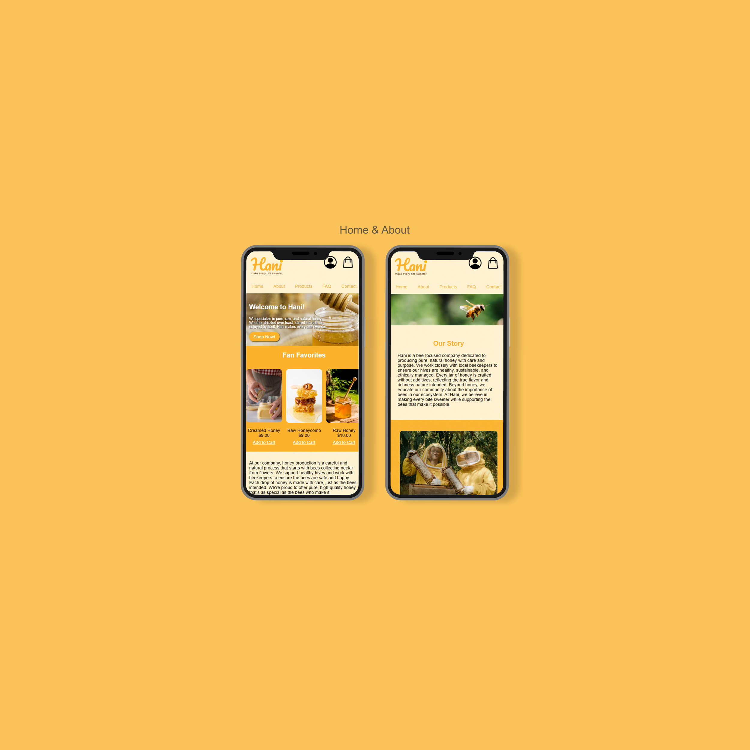
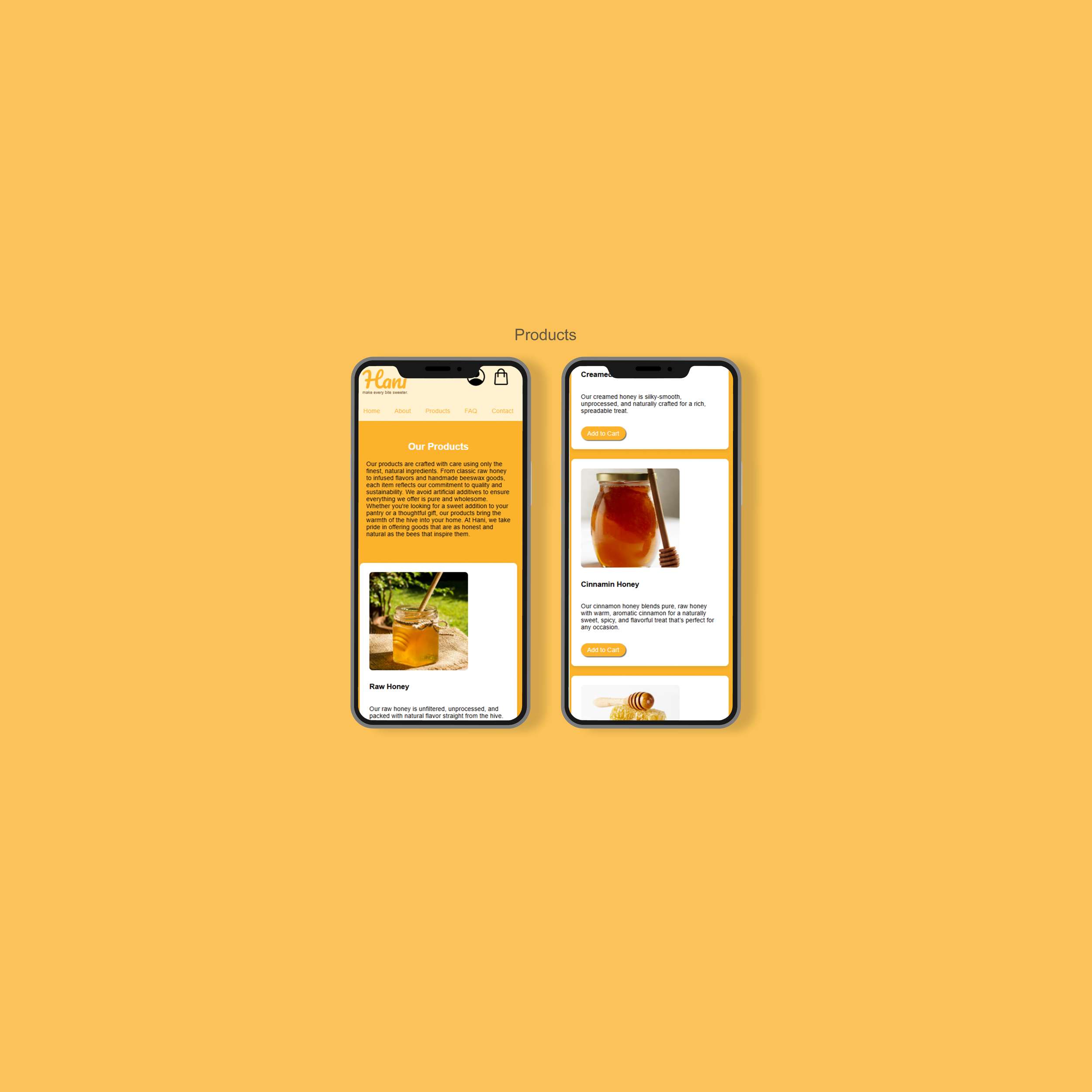
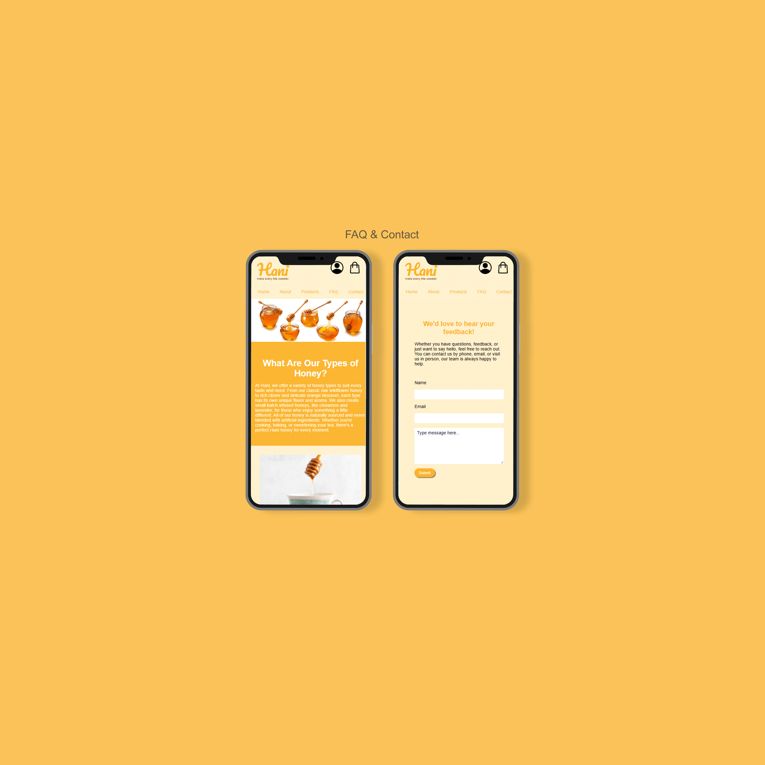
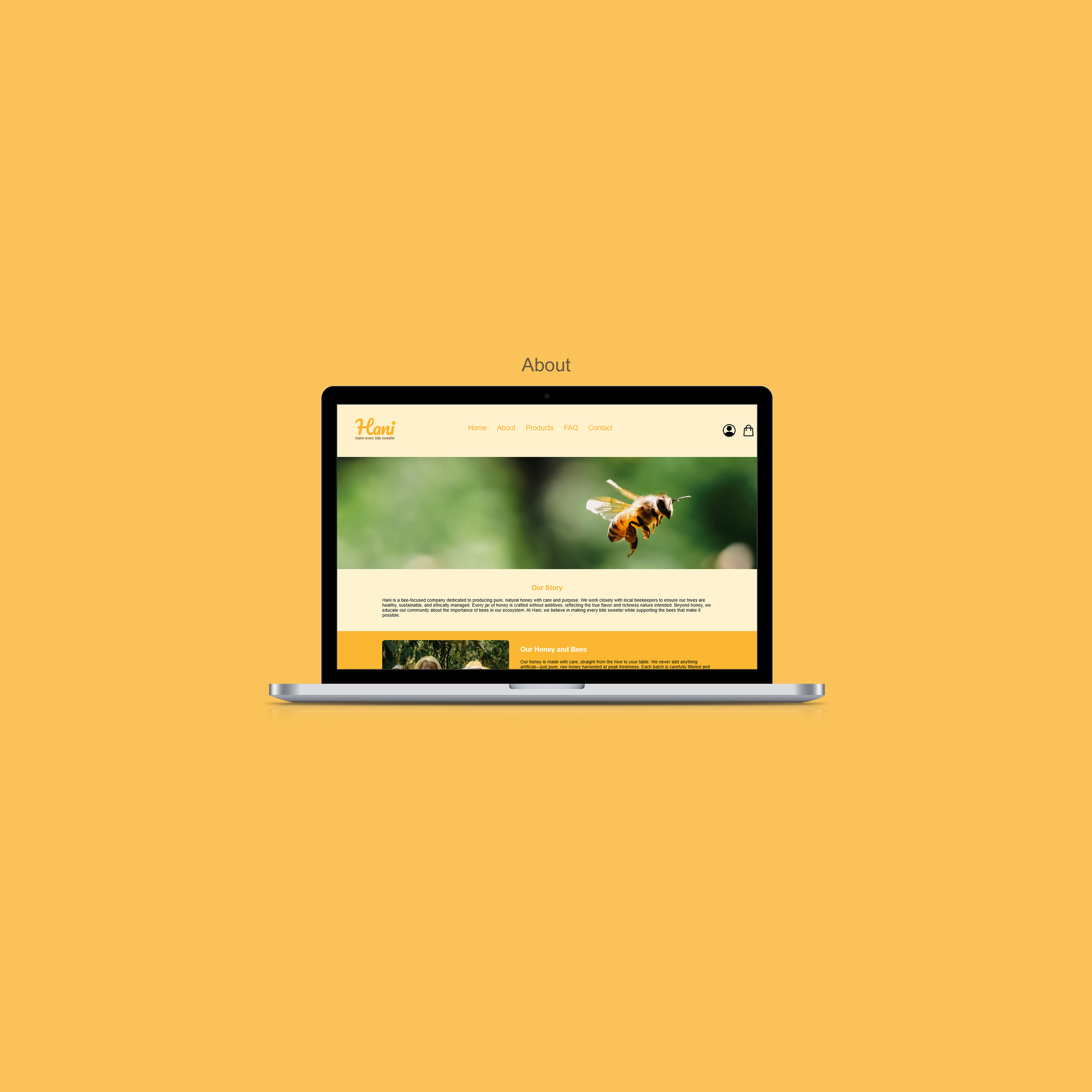
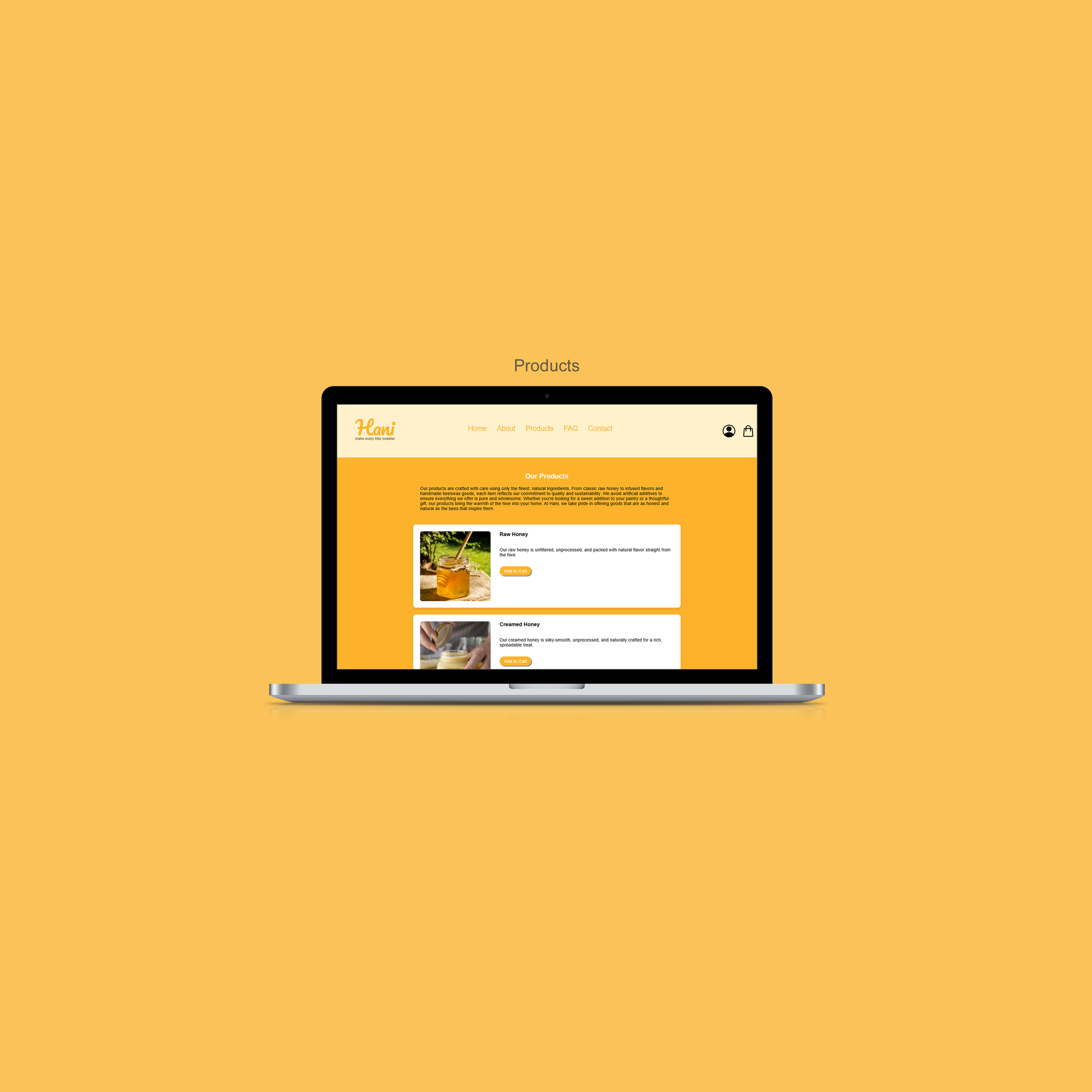
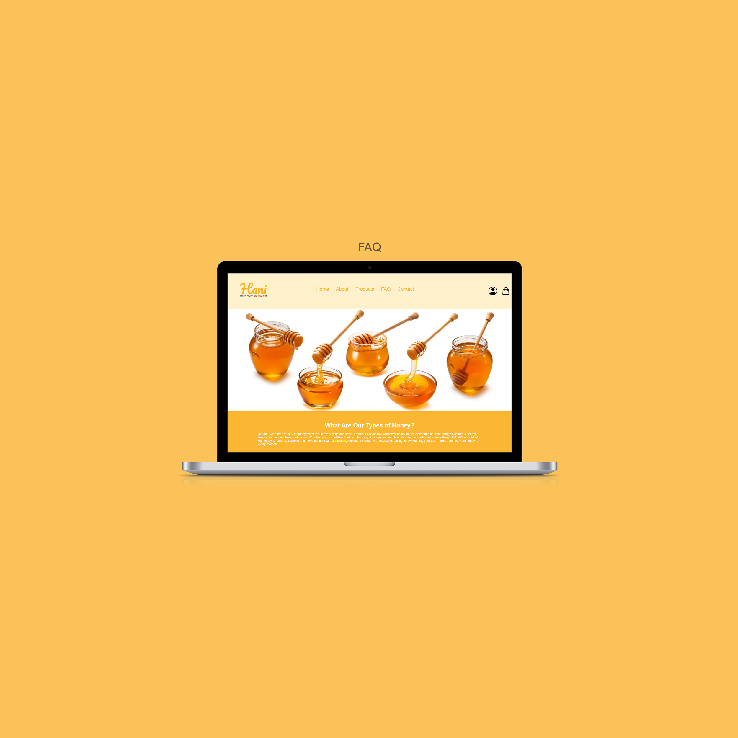
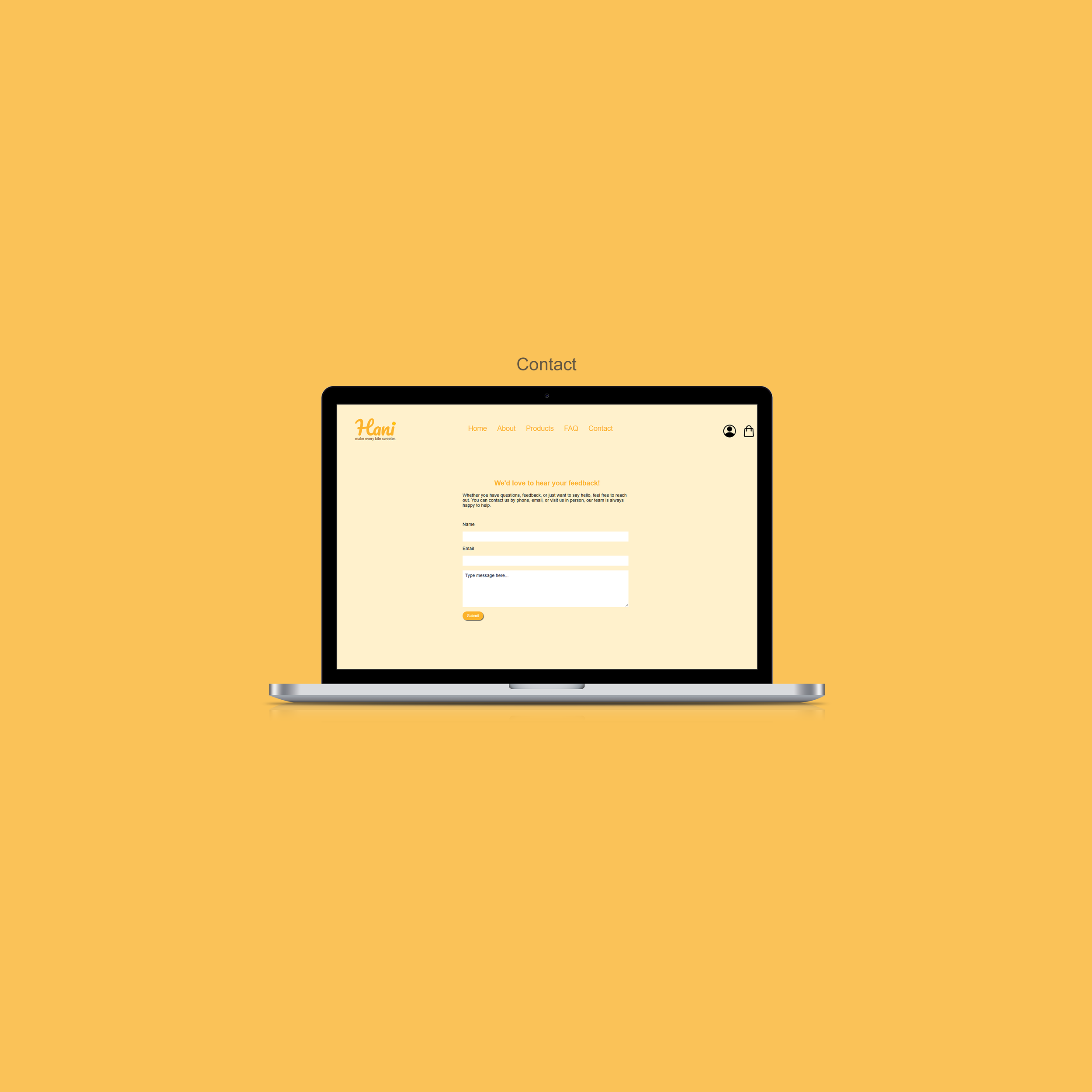
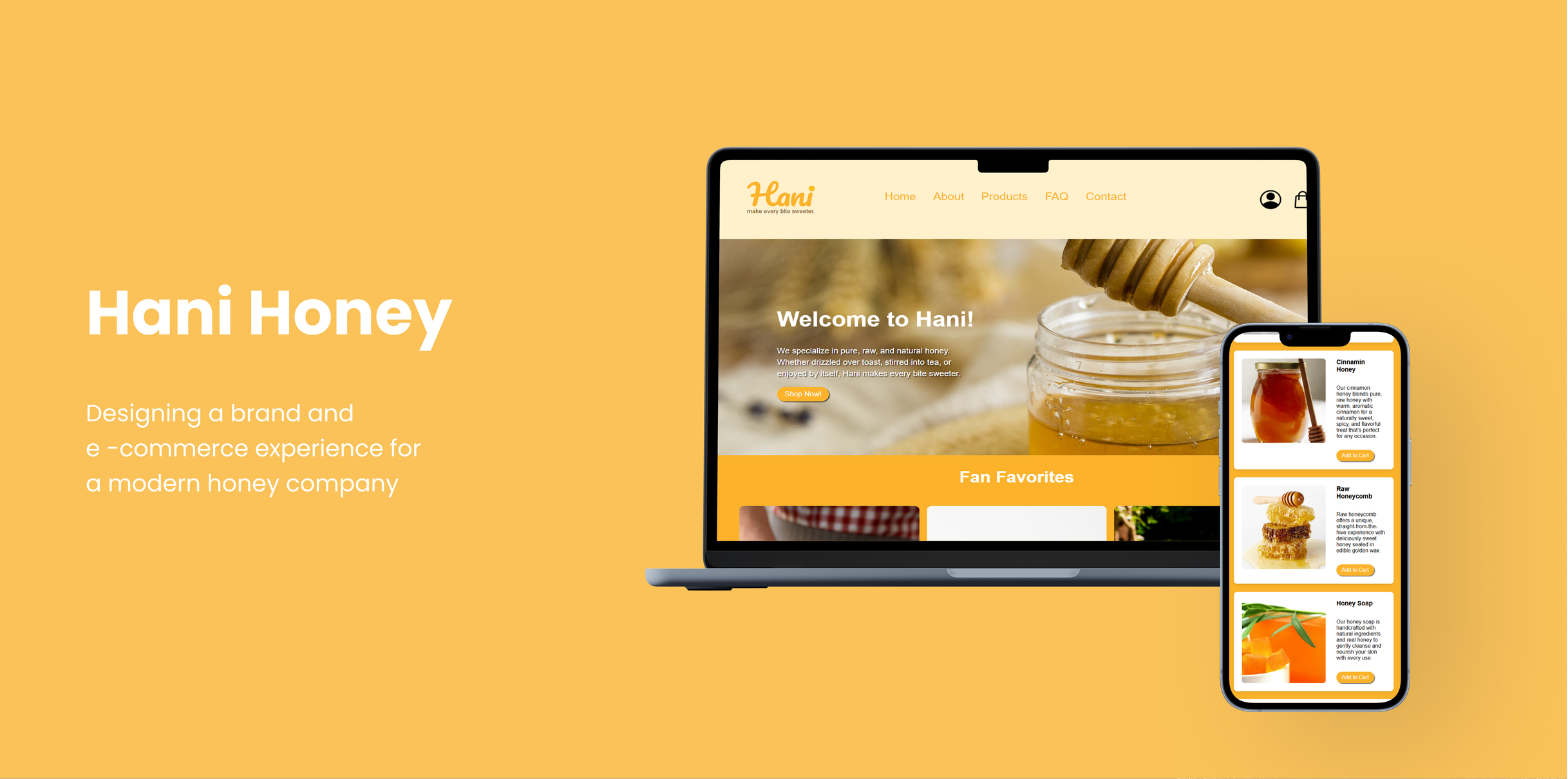
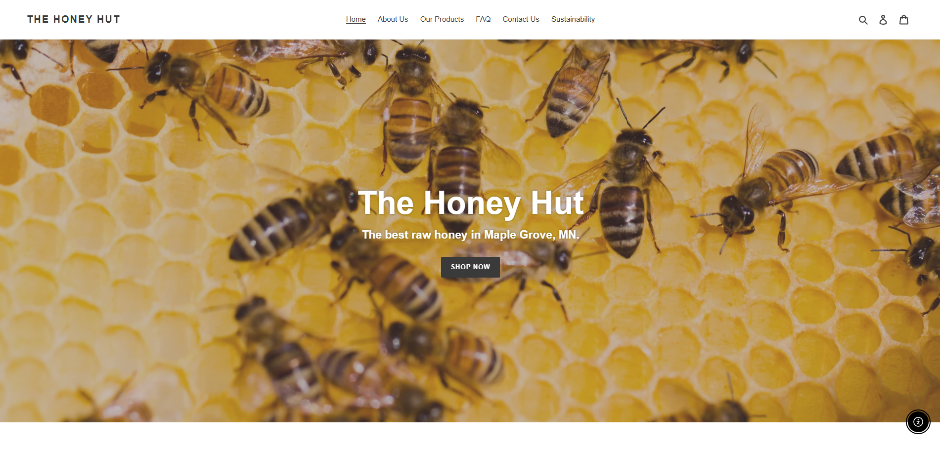
Final Design
For the final design, I refined several elements across the website to improve visual consistency, usability, and overall appeal.
Final Design Updates
Homepage:
Added an underline to “Add to Cart,” rounded product images, and centered navigation for a cleaner, more user-friendly look.
Products:
Added white backgrounds behind products and used a full orange background to create stronger contrast and highlight items.
FAQ:
Swapped the placement of text and photos for better flow and readability.
Contact:
Redesigned with a more modern, familiar layout to make it easier for users to find contact information.
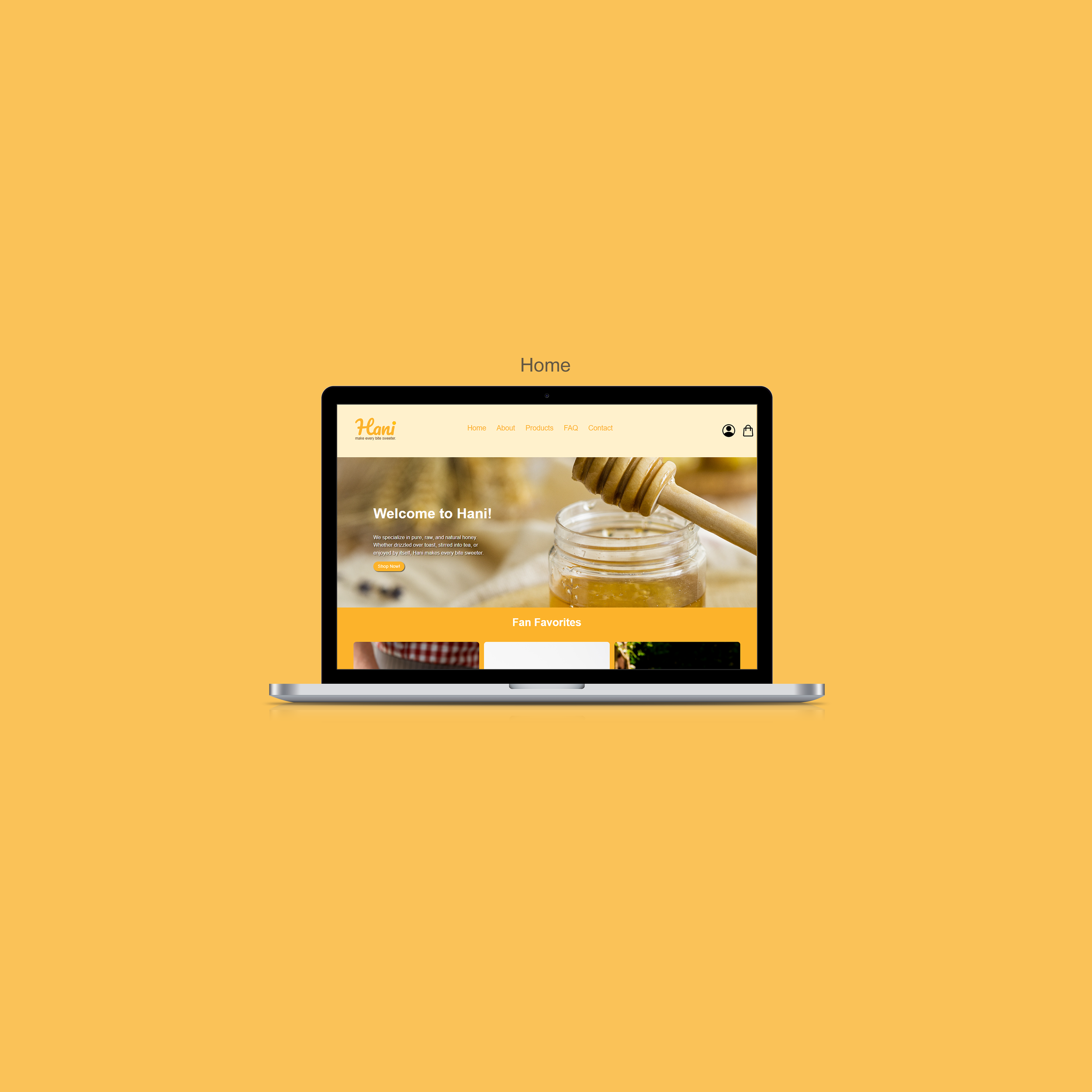
Bringing Hani’s Website to Life
The final website was built with valid HTML5 and CSS3, ensuring a clean, responsive design across desktop and mobile devices. The site reflects Hani’s brand identity through simple navigation, clear product displays, and a warm, inviting tone.