Wellness Shack
A refreshed brand identity and brochure
A responsive web design project for a fictional North Dakota honey company focused on branding, storytelling, and user experience.
Background
A local Eau Claire nonprofit centered on mental health recovery and peer support. They sought a modern rebrand and a clear, accessible brochure to better communicate their mission.
Challenges
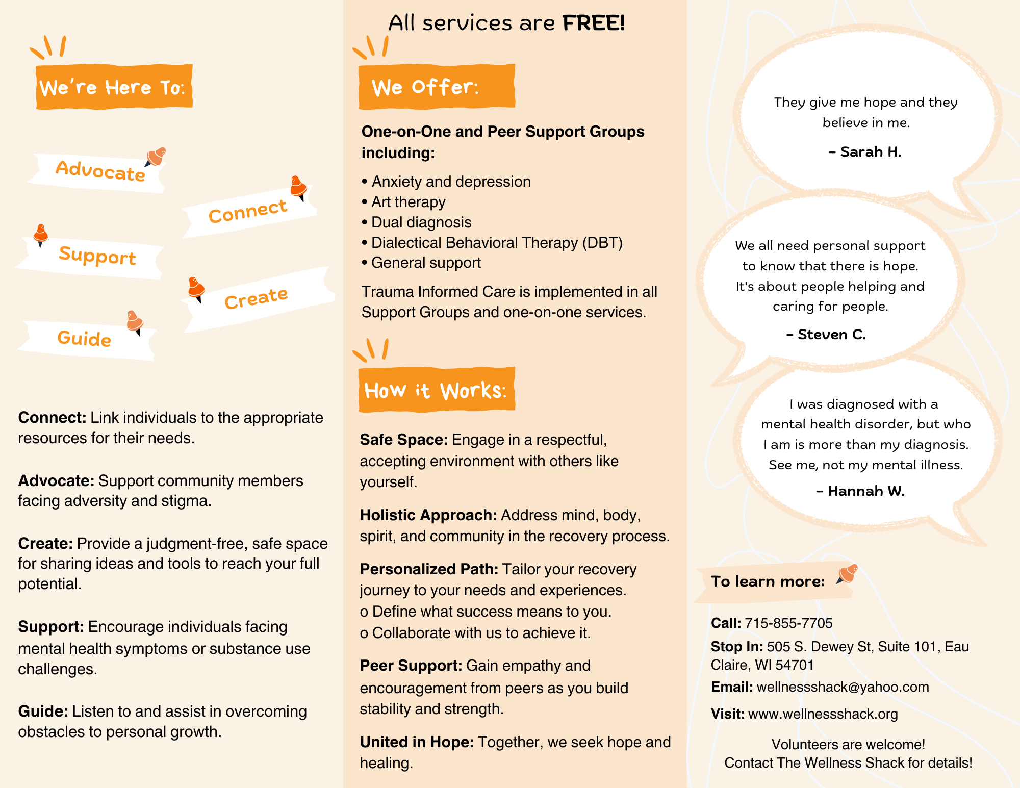
One challenge I faced was fitting all of the information they wanted into a clear, organized brochure. I had to decide what to highlight and how to arrange it so the design stayed clean and readable.
Tools
Adobe Illustrator & InDesign
Role
Logo & Print Design
What I Accomplished
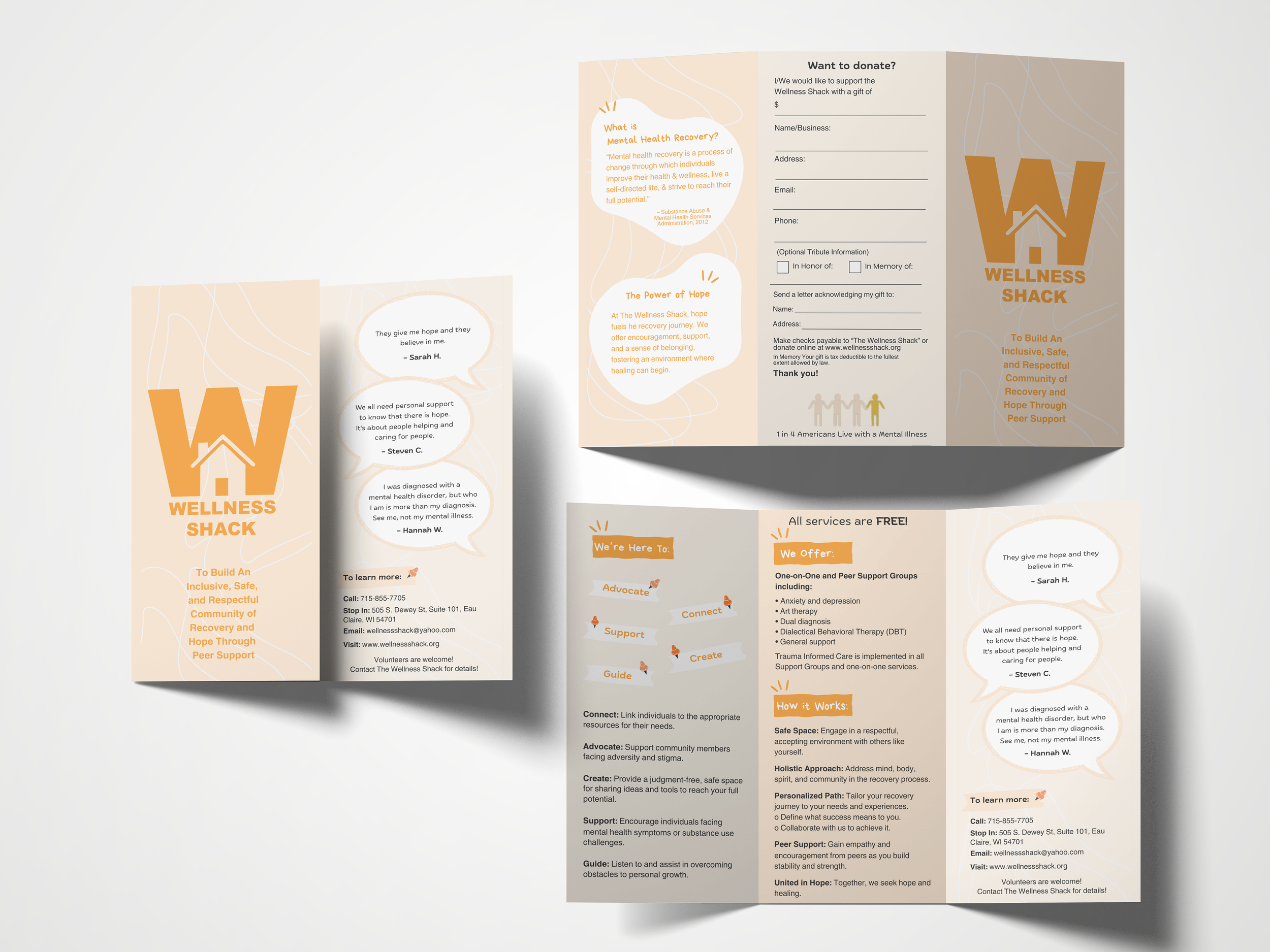
I created a brochure that is clear, organized, and visually balanced. The layout uses thoughtful negative space, peaceful colors, and calm composition to make the information easy to read while still feeling welcoming and approachable.
Goal
Create a welcoming identity and brochure
01 Define + Research
Project Brief & Analysis
The first phase of the project involved researching the organization and creating a project brief and analysis. My goal was to reshape the brand into something clearer, friendlier, and more visually connected to the warmth of their services. After reviewing competitors, I noticed that using a strong, bold color made their branding feel complete and confident, which guided my direction for the refreshed identity. This brief helped me identify what wasn’t working and where the design needed more clarity.
02 Brand Identity
Project Brief & Analysis
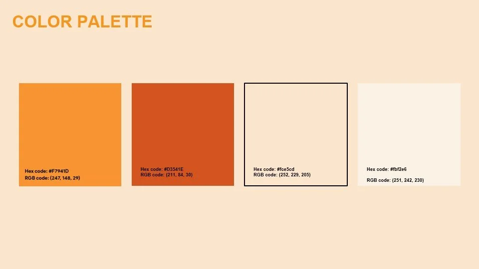
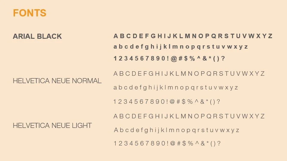
My next step was defining the new brand identity. This included selecting a calm color palette, choosing friendly and readable typography to refresh the logo and brand.
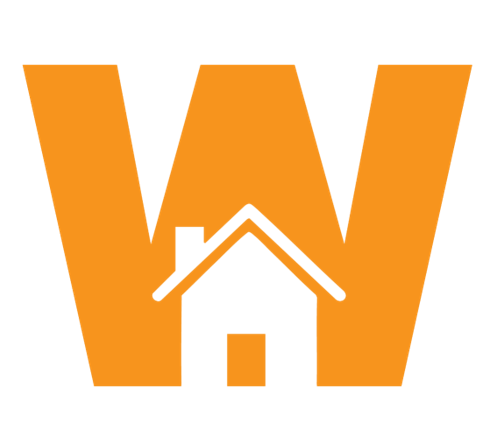
Orange was chosen for the color palette because it embodies happiness, warmth, and a well-balanced mind. Unlike the typical blue and green often seen in clinic logos, orange stands out as bright, lively, and uplifting, reflecting our focus on mental health and creating a welcoming, positive space for the community.
The fonts were chosen for their simplicity and airy feel, creating a gentle look that supports the overall sense of calm.
03 Final Design
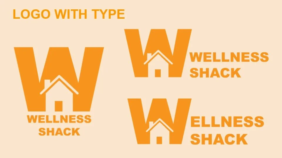
Logo Design
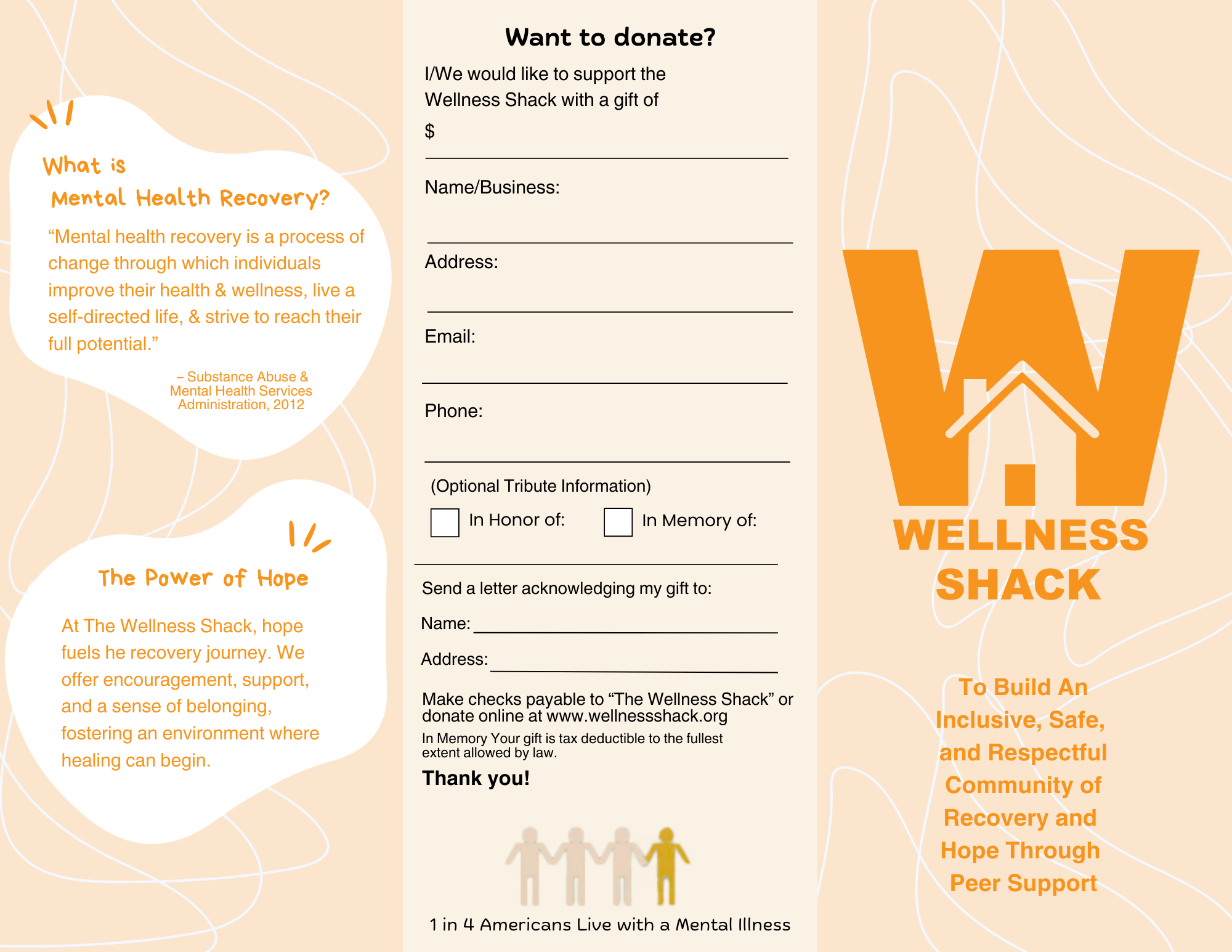
The logo focuses on the “W” for wellness and the concept of a safe space, I wanted to create something simple, effective, and engaging. Simplicity not only keeps the design cost-efficient but also ensures it’s impactful and memorable.
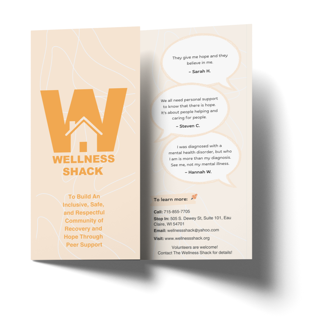
Brochure Design
The brochure design uses smooth, flowy shapes and gentle linework to create a warm, welcoming atmosphere. These organic forms bring softness to the layout and help balance the denser text sections. Paired with a calm, neutral color palette, the visuals create a sense of openness and approachability that aligns with the organization’s mission.
Not pictured here is the printed brochure. I printed a physical copy and delivered it to the organization’s leadership so they could review and test it in real use.