A responsive web design project for a fictional North Dakota honey company focused on branding, storytelling, and user experience.
Overview
The Process:
Context - The Problem - Research - Brainstorming - User Flow - Design Decisions - Final Flow- Prototype - Takeaways
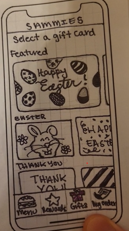
This project focuses on designing a mobile ordering experience for Sammie’s, a sub shop that partners with the Humane Society to support animal welfare.
Challenges
A challenge in this project was designing a flow for sending gift cards across different delivery methods. Since the process required several inputs like recipient details, delivery choice, custom messages, and payment, the biggest difficulty was keeping the interface uncluttered.
Role
UX/UI Designer, User Researcher, Prototyping & Interaction Designer
What I Accomplished
My design makes the experience of purchasing a gift card more personal and meaningful by giving users flexibility in how they send the card, when it’s delivered, the message they include, and the design they choose. This made the users more engaged and excited to purchase a gift card.
Timeline
6 Weeks, 2025
Tools
Adobe Illustrator, Balsamiq, & Figma
Context
About the Project
Sammie’s is a digital-first sub shop that partners with the Humane Society, offering a modern, delivery-focused food experience. The app allows users to easily browse, order, and interact with the brand. I was tasked with designing a gift card flow that would increase engagement while making the experience feel more personal and meaningful.
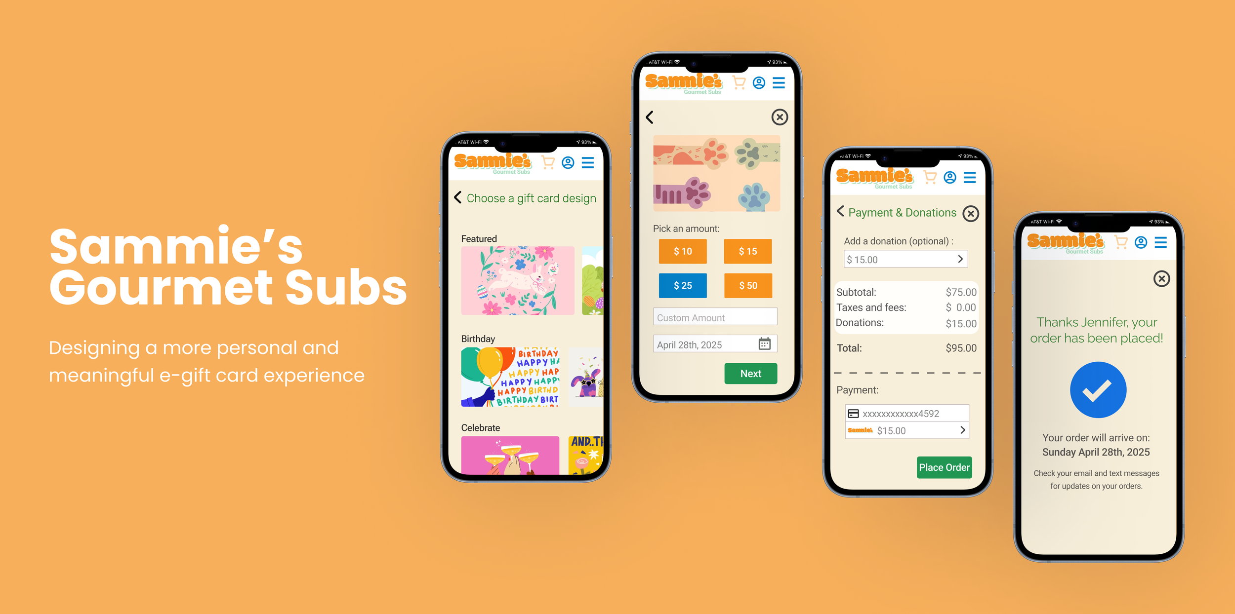
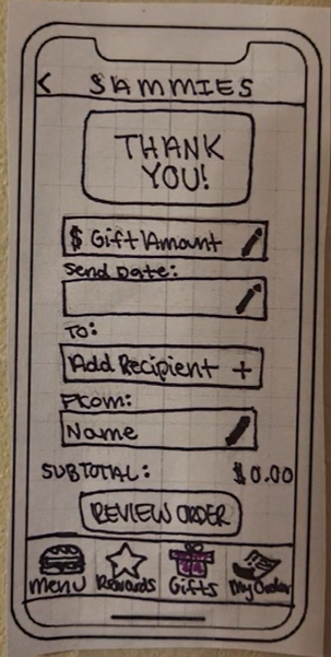
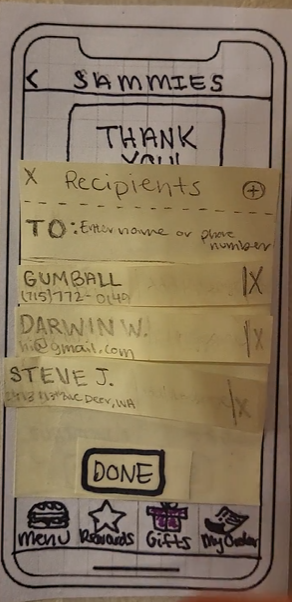
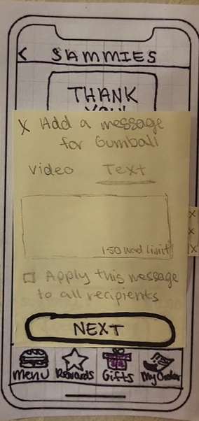
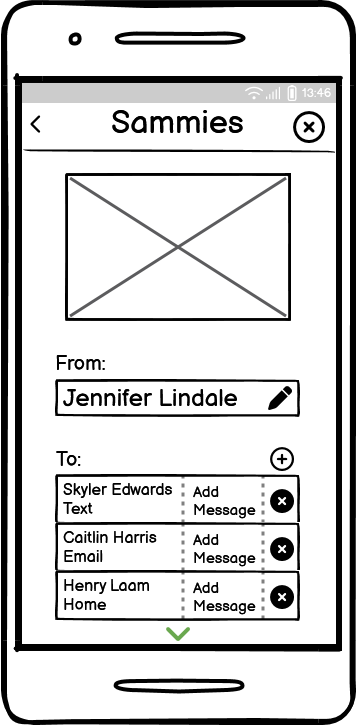
Final Gift Card Flow
Final Screens
Let’s see how I got here 👇🏼
Understanding Users
The Problem
By talking to potential users, I found that personalization options for gift cards on mobile are often limited. Users are usually restricted in how they can customize the experience, such as choosing delivery methods, adding meaningful messages, or selecting designs. This can make the process feel more transactional and less thoughtful.
Problem Statement: Users need a more personalized gift card experience on mobile, as current options feel limited and not very meaningful.
The Goal
Design a mobile gift card experience that is simple, flexible, and personalized, allowing users to easily create and send meaningful gift cards.
“How Might We’s”
How might we make sending a gift card feel more personal and meaningful?
How might we give users more flexibility in how and when they send a gift card?
How might we simplify the gift card process?
How might we design an experience that feels engaging rather than transactional?
I conducted user interviews and reviewed competitor gift card experiences to understand common patterns and gaps. Across all of the competitors, I observed consistent strengths in usability, simplicity, clear purpose, and a seamless purchase experience. My goals were to:
Understand how users currently purchase and send gift cards on mobile
Identify what makes a gift card experience feel personal and meaningful
Analyze competitor solutions to identify gaps and opportunities
Key Findings
Personalization options are often limited
“I wish I could customize it more—it usually feels pretty basic.”
Many experiences don’t feel special or important
“It kind of just feels like sending money, not really a gift.”
Competitors lack Flexibility
Too many inputs at once can feel overwhelming on mobile
User Research & Competitive Analysis
Understanding the Problem
Personas and Empathy Mapping
Empathizing with the Target Users
To better understand the target users, I created personas and used empathy mapping to better understand what users think, feel, and need throughout the experience
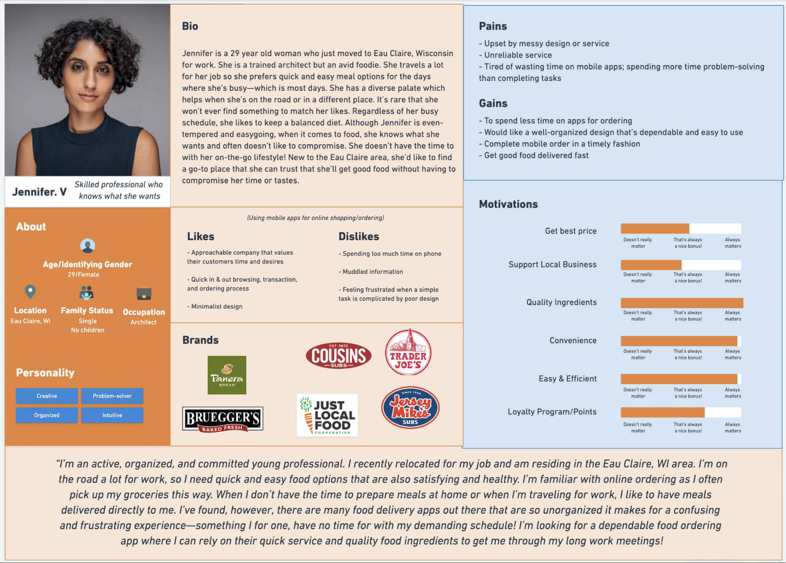
Persona: Jennifer
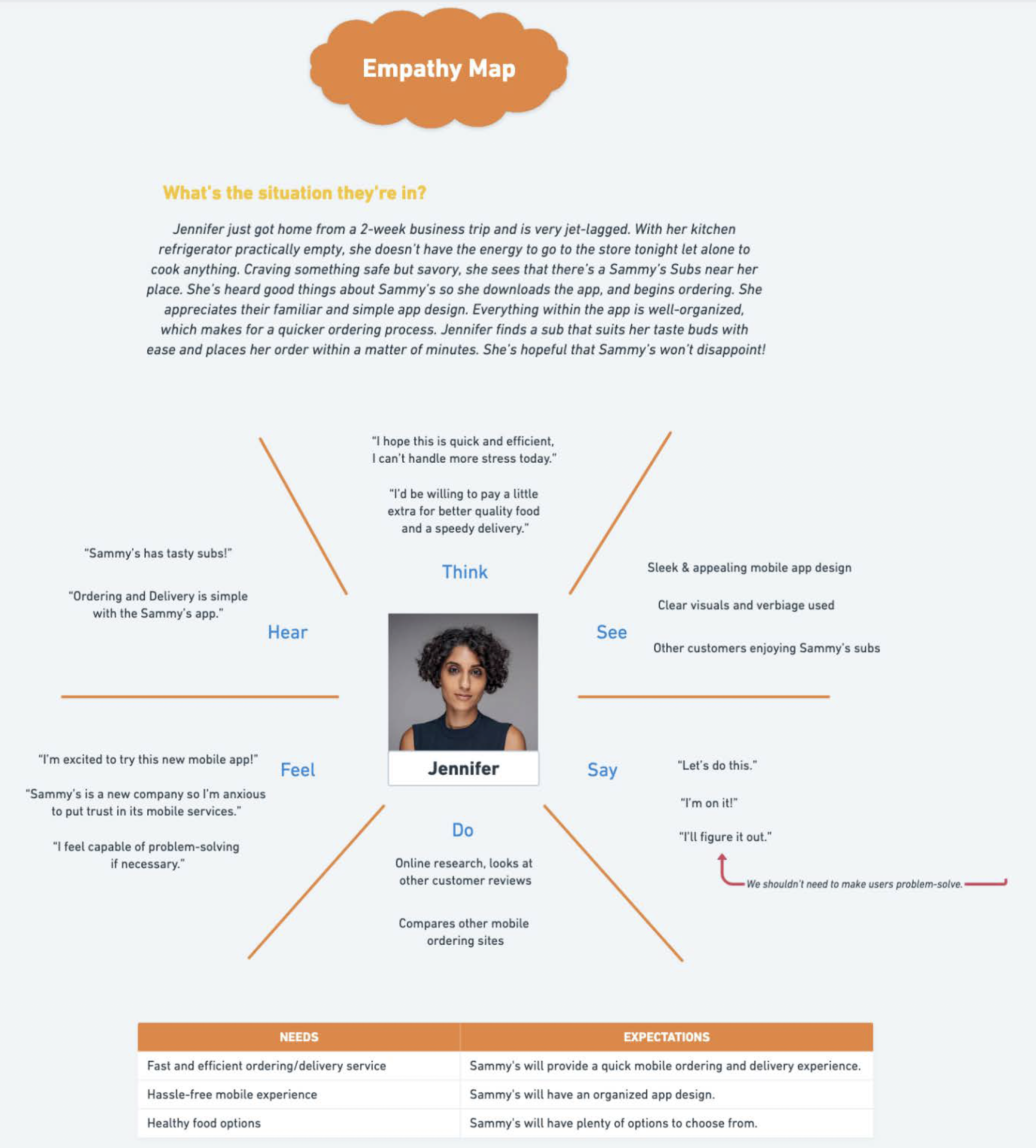
Empathy Map: Jennifer
Brainstorming
Exploring Solutions
I met with a group of designers and brainstormed 5 different features of how to make the experience more thoughtful and tailored to each user.
1. Gift Card Design Selection + Flexible Amount Selection + Custom Send Date/Time
Different design options let users choose a style that fits the recipient or occasion, making the experience feel more customized. Users can insert a custom amount, rather than a preset amount. This gives them more control and making the gift feel more intentional.
Low-Fidelity Sketches of Gift Card Design Selection
Low-Fidelity Sketches of Flexible Amount Selection + Custom Send Date/Time
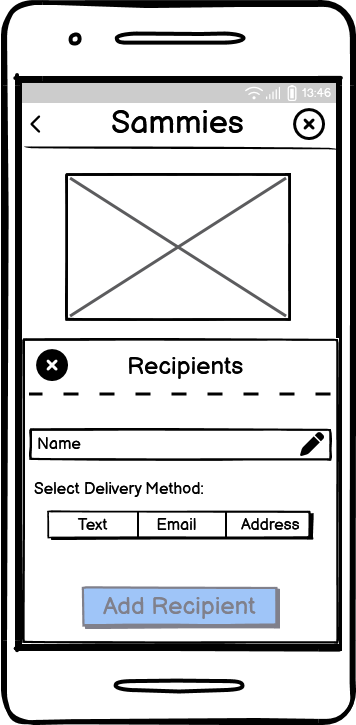
2. Delivery Options + Custom Message
Offering text, email, and physical mail gives users the flexibility to choose a delivery method that feels most appropriate for the occasion and recipient. Adding a personal message allows users to express intention and makes the gift feel less transactional.
Low-Fidelity Sketches of Multiple Delivery Options
Low-Fidelity Sketches of Custom Message
3. Donation on Behalf of Recipient
Adding an optional donation allows users to extend the impact of the gift, making it feel more intentional and connected to a cause.
Low-Fidelity Sketches of Donation on Behalf of Recipient
Usability Testing
Feedback, Iterations, & Micro-interactions
I created low-fidelity wireframes and completed usability tests with real users and to observe how they moved through the prototype. Feedback from group design meetings and user testing helped me identify what was working, what felt confusing, and what needed to be improved before moving into high-fidelity design.
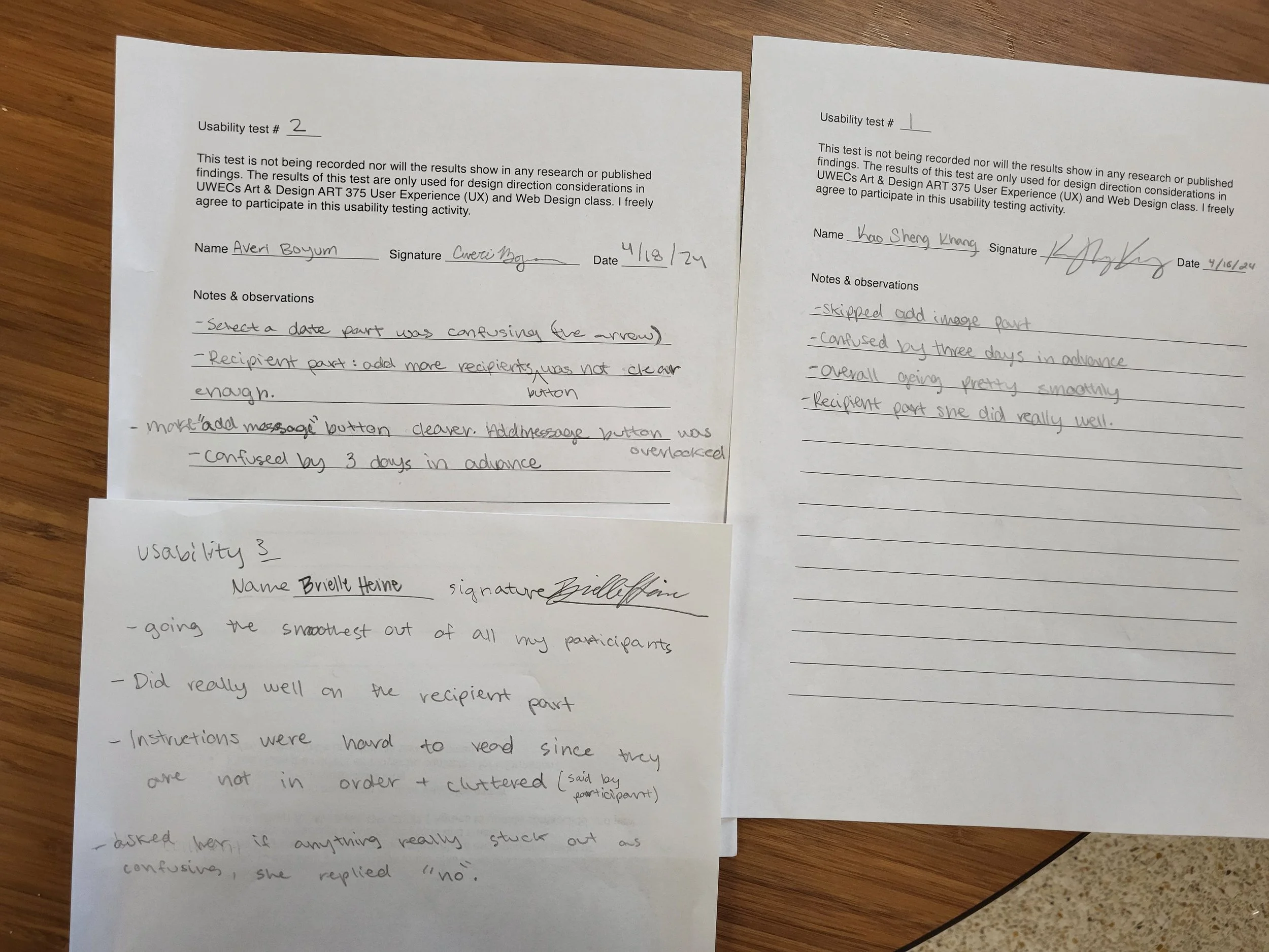
User Test Notes
Design Decisions
1. Split complex steps into separate screens
I separated the gift amount and send date, as well as the sender and recipient information, into different steps to make the process feel more manageable and reduce cognitive load. I also redesigned the amount selection to include quick select options, as typing in an amount adds friction and slows users down. Providing preset options allows users to make faster decisions while still offering a custom input for flexibility.
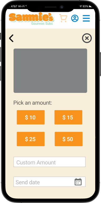
Gift Amount + Send Date
2. Simplified delivery and integrated messaging into the flow
I removed the need for users to select a delivery method by allowing them to enter an email, phone number, or address directly, reducing unnecessary steps and making it a lot simpler. I also integrated the message into this step after noticing users were missing the message button in earlier designs. By making it part of the core flow, users are naturally prompted to include a message, ensuring they don’t overlook an important part of the experience.
Old Design: Delivery Method
Old Design: Add Message
Old Design: Donation
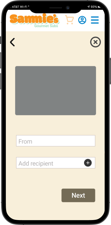
From + Recipient
2. Simplified delivery and integrated messaging into the flow
I removed the need for users to select a delivery method by allowing them to enter an email, phone number, or address directly, reducing unnecessary steps and making it a lot simpler. I also integrated the message into this step after noticing users were missing the message button in earlier designs. By making it part of the core flow, users are naturally prompted to include a message, ensuring they don’t overlook an important part of the experience.
→
→
→
→
→
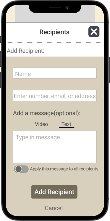
New Design: Delivery Method+ Add Message
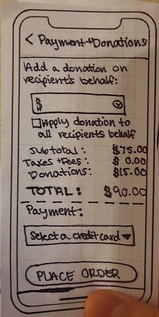
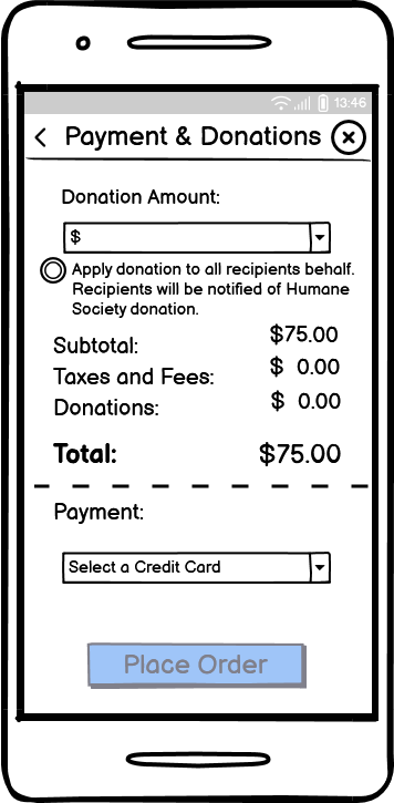
3. Organized the donation
I redesigned the donation feature as a pop-up instead of keeping it within the main payment screen after user testing showed the page felt cluttered and overwhelming. This allows users to focus on completing their purchase first, while still giving them the option to add a donation in a more intentional and less distracting way.
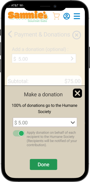
New Design: Donation
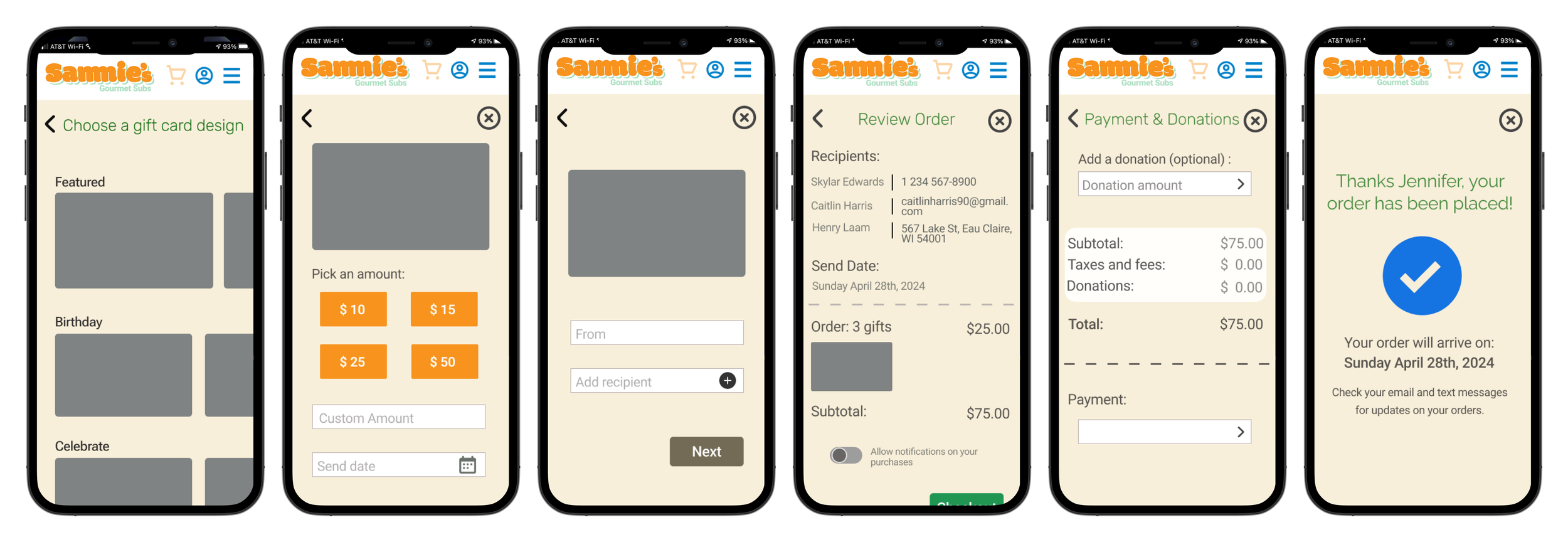
Final Flow
Final Interaction
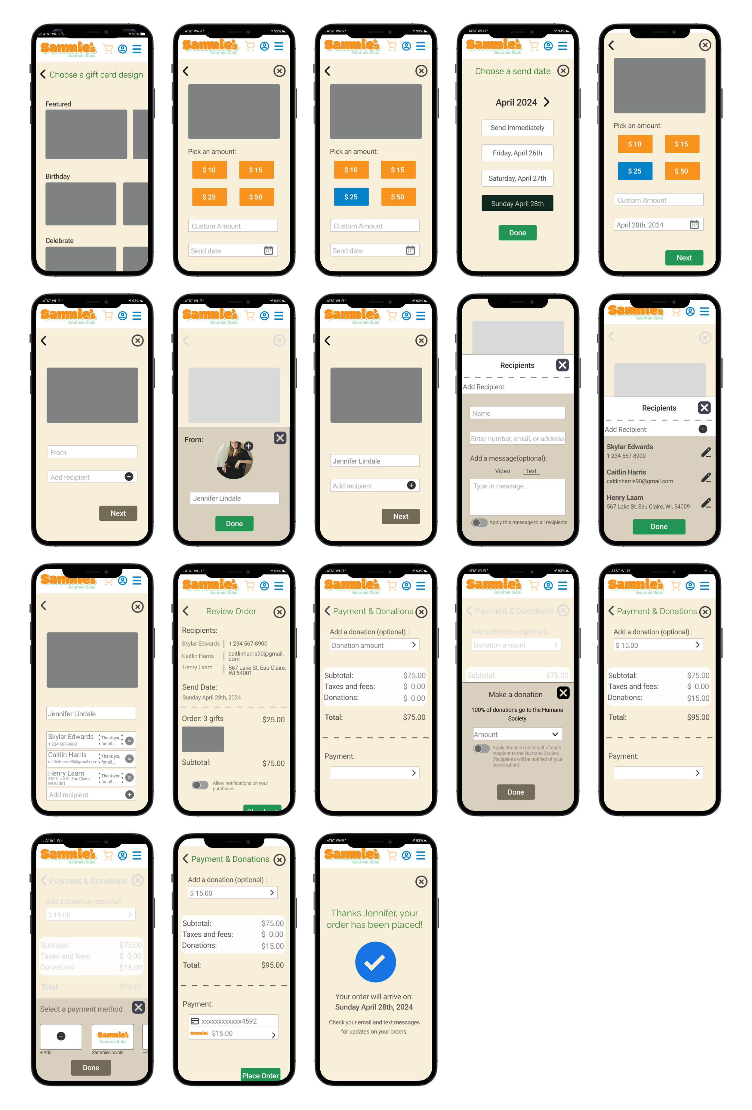
Interact with Screens
Prototype
Conclusion
Reflection & Takeaways
This project taught me the importance of designing with clear intention behind every decision. Throughout the process, I learned that creating a visually appealing design isn’t enough. Each interaction needs to solve a real user problem and make the experience easier and more thoughtful. By focusing on reducing friction, simplifying the flow, and making the experience feel more personal, I was able to create a gift card flow that better supports the user.
What are the next steps?

More user testing

Enhancing personalization

Optimizing donation experience