Timeline
September - December 2025 (12 weeks)
My Role
Solo student project for User Experience and Web Design Course
CONTEXT
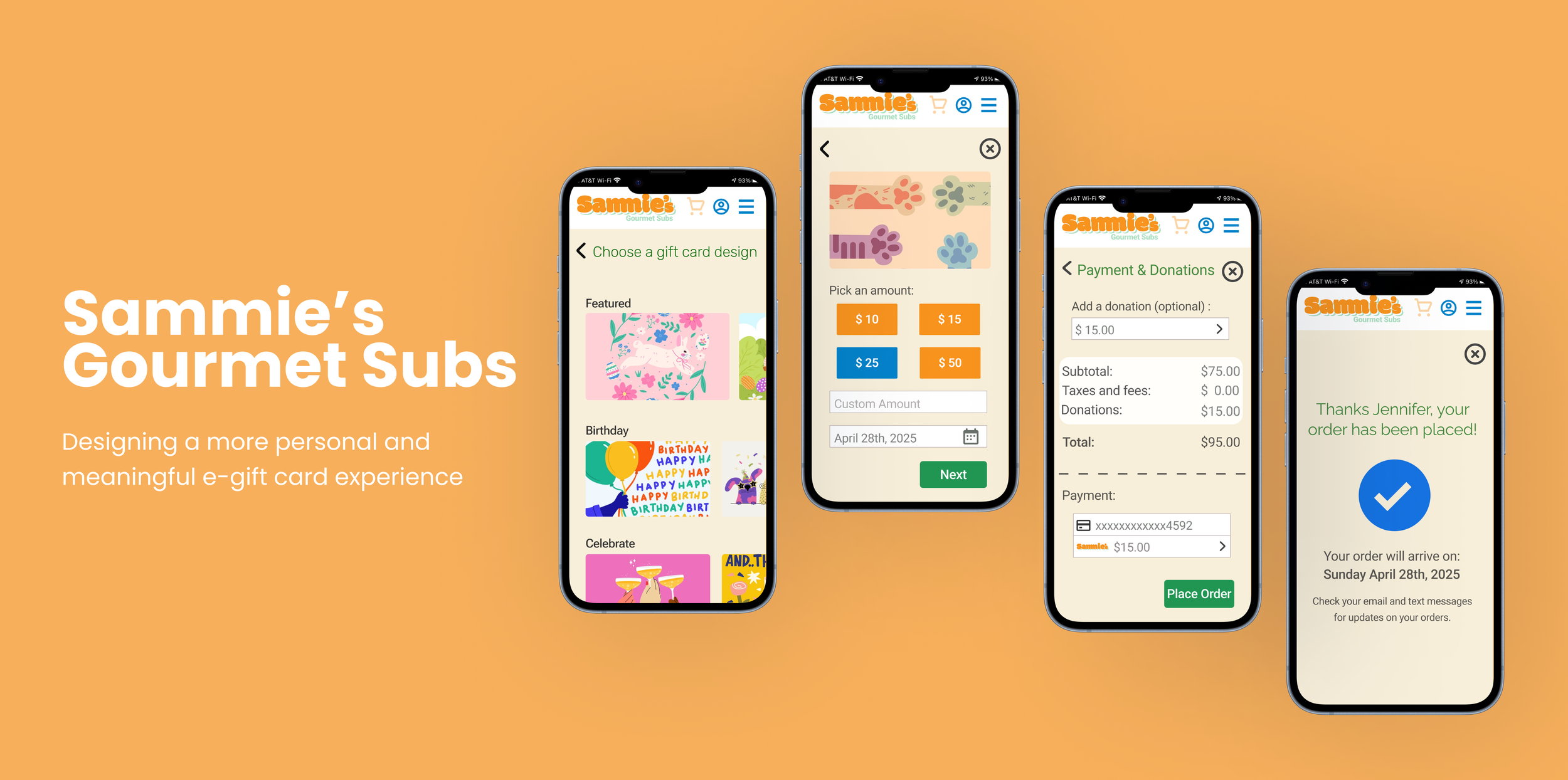
About the Project
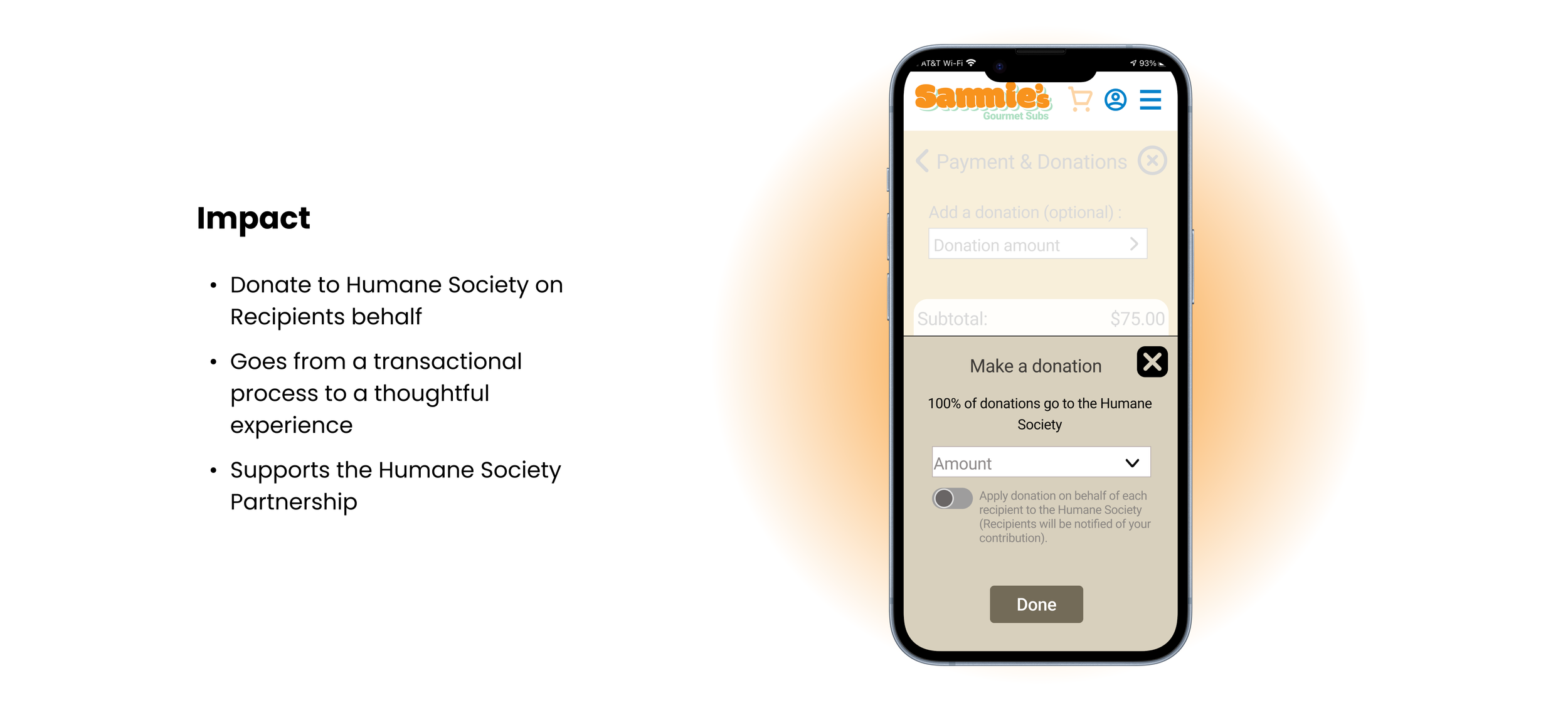
Sammie’s is a digital-first sub shop that partners with the Humane Society, offering a modern, delivery-focused food experience. The app allows users to easily browse, order, and interact with the brand. I was tasked with designing a gift card flow that would increase engagement while making the experience feel more personal and meaningful.
PROBLEM
Mobile e-gift card experiences lack personalization, making it feel less meaningful.
By talking to potential users and competitor research, I found that personalization options for gift cards on mobile are often limited. Users are usually restricted in how they can customize the experience, such as choosing the amount, delivery methods, adding meaningful messages, or selecting designs. This can make the process feel more transactional and less thoughtful.
SOLUTION
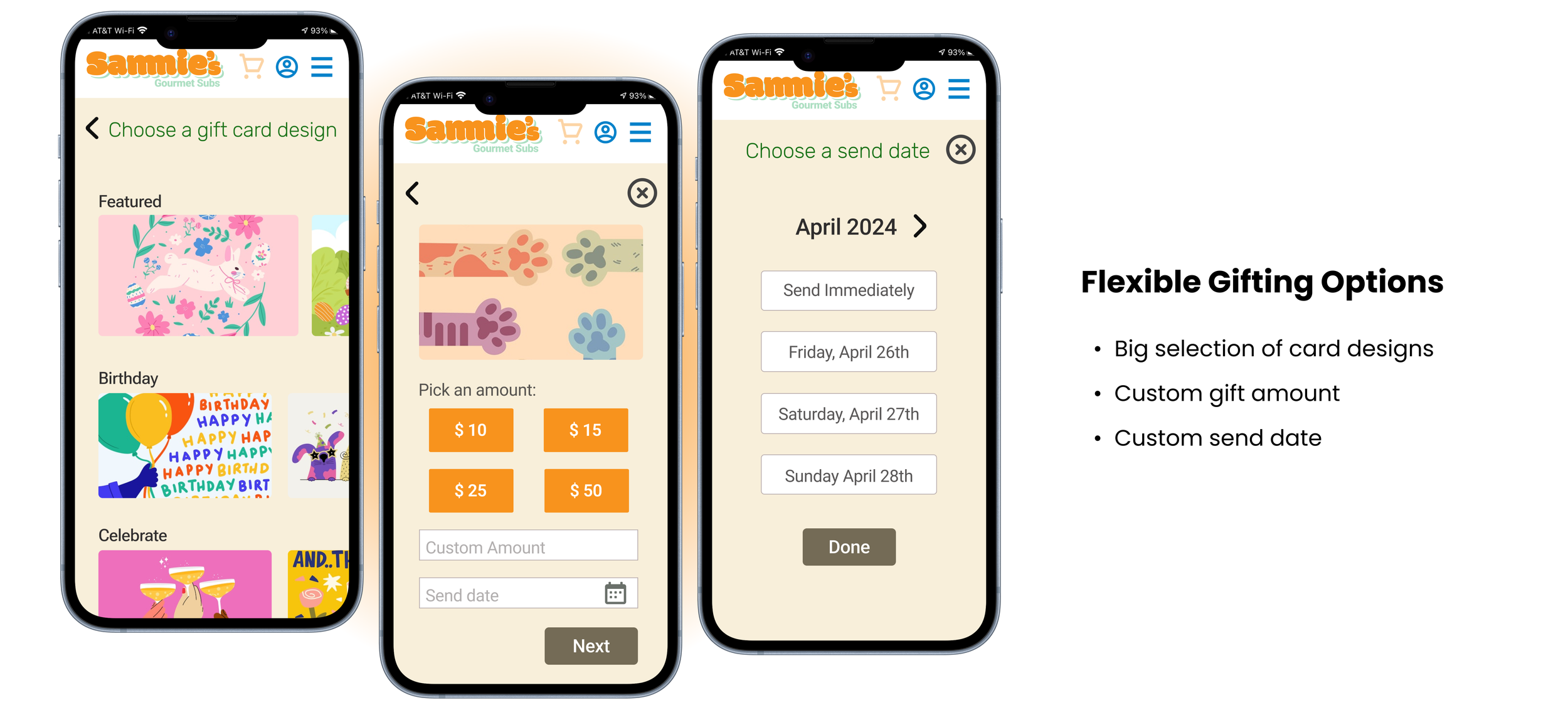
Allow users more ways to customize their e-gift cards.
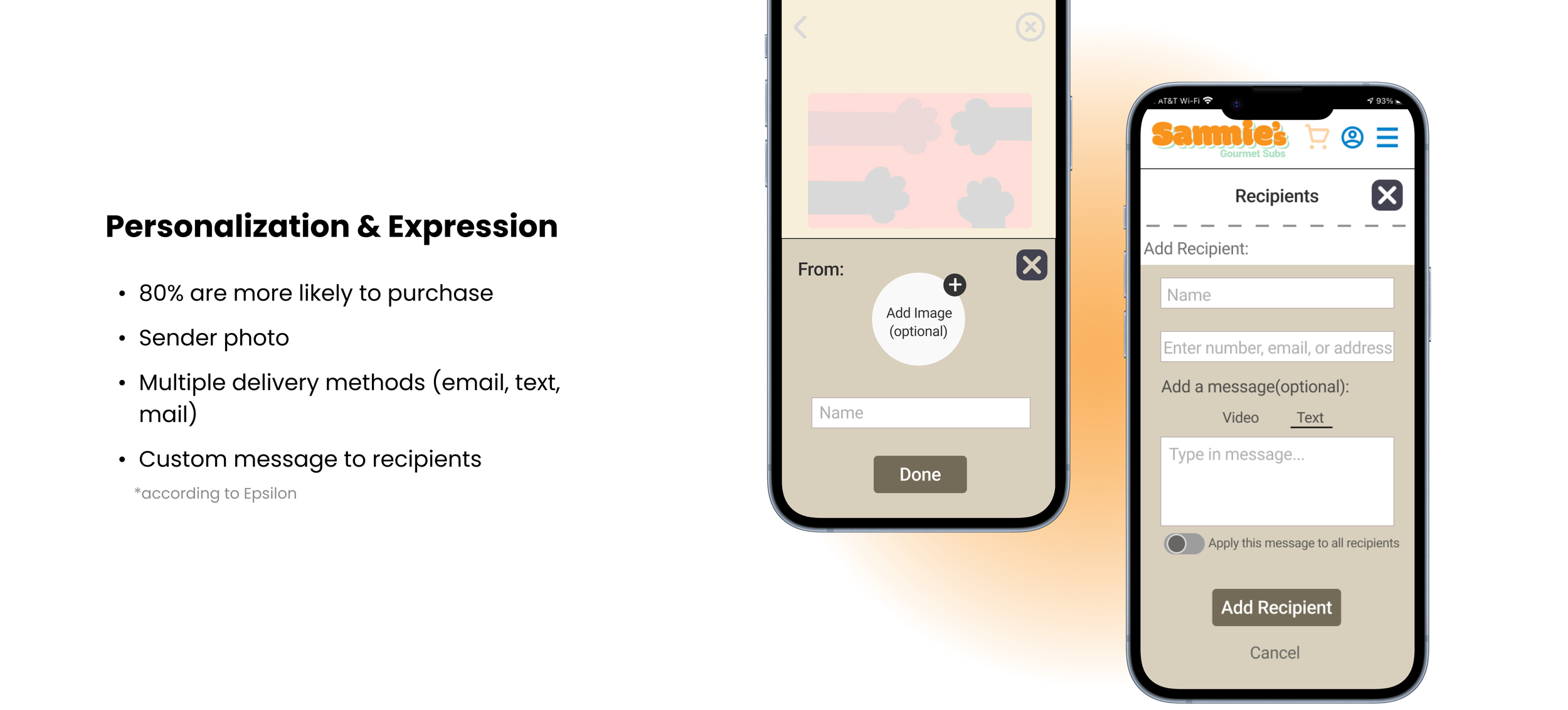
“..the appeal for personalization is high, with 80% of respondents indicating they are more likely to do business with a company if it offers personalized experiences and 90% indicating that they find personalization appealing”
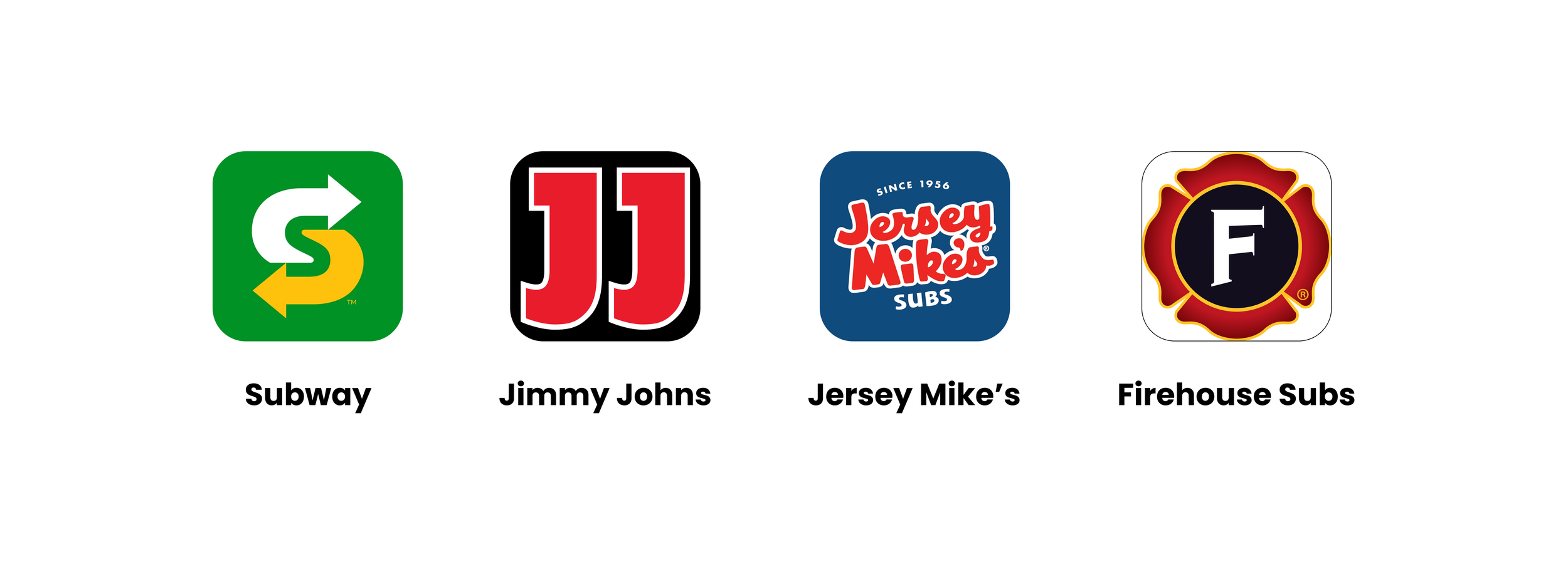
COMPETITOR ANALYSIS + THE GAP
The Competition had NO FLEXIBILTY
While keeping the above statistic in mind, I analyzed four popular sandwich chains and found that their e-gift card experiences lacked flexibility and meaningful personalization. Common limitations included minimal design options, restricted delivery methods (only sent through email), fixed or limited amount customization, and a lack of smaller details that make a gift feel personal.
This revealed an opportunity to design a more customizable and expressive gift card experience for Sammie’s.
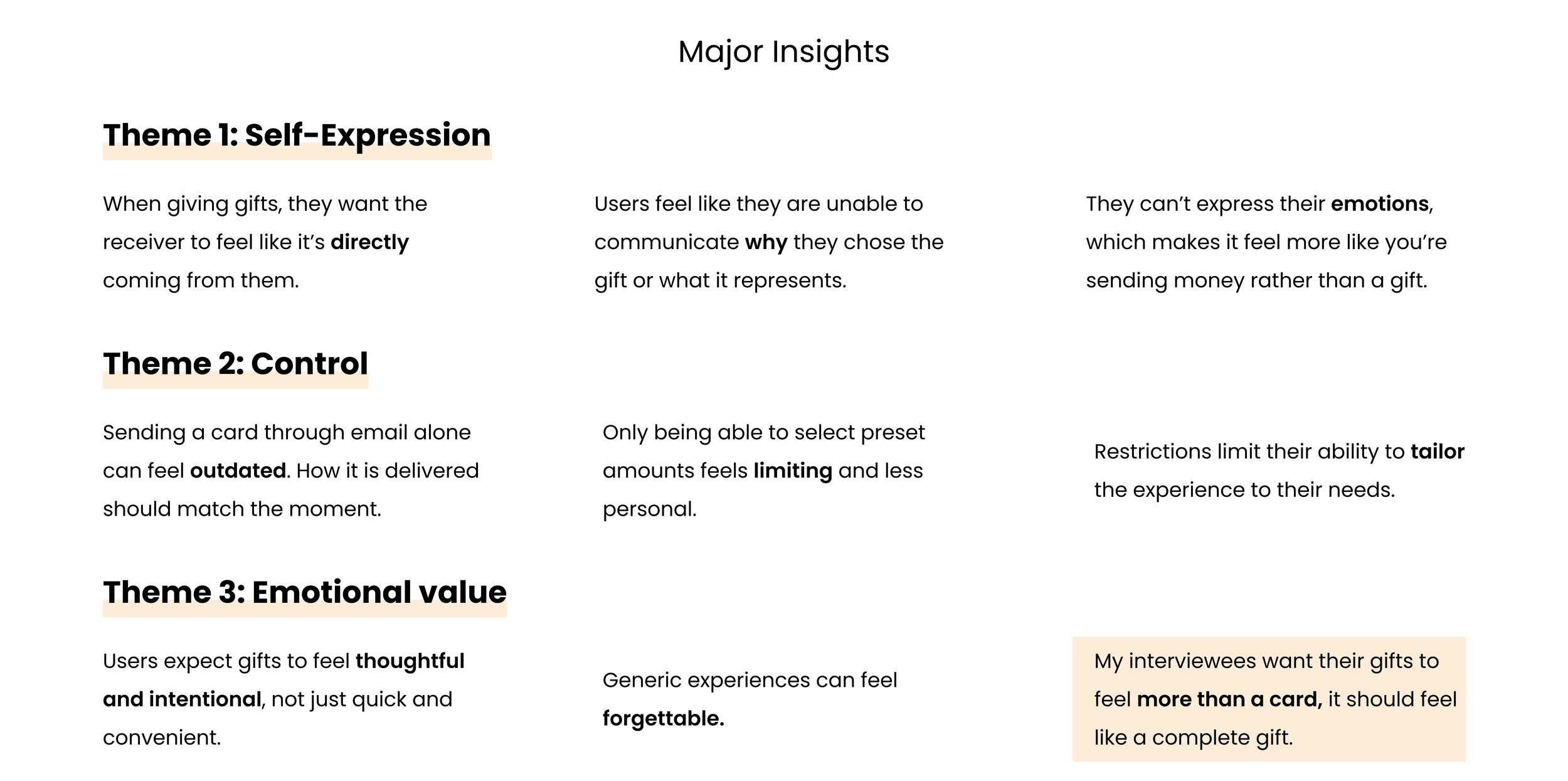
USER INTERVIEWS
My interviewees were more likely to engage with e-gift cards when personalization is available.
Although research showed that personalization increases engagement, I wanted to better understand how users perceive digital gifting experiences. I conducted 5 interviews with users to identify common frustrations and opportunities within existing e-gift card flows. I asked them the questions below to find trends on why they didn’t purchase e-gift cards, then organized my data though affinity mapping.
RESEARCH QUESTIONS:
How do you typically purchase or send gift cards?
What makes a gift feel meaningful to you?
Have you ever sent a digital gift card? What was that experience like?
What features would make a gift card feel more personal?
On a scale form 1-10, how important is customization when giving a gift and why?

RESEARCH
Personalized experiences can increase engagement by up to 80%
In my research, I explored how personalization impacts user behavior and perceived value - when I stumbled upon an eye opening statistic from Epsilon:
THE MAIN INSIGHT
E-gift cards feel more like sending money than giving a thoughtful gift.
Based on trends in my affinity map, I noticed how many recive the current e-gift card experience impersonal. Without the ability to customize or add meaningful details, gifting felt more like sending money than giving a thoughtful gift.
PERSONA
To better understand the target users, I created persona to better understand what users think, feel, and need throughout the experience.

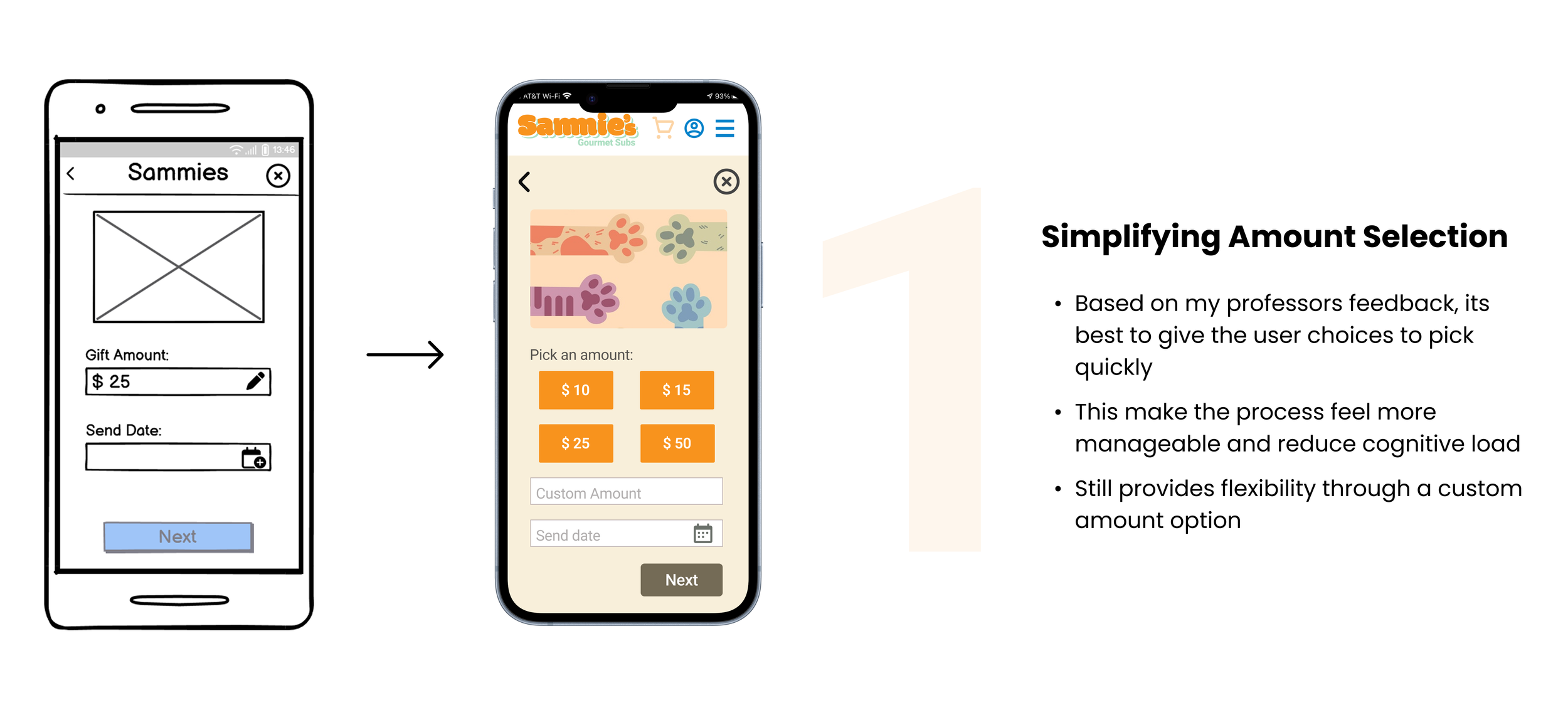
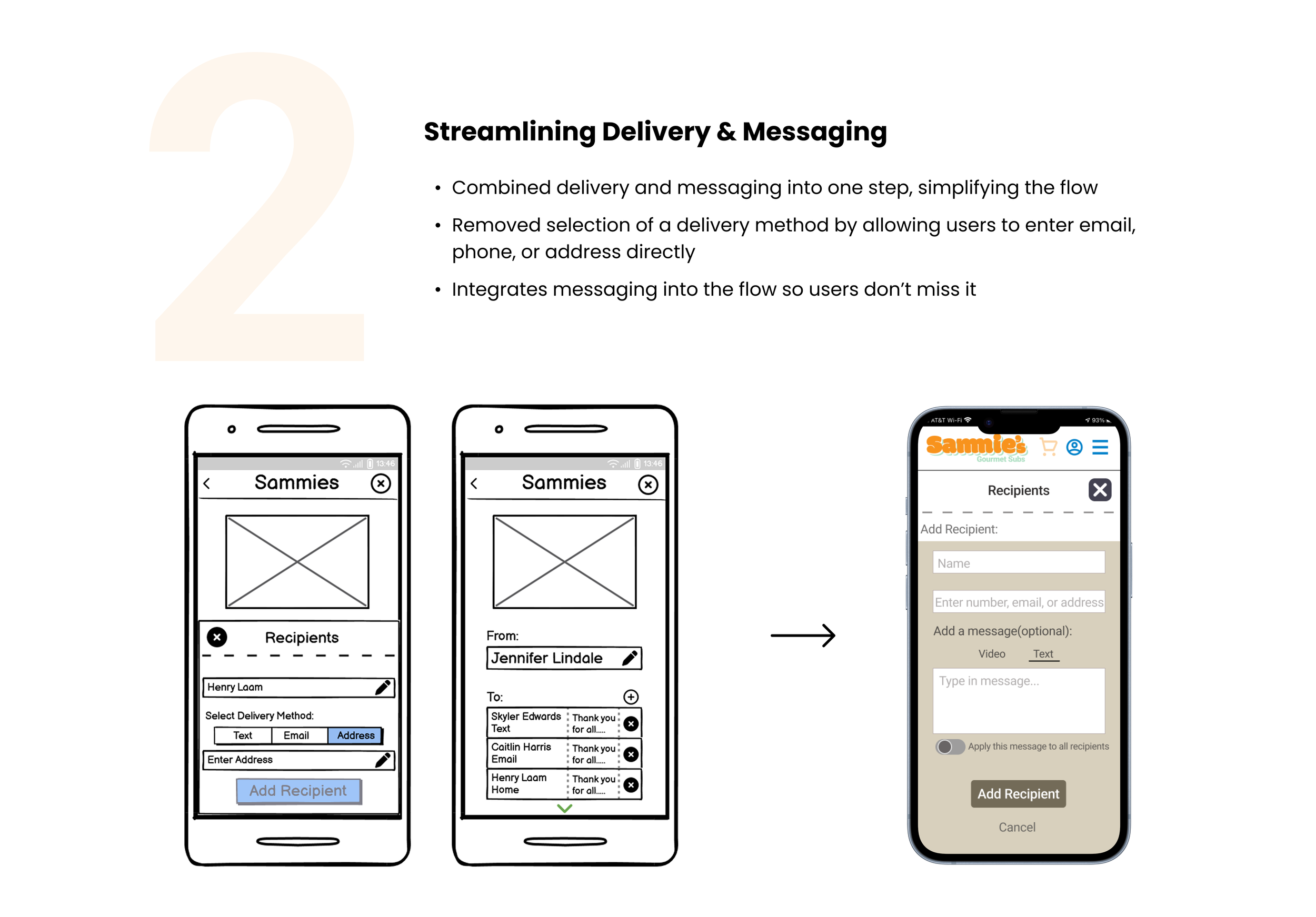
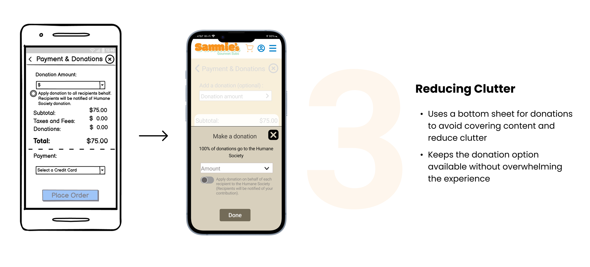
TESTING + IMPROVEMENTS
3 Major Improvements in my Design
Based on various feedback from my professor and peers, I continually iterated my design over the span of 4 weeks with 3 major improvements:
Final Flow
The Final Product
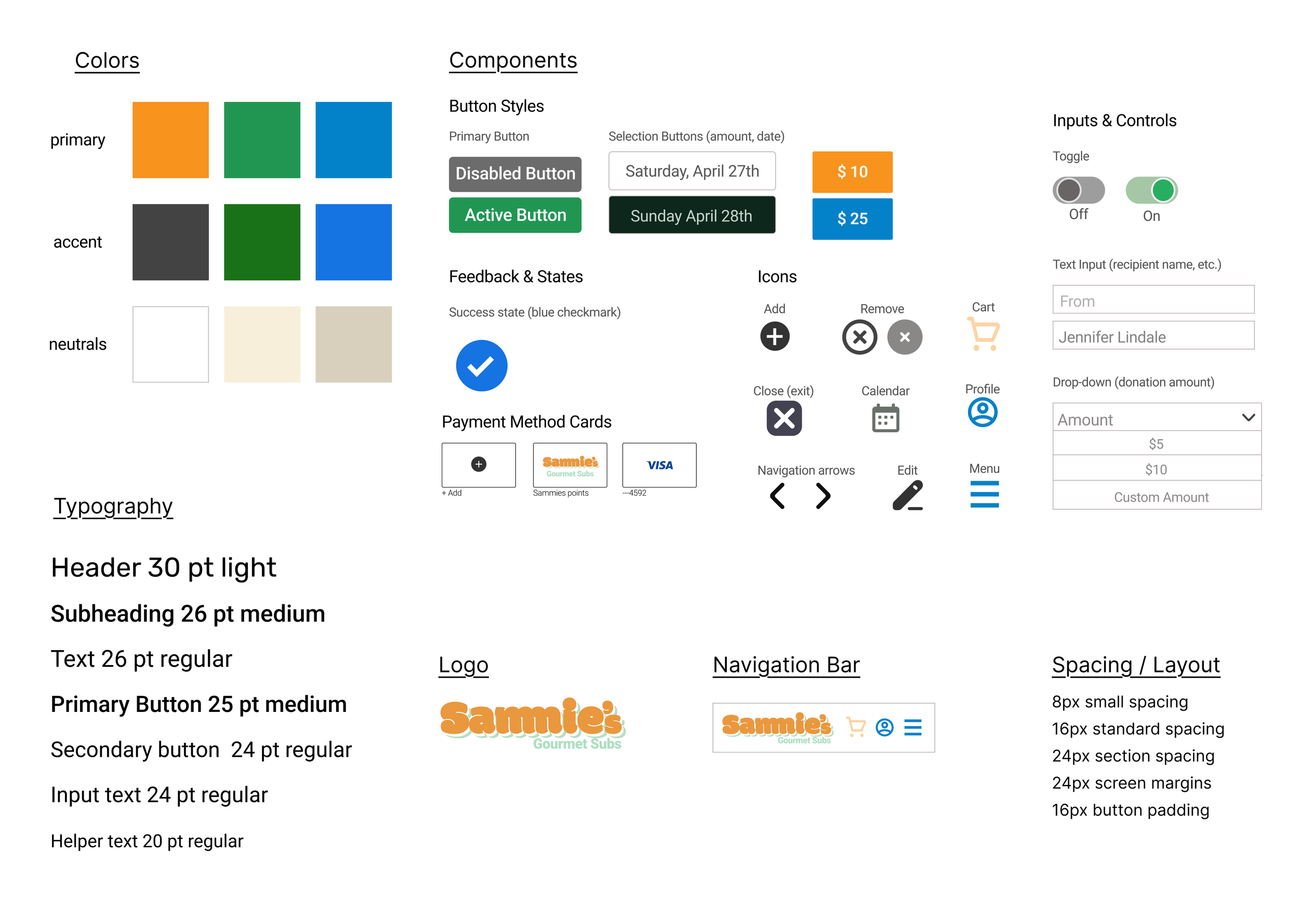
The Style Guide
CONCLUSION
Reflection & Takeaways
This was my first ever UX project! I am grateful this project taught me designing meaningful experiences goes far beyond creating polished screens. I got to experience the entire UX process and learned a lot. Here are a few things I learned along the way:
You don’t need the perfect solution immediately
One of the biggest things I learned throughout this project was that strong solutions rarely appear on the first attempt. Iteration exists to test ideas, uncover what works, and identify what doesn’t. Some of my strongest improvements came after realizing earlier decisions were not solving the problem as effectively as I thought.
A design not working doesn’t mean failure
During the process, I learned that unsuccessful ideas are still progress. Every design decision that didn’t work helped me better understand the user problem and pushed me closer to a stronger solution. Receiving feedback and revisiting my designs became one of the most valuable parts of the project.
Making decisions easier for users
I learned that giving users clear choices can create a smoother experience than requiring them to manually input information. Providing structured options helped reduce cognitive load, simplified decision making, and made the flow feel faster.
If you'd like to connect, collaborate, or chat about design, feel free to reach out at rosem9298@outlook.com
Thanks for reading!✨
Explore my other projects:
