Brightway
Family Clinic
Primary care made simpler
Role
User Experience Design,
Overview
6 weeks, Summer 2018
CONTEXT
Timeline
February 2026
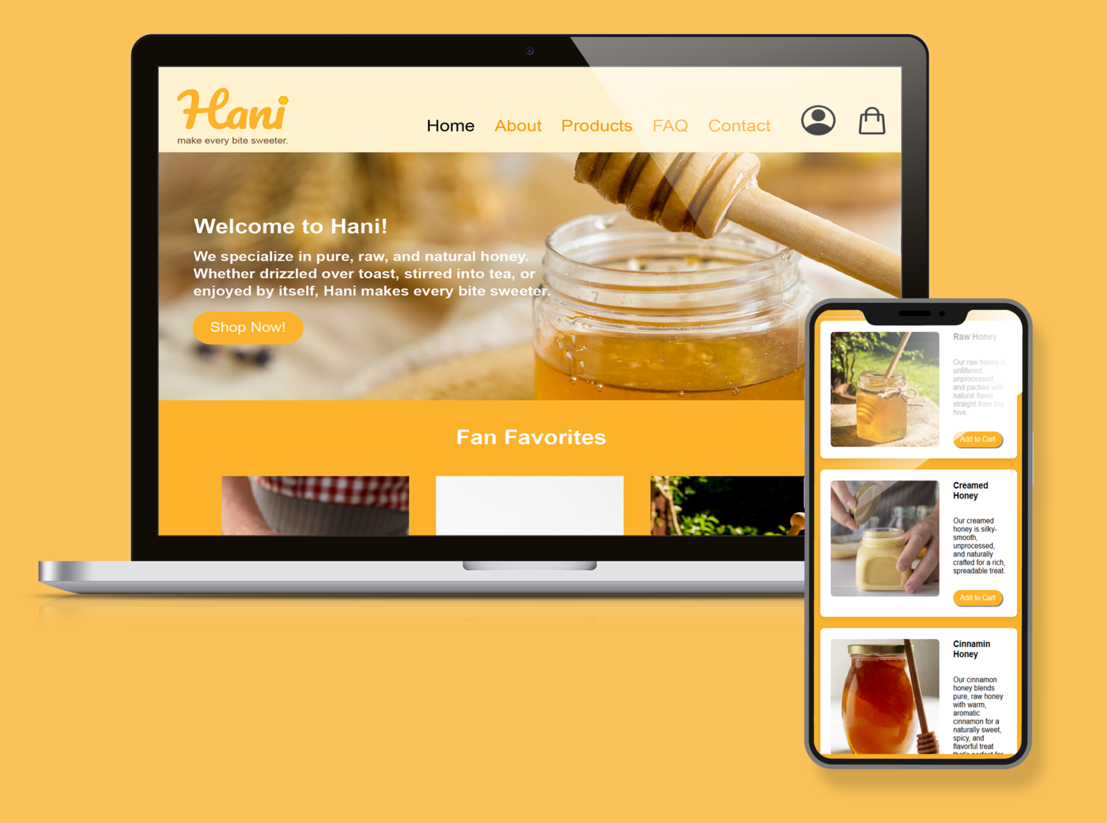
Brightway Family Clinic is a mid-sized primary care practice serving families, seniors, and working adults in a suburban community. The clinic focuses on preventative care and long term patient relationships, but experiences long front desk lines and paper intake forms during peak hours.
My challenge was to design a mobile app that helps patients check in quickly and complete required health screening questions while maintaining privacy, accessibility, and ease of use.
Why They Need a Mobile Pre-Check-In:
high patient volume during mornings
limited front desk staff
frequent form errors or missing information
growing expectation for digital first experiences
The Problem
The Goal
Returning patients experience unnecessary friction during hospital check-in because they are required to re-enter demographic and medical information that has already been submitted. This redundancy increases wait times, delays care, and creates frustration at the start of the patient experience.
Help patients check in before their visit so appointments start faster and lines stay short.
"How Might We’s"
How might we help patients complete check in before arriving?
How might we design check-in for patients who aren’t tech-savvy?
How might we support first time and multilingual patients?
How might we reduce repeated data entry for returning patients?
USER RESEARCH
Understanding
our Users
Competitive Audit
To understand how it works in real healthcare settings, I reviewed nine existing hospital portals, mobile apps, and in clinic kiosk systems, including Virtuwell, Froedtert & MCW, CER Hospital, Phreesia, Aila, Modernizing Medicine (PocketPatient app), West Cancer Center, Yankton Medical Clinic, and Scarborough Health Network.
Research was based on publicly available demo videos, walkthroughs, marketing pages, and patient facing screenshots. I evaluated the same set of features, including identity verification, insurance review, health questionnaires, document uploads, progress indicators, language options, and confirmation states.
Secondary Research
In addition to reviewing other platforms, I explored articles about the benefits of mobile check-in’s and how they can be improved.
USER RESEARCH TAKEAWAYS
People prefer completing forms before arriving
“to avoid waiting in line and dealing with paperwork at the clinic.”
Language barriers and medical wording can cause difficulty
Patients aren’t sure if check-in worked
Patients feel frustrated by long + repetitive forms
“It feels like I’m filling out the same paperwork every time I visit.”
Progress indicators and time estimates reduce anxiety
“Knowing how many steps are left makes the process feel manageable.”
Key Findings
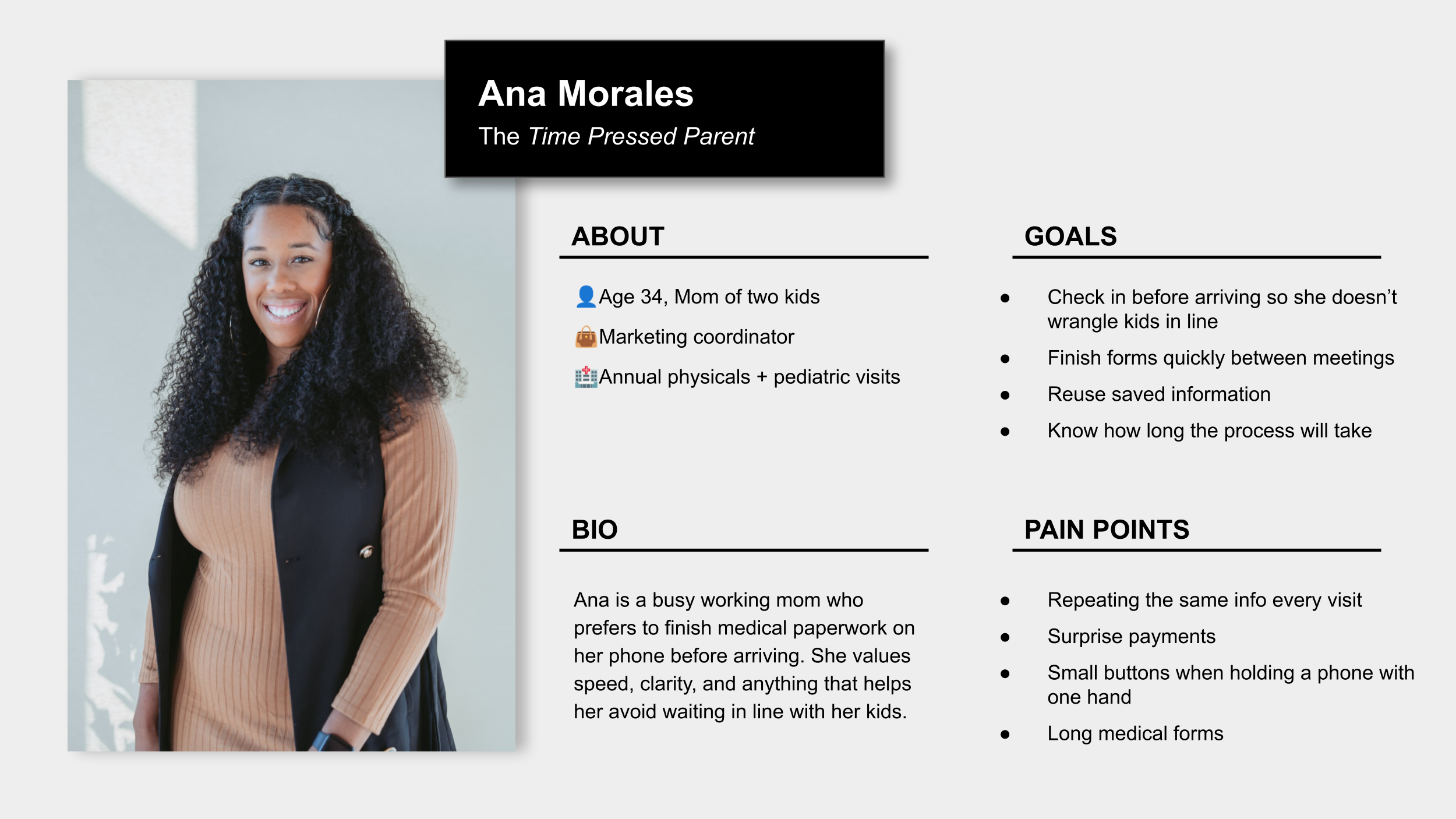
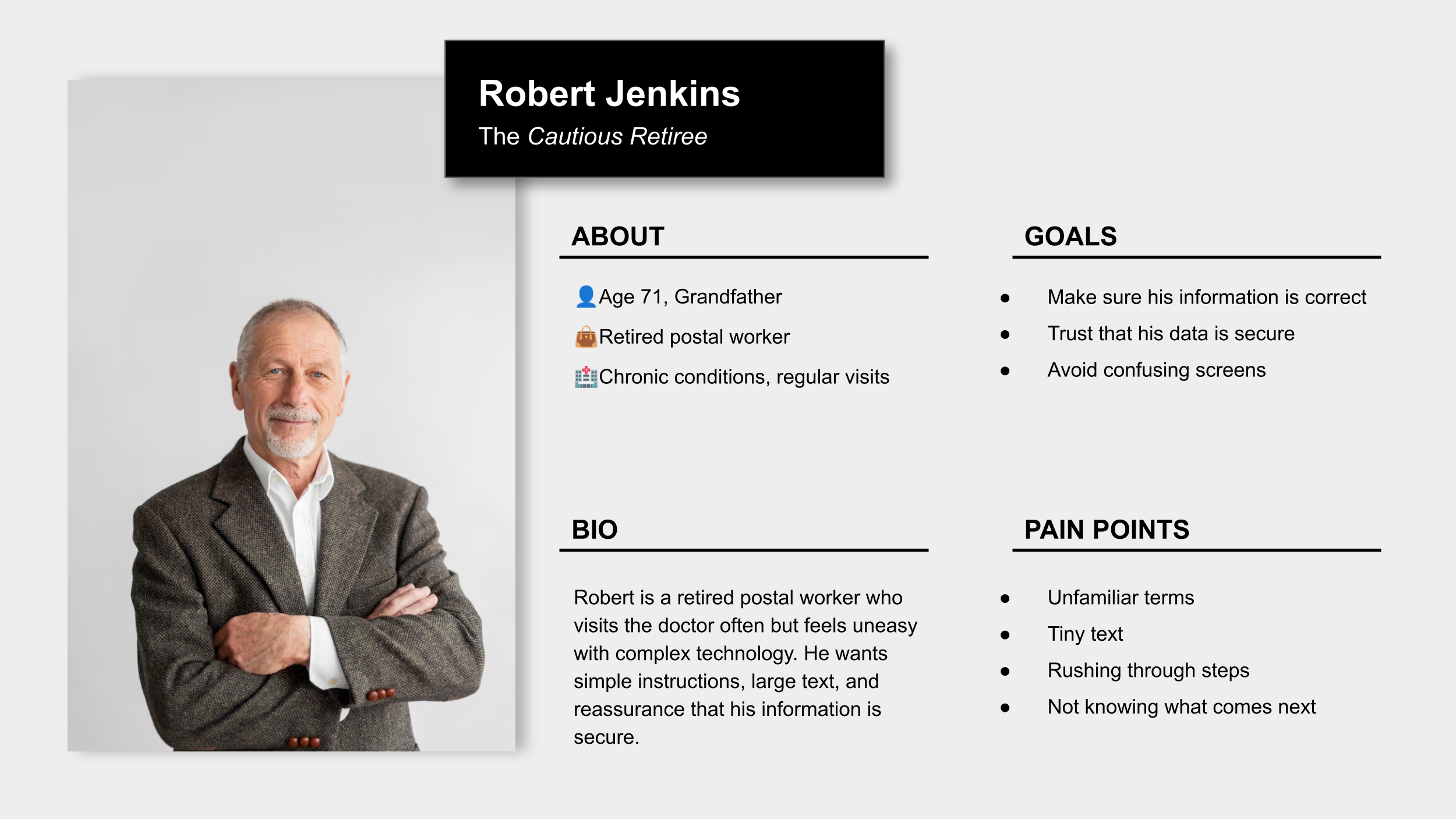
PERSONAS
Empathizing with
the Target Users
To better understand the target users, I created fictitious personas so that I can jump into the users' shoes and truly understand their needs, wants, thoughts, and priorities.
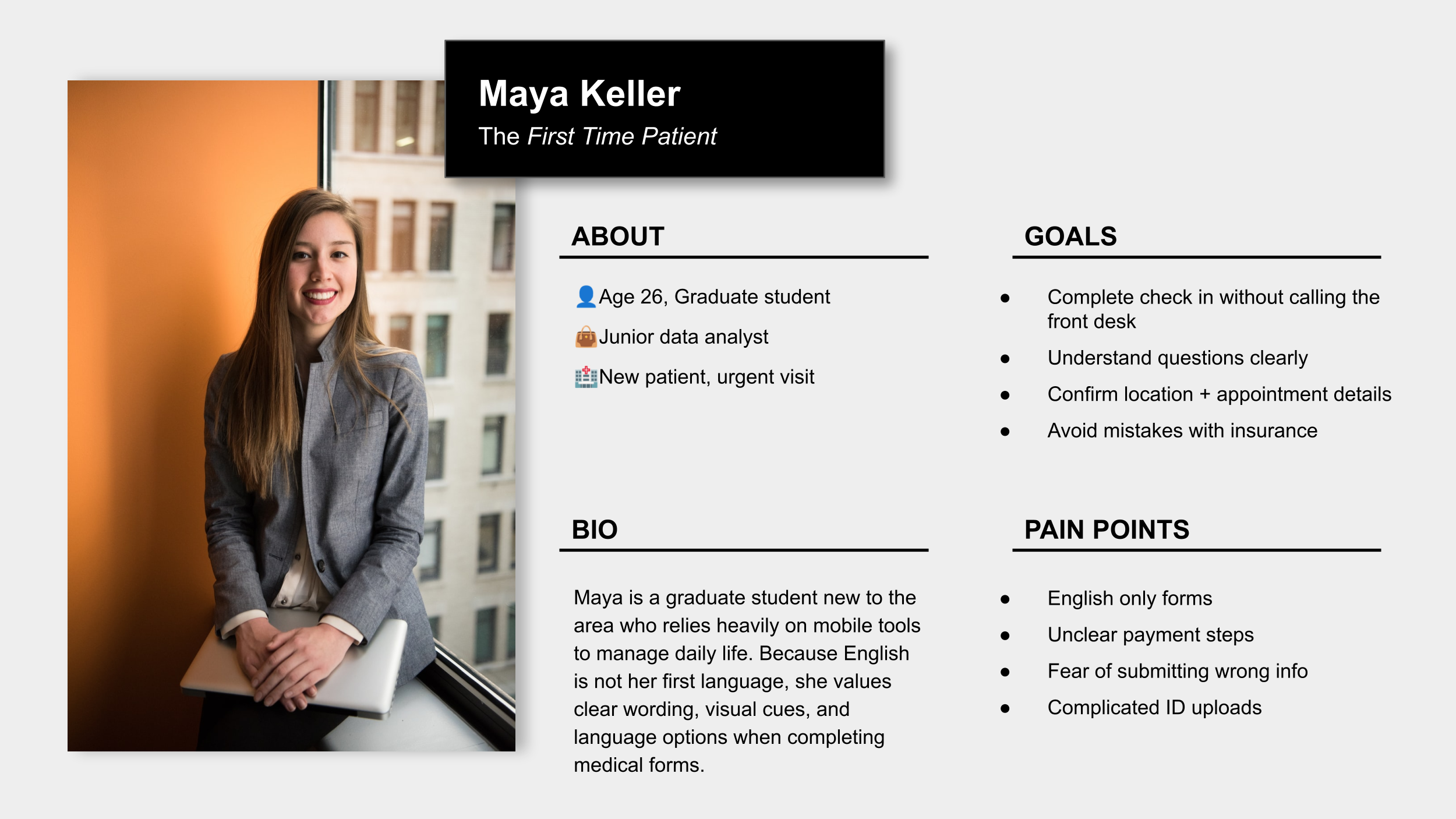
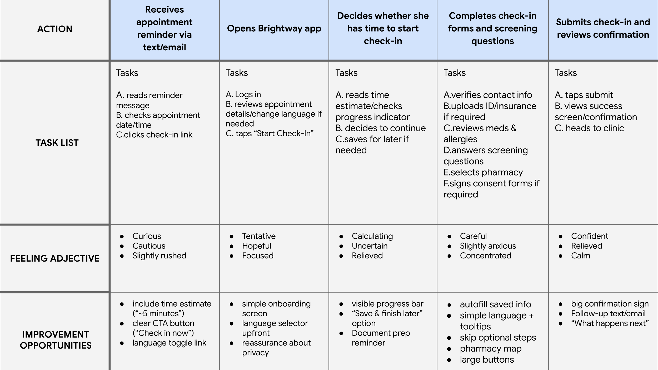
User Journey Map
To better understand the patient experience before arriving at the clinic, I created a user journey map for our persona “Maya”.
It helped bring attention to moments of uncertainty, reassurance needs, and opportunities to reduce anxiety through clearer feedback and guidance.
Persona: Maya Keller
Goal: Ana has a pediatric appointment and uses Brightway to check in ahead of time.
BRAINSTORMING
Exploring Solutions